
Hudson Yards is a major new highrise development planned for the west side of Manhattan, New York. The site is a railyard, which is being decked over. Once both phases are completed, a total of more than 17 million square feet of commercial and residential space will be built.
http://www.hudsonyardsnewyork.com/the-story
Well, let’s take a look.
The problem with hirise architecture, over the past century or so as I see it, is generally not the height of the building itself. There’s nothing particularly unpleasant that I find from living or working on the 48th floor (I once had an office on the 42nd floor in Lower Manhattan), with some tradeoffs of course, such as generally not being able to open the windows. Against this, we get some impressive views. It seems like people with money, who can live wherever they want, are quite happy living in downtown highrises, and pay a lot of money to do so. In general, TradCity neighborhoods and hirises don’t play well together — it would be best not to build any more hirises in central Paris — but if there is any place that a hirise is more than appropriate, certainly it is Manhattan, and certainly on the site of a railyard in a prime location.
Thus, this is not really a discussion about whether the six-stories-or-less pattern of central Paris is superior to the hirises of Manhattan. In general, I prefer the TradCity in its traditional form, typically of six stories or less. This pattern is capable of densities of 100,000 per square mile or greater — more than Manhattan — so there is no particular need for hirises. But, in this case, I don’t think anyone is going to get anywhere with the argument that this particular site should be built out at six stories instead of ninety, the height of the tallest building.
So, the question is: how to get the best result possible, for this particular site, with hirise architecture and 17 million square feet, or more. I assume more square feet is better, if we can find a good way to do it.
The basic problem with hirise architecture is at ground level. First, there is the interaction of the building itself with the street. Often, hirises meet the street with featureless blank walls of stone or glass, rather than the storefronts of the Traditional City. But, this is relatively easy to remedy with a little attention, as demonstrated by the “pedestal” form of the Empire State Building, and is also fairly well recognized by architects today.
A more important problem is: what is outside the building. Here we have two common outcomes:
1) 19th century hypertrophism with hirises. This is the present form of Manhattan. Tall buildings are combined with the original 19th century street pattern, typically a grid, and typically of very wide “arterial” streets of perhaps 100 feet from building to building, with sidewalks on either side, perhaps street parking, and two to four, or more, lanes of automobile traffic.
This is not the worst thing. Since things are still pretty close together, it is usually easy to get from place to place by walking and subway. But, the result is typically harsh and ugly, dominated by several lanes of roaring traffic in the middle, with people huddled along sidewalks on either side of a “concrete canyon.” It is tolerable for the working day, but people want somewhere more pleasant to relax and raise their families.
2) 20th century hypertrophism. This is a combination of hirise buildings with what amounts to a suburban street pattern. It emerged in the early days of hirise architecture and also widespread use of the automobile, in the 1920s, and is often associated with Le Corbusier. The streets get even bigger. Then, to relieve the unpleasantness of the giant roadways, “green space” buffers are introduced, thus spreading things out in the form of the suburban office park. Often, bizarrely, outdoor parking lots become common, a total contradiction of a very low-value use (outdoor parking) combined with a very high-value use (hirise building). This form is common in places like Dubai or Las Vegas. This result is typically very difficult to walk in, much like lowrise Suburbia, which of course means more cars and more parking, thus spreading things out still further and making things yet more unwalkable in the Suburban pattern.
The problem with both of these solutions is that, in either case, the area outside the building is harsh and inhospitable to people. We discussed all these topics earlier here:
September 23, 2012: Corbusier Nouveau 3: Really Narrow Streets With High-Rises
August 26, 2012: Corbusier Nouveau 2: More Place and Less Non-Place
August 19, 2012: Corbusier Nouveau
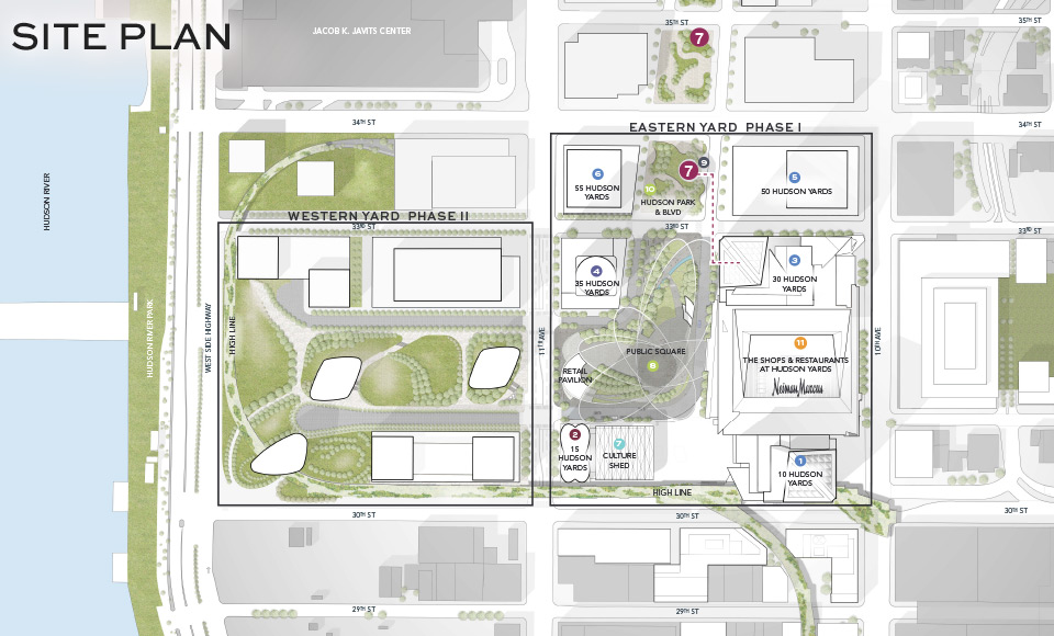
Recognizing these defects, architects today are striving to combine hirises with something a little more human-friendly at ground level. You can see this urge in the design for Hudson Yards. Here’s what it looks like:
Here’s an artists’ conception of the Eastern Yard Phase I:
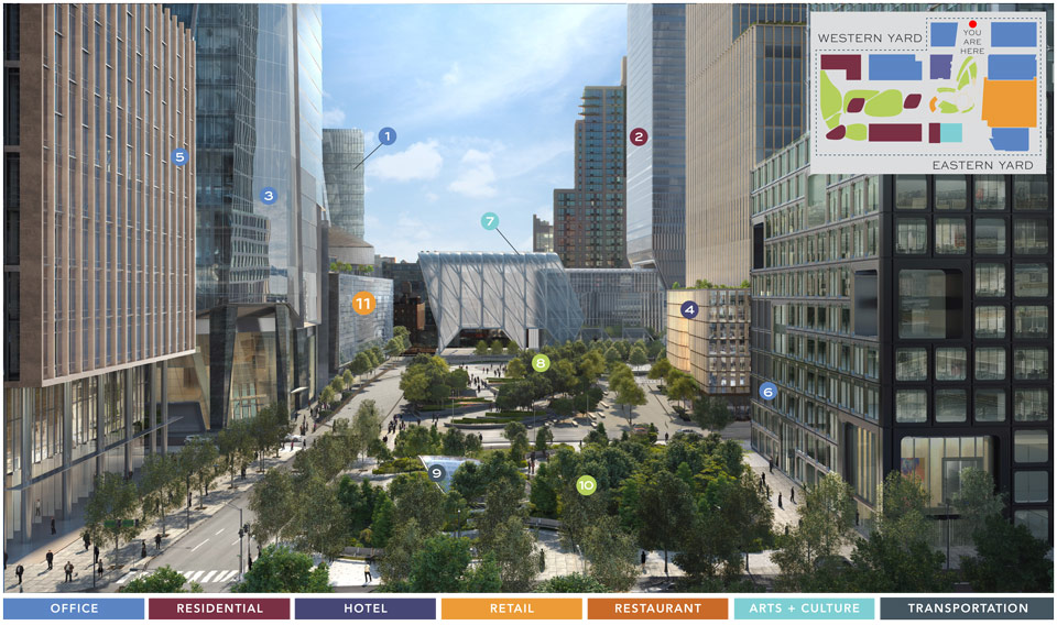
My first impression is: not bad. There’s something sort of like a park there. The glass dome marked #9 is actually the entrance to a subway station, which sure beats a big parking lot. The funny greenhouse-sort-of-thing marked #7 is a “culture shed.” The project actually connects directly with the popular High Line park, which was originally an elevated railway leading, naturally, to the railyard.
But, my second impression was: this could be so much better.
How?
Some of my TradCity principles, which we can use here, were that you should make Places. Places are destinations, where you do something.
October 10, 2009: Place and Non-Place
Streets can be Places, especially Narrow Streets for People which are dominated by walkers. Arterial streets are hybrids at best: the center automobile lanes are, of course, totally inhospitable to humans, and are essentially transportation infrastructure. However, the sidewalks can be lively Places of a sort, especially if there are a lot of shops and so forth. On the other hand, a blank and barren street with nothing to interact with, like a Suburban Hell “stroad”, are Non-Places. Other common non-places are parking lots and Green Space landscaping buffers, used to break up the endless pavement of automobile roadways and parking lots.
One problem of Suburbia, and also 20th Century Hypertrophism of the Courbusier hirise variety, is that nearly all of the outside area is consumed by Non-Place. It is not a Place for People.
What do we see at Hudson Yards?
The parklike areas are certainly better than most Green Space buffers that you typically see in 20th Century Hypertrophism. This is from Florida:
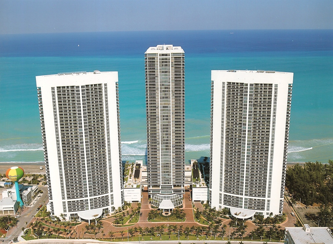
In this example, we clearly have some landscaping buffers, along auto roadways, that can’t be considered a “park” in any way. (Actually, there are something like real parks in behind, on top of what appear to be multilevel parking garages. So, this example is better than most.)
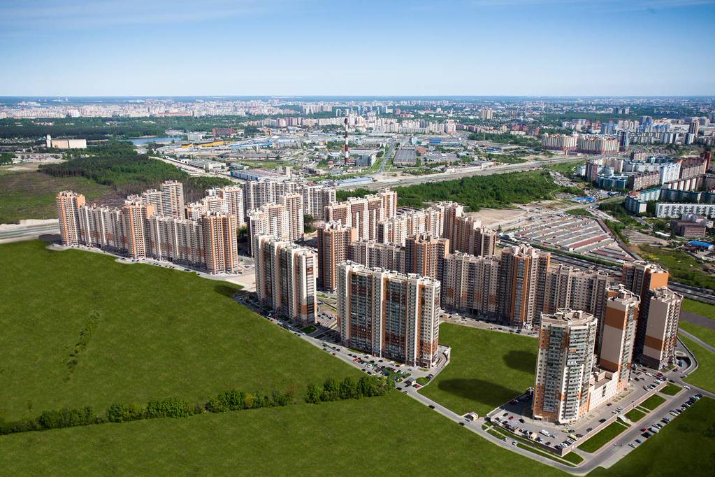
Here too, we see hirise buildings combined with large roadways, parking lots and Green Space buffers (they certainly aren’t parks), in the typical 20th Century Hypertrophism format. Like a typical suburban office park, there’s really nothing to do once you step out of the building except get in a car.
The Hudson Yards example is certainly better than this. I can imagine going down to that parklike area, sitting down, and enjoying a cup of coffee during my workday lunch break. I can almost imagine taking my kids there to play, although I could probably think of some much better places to go.
But … is it a park?
Some of the defining characteristics of a park are that:
1) It has a name.
2) The name includes the word “park.”
3) It has clear borders.
October 11, 2015: Parks and Squares 4: Smaller Squares
August 16, 2015: Parks and Squares 3: Squares
August 2, 2015: Parks and Squares 2: Smaller and Closer
July 26, 2015: Parks and Squares
And, I would have to say that these parklike areas are not parks. They are just “parklike.”
In other words, they are filler.
There is one small part that is labeled “Hudson park and boulevard.”
That is a name (rather uncreative alas), and it does include the word “park.” However, I would say that it falls a little short of a real park, just from its appearance and form. The architects themselves probably sensed this, which is why they couldn’t quite call it a “park” with a straight face, and instead called it a “park and boulevard.”
The second odd thing here is the big street (actually two streets, crossing). The plan seems to include an extension of Hudson Boulevard East.
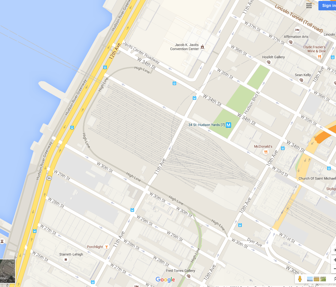
A better solution, in my opinion, would be to eliminate 33rd street and Hudson Boulevard south of 34th street. I bet they could get the city to agree to that. Why do we have an automobile roadway here? All of the buildings have access to existing streets around the perimeter. Nobody needs to drive through the middle.
Is the sole purpose for “33rd street” so that someone can drive from 10th Avenue to 11th Avenue without having to go all the way to 34th street?
Why bother to extend Hudson Boulevard to the south? The answer, I think, is that the street is filler. The architects just had this blank between the buildings, and so they started filling it up with doodles, a sort-of-park and a street-nobody-needs. It is, actually, just a little different than the Florida example above.
If you can’t think of anything better, I say: make more buildings. Make another ten million square feet of space where people can live and work. Ten million square feet is enough for ten thousand 1000sf apartments. Let ten thousand more families walk to work via High Line Park instead of commuting from New Jersey. Let the developers make oodles and boodles more money. Don’t waste the space on a street-nobody-needs.
But, here’s another proposal:
First, get rid of the streets.
Now, take essentially all of the area between the buildings (except for the narrow corridor-like places), and make a real park.
Give it a name. I suggest the name of the developer’s wife. Call it the Mariann Williamson Park.
Then, give it clear boundaries.
Now, take this park, and make it the best park in New York City.
New York City has some pretty nice parks. Think of your ten favorite parks in New York. So, just like that, but better of course.
Make it the kind of place that is on the Top Ten Places To Visit In New York in a French tourist’s guidebook.
Make it the kind of place that, if some architect suggested you call it the “Mariann Williamson Park and Boulevard,” you would burst out laughing, just before you fired them.
TimeOut.com’s list of the Ten Best Parks in New York.
Of course, it might not actually be the best park in New York City. But, if you tried, it would still probably be pretty good. And, I think you can tell the difference between the best park in New York City, whatever image that phrase generates in your imagination, and this filler-greenery that we can’t quite manage to call a “park.”
Now, try to imagine what that would be like. Instead of this sort-of-park and a street-nobody-needs, you can take the elevator down from your apartment or office on the 57th floor, and step out the door into the best park in New York City. Can you imagine how wonderful that would be?
Look again at the second picture above, the concept of the existing plan. In your imagination, erase eveything in between the buildings and replace it with the best park in New York City.
Pretty different, isn’t it.
Now, I could go down the elevator with my six-year old, and without even having to cross one street, step directly into the best park in New York City, where she can play all day with all the other kids with similarly lucky families, and I can be so happy that I chose this place to live, this one place so obviously superior to all other places, where I can go to the best park in New York City without even having to cross Fifth Avenue.
And … that’s it. It is really just a matter of getting architects to stop this filler-doodling and instead make some real Places for People.
In the end, these are minor tweaks. I didn’t change the buildings, or building footprint, at all. (The building layout for the Western Yard Phase II could be improved a lot.) My version doesn’t really cost any more than what’s proposed. But, I think my version is much better. And, we got there by applying our Traditional City design principles.
Click Here for the Traditional City/Heroic Materialism Archive
