Courbusier Nouveau
August 18, 2012
We’ve been having fun with various Traditional City-inspired solutions that are basically drop-in replacements for today’s typical Suburban Hell single-family detached housing.
July 1, 2012: How To Make a Pile of Dough With the Traditional City 9: Townhouses With Parking
April 22, 2012: How to Make a Pile of Dough With the Traditional City 8: Shared Parking
April 1, 2012: How To Make a Pile of Dough With the Traditional City 7: Let’s Bulldoze a Big Box Shopping Center
December 25, 2011: Life Without Cars: 2011 Edition
December 4, 2011: The Diminishing Returns of Heroic Materialism 2: End of the Line
November 6, 2011: Let’s Take a Traditional City Break 5: Stuff That Works
October 30, 2011: The Diminishing Returns of Heroic Materialism
September 25, 2011: Let’s Take a Traditional City Break 4: Many Variations, One Theme
August 21, 2011: How To Make A Pile of Dough With the Traditional City 6: Better Than a Thousand Words
July 31, 2011: How To Make a Pile of Dough With the Traditional City 5: The New New Suburbanism
July 17, 2011: How To Make A Pile of Dough With the Traditional City 4: More SFDR/SFAR Solutions
Today, let’s go to the other end of the spectrum, which is to integrate Traditional City elements into the design of potentially very high density neighborhoods using high-rise buildings, to get a result that is much better than what we’ve had for the past several decades, when using high-rise buildings.
If you’ve been following along, you probably noticed that, despite my wholehearted enthusiasm for the Traditional City, in its Traditional form without any particular innovations except a subway system, I am not necessarily against high-rise buildings of heights 30 stories or more.
I don’t think that high-rises are “better.” Not at all. Nor do I think they are necessary. Paris has population densities in excess of 100,000 people per square mile in some areas, with a Traditional City layout and buildings no higher than about six stories. Certainly, there are cities with a mostly Traditional City layout with population densities still higher than that. Manila has an overall population density of 111,000 people per square mile, roughly double that of Paris, which means there are some neighborhoods there which exceed that average by a large margin. Yes, a density higher than the typical 3,000-8,000 people per square mile of Suburban Hell is good, but there is no particular need to go higher than 100,000, which is entirely possible with a Traditional City format, and indeed, can produce absolutely fabulous environments at those densities. The benefits of the Traditional City are completely apparent at the 30,000 people per square mile density of some of the Japanese single-family detached residential districts. If you took Los Angeles (the actual municipality of Los Angeles, not the greater metropolitan area), population density 8,100 people per square mile, and built it in the fashion of Paris (the actual city of Paris), 54,900 people per square mile, it would take only 15% as much space! Everyone could live within a mile of the beach. A twenty-minute walk! Plus, not only could they go bodyboarding after work, they would also be living in “Paris,” at least, a Southern Californian version of it.
That’s dense enough.
Also, I think that many people’s negative impressions of existing high-rise neighborhoods are entirely correct. High-rise construction basically began around the 1900. The Flatiron Building, one of the first “skyscrapers” in New York City, was completed in 1902. It is 22 stories high. Doesn’t seem like much today, but after five thousand years of buildings that tended to top out around six stories — because that’s about the limit of practical wood/stone construction, and also, nobody wants to climb more stairs than that — it was pretty impressive.
As we’ve seen, the 19th Century Hypertrophic layout in the United States dates from far earlier than that, to about 1780 or so. This basically meant buildings that were largely in the Traditional City style, but very, very wide streets, often 60-100 feet from building to building, and usually a street layout in the form of a grid. So, the first high-rise buildings were installed in an existing 19th Century Hypertrophic layout, which, in New York City, and also Chicago and a great many other U.S. cities, meant very wide streets in a grid pattern.
And thus, we have Manhattan. What are the characteristics of this pattern of high-rises and the 19th Century Hypertrophic street layout?
What tends to happen is that the streets become rather miserable concrete canyons, with four to six lanes of roaring traffic in the middle, and the people are huddled against the sides between the traffic and some monolithic blank wall of a high-rise building. This can be semi-tolerable for an adult in a business-y mood, but it is a forbidding and uncomfortable place for women, children and the elderly. Certainly not a nice place to raise a family. Since women, children and the elderly, and men with families, constitute about 90% of the population, this makes the 19th Century Hypertrophic High Rise City a difficult place to live for about everyone. We are, by now, well aware of this.
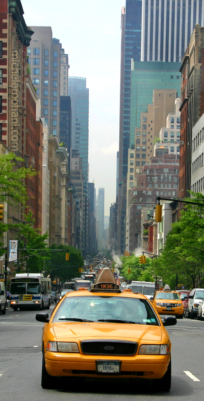
Manhattan.
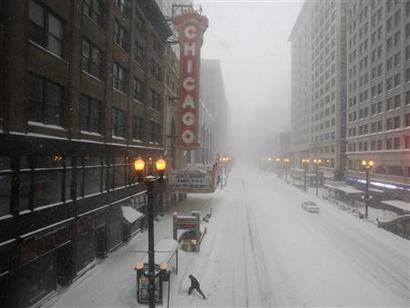
Chicago’s State Street is covered in snow February 2, 2011. REUTERS/John Gress (
Chicago.
However, using Manhattan as a guide, we can say a few good things too. For one, the fact that buildings are very tall doesn’t seem to detract too much from the experience on the street itself, except perhaps to make things a little dim. Once you are over twenty stories or so, you can go up to fifty or even a hundred stories and, from the street level, it doesn’t change much. Also, things seem to be fine inside the buildings. There doesn’t seem to be anything particularly unpleasant about an office, restaurant or apartment on the fiftieth floor, except perhaps that buildings are often designed so that you can’t open the windows, and things like balconies, though possible, are unusual at that height. Against this we have “airplane views,” as the real estate agents say, which is, in fact, sort of fun. (I once had an office on the 43rd floor in Lower Manhattan, with nice views.) To summarize: the big problem with the Manhattan-style 19th Century Hypertrophic layout with high-rises is the outside part — once you step outside the buildings.
February 21, 2010: Toledo, Spain or Toledo, Ohio?
January 31, 2010: Let’s Take a Trip to New York 2: The Bad and the Ugly
January 24, 2010: Let’s Take a Trip to New York City
It’s important to see that this 19th Century Hypertrophic pattern was never planned. It started with some very wide streets and a grid layout in the late 18th century (itself largely irrational), to which was added tall buildings mostly in the 20th century. Also, the 20th century brought the introduction of automobiles, which filled those very wide streets with the constant roar, stink (cars used to stink a lot more than they do today), and general unfriendliness of continuous automobile traffic.
By the 1920s, it was natural that someone would think that things would be improved with some more grass and trees. This would help provide a balance to the roaring automobile traffic and giant monolithic buildings stacked into concrete canyons. Also, in fact it was pretty hard to drive in those 19th Century Hypertrophic Cities, which were designed decades before the automobile. Ever tried to drive in Manhattan? So, people wanted a little less daunting traffic. Wider roads, with things like left turn lanes. Thus was born 20th Century Hypertrophism, the high-rise complement to Suburban Hell.
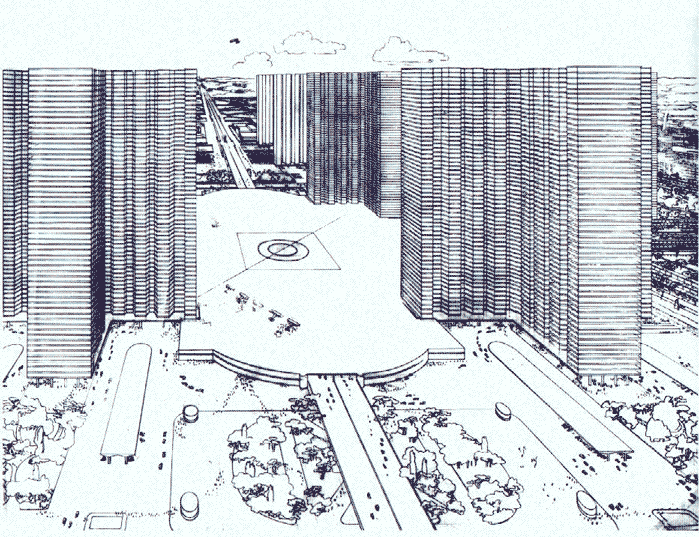
Le Corbusier, “A Contemporary City of Three Million,” 1923.
Here we have some very tall buildings but, unlike Manhattan, we start to space them out. Note the very large roadway (elevated expressway of perhaps 10 lanes) in the middle.
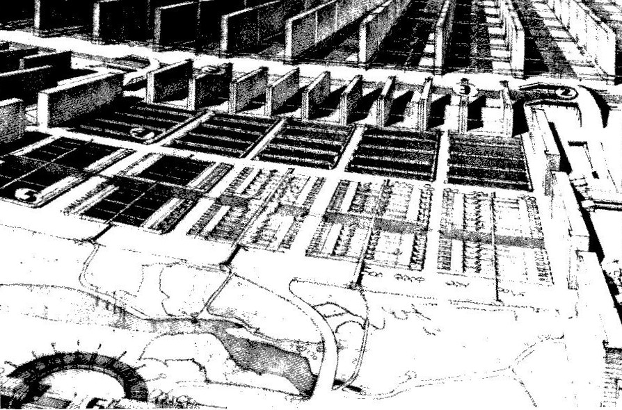
Richard Neutra, “Rush City Transformed,” 1928.
With 20th Century Hypertrophism, the streets, which were already very wide to begin with, become absolutely immense. You often see something like twelve lanes of traffic in the middle, always presented as a sort of centerpiece of the entire city design. A lot of “green space” is then added everywhere to provide a buffer between the very large streets filled with automobiles, and the places where people are. Perhaps, given all the automobile traffic, we now have the addition of a lot of outdoor parking as well.
October 10, 2009: Place and Non-Place
At this point, the density is falling dramatically, because, although we have some very tall buildings, the building footprint/land area ratio can be very low, perhaps even under 10%. Oddly enough, the addition of all this “Green Space” and so forth, inspired by the urge to make the high-rise city a more appealing place for humans, instead leads to horrible sprawl. It is no longer so easy to walk anywhere, and besides, there is nowhere to walk to because so much of the city is now taken up by roadways, Green Space, and parking lots. Once it is hard to walk, trains and buses become less useful, because it is not so easy to walk to and from the train station and bus stop. People begin to drive from one high-rise building to another. The end result is, again, not a very nice place for humans, and amounts to Suburban Hell with taller buildings. We don’t even have what small comforts are enjoyed at the suburban single-family detached house.
Thus, we get Dubai, or Las Vegas.
August 10, 2008: Visions of Future Cities
July 20, 2008: The Traditional City vs. the “Radiant City”
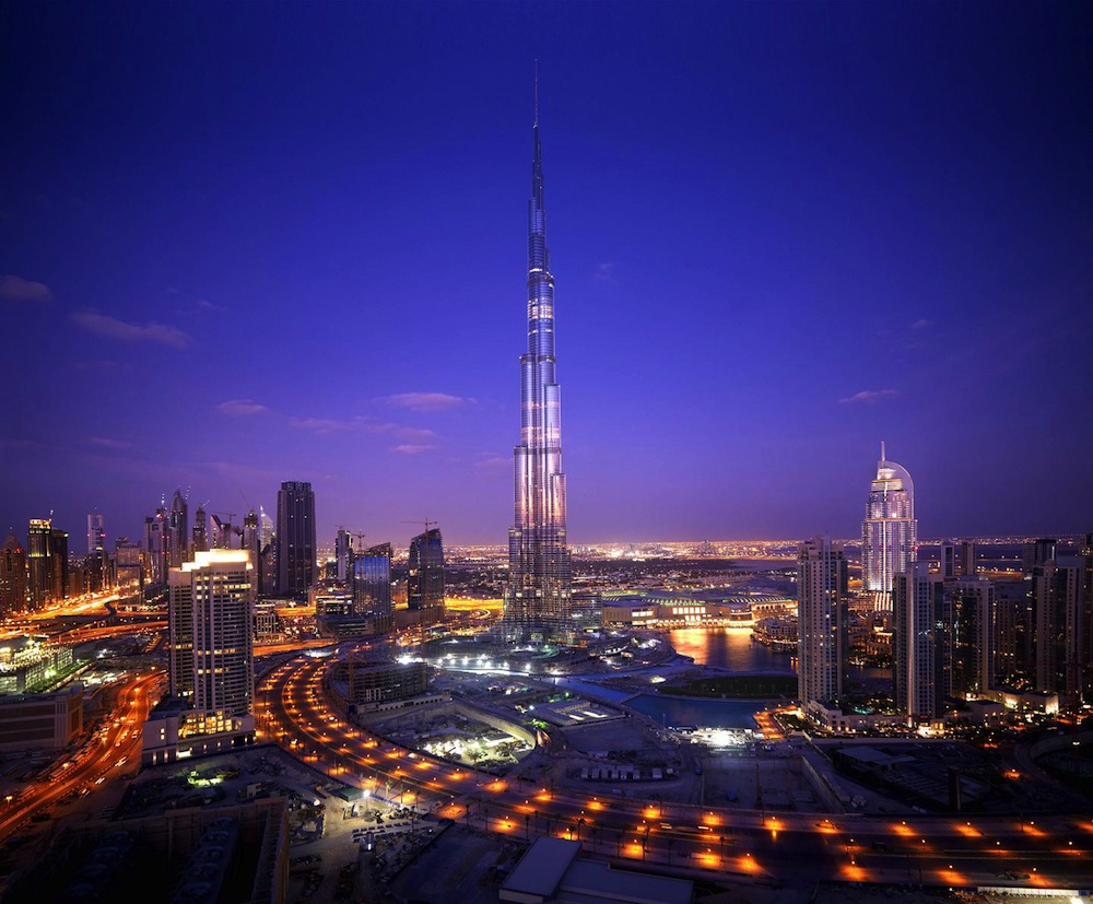
Dubai. Impressive blinky lights, but look how the land is used. It is mostly gigantic roadways and parking lots. Building footprint is only 10%-20% of land area.
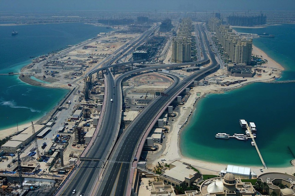
Look at the series of cookie-cutter highrise buildings on the right. This is fairly typical around the world these days. Would you want to raise your kids here? Isn’t it a little unpleasant?
It appears that the first and foremost design consideration here was to make some immense superhighways. Which is, maybe, not really what you want to be living next to hmmmm?
What is the building footprint/land area ratio here?
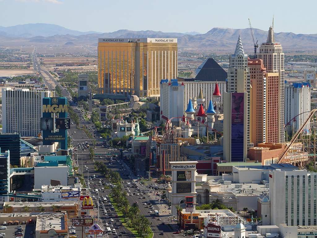
Las Vegas. Gigantic roadway stuffed with cars, Green Space, gigantic buildings. Building footprint is actually rather low here.
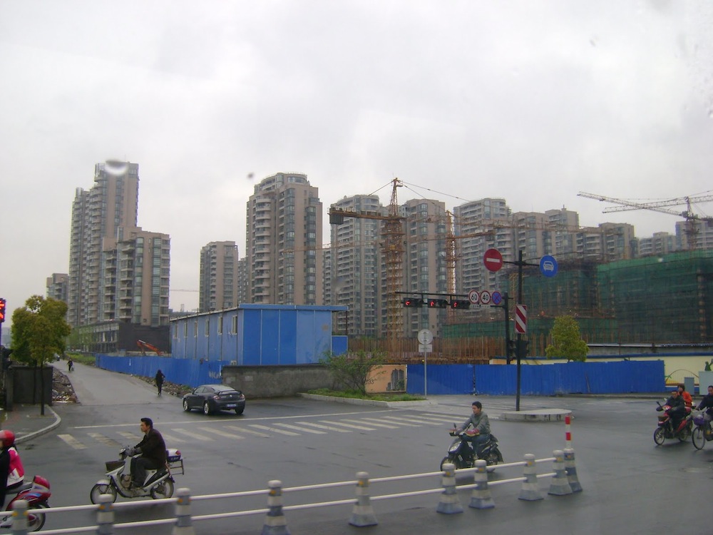
Shanghai. Fairly typical high-rise residential buildings. Large roadways and Green Space.
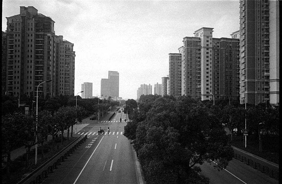
Typical “20th Century Hypertrophism” residential buildings in Shanghai. We are quite familiar with this now. Look at the size of that roadway! Also, note the introduction of a lot of “green space” to help buffer the immense roadway and the buildings. Look how teeny the people are here. This is a difficult environment to walk in. There’s nowhere to go, and the distances are very large.
It’s important to see that this 20th Century Hypertrophism pattern is in fact quite unlike the 19th Century Hypertrophic Highrise Pattern exemplified by Manhattan. In the Manhattan pattern, there is in fact very little “Non-Place,” except for the very large roadways, and even those are much smaller than what came later in places like Dubai or Las Vegas.
October 10, 2009: Place and Non-Place
In the 20th Century Hypertrophic pattern, non-Place could easily constitute 80% or more of total land area. No wonder these places are so hideous.
As a contrast, here are some Traditional City places.
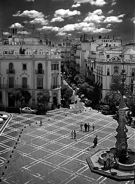
Doesn’t that look nice? Look how there are no cars and the outdoor space is dominated by people. The street width is much, much narrower (although even these are rather wide by Traditional City standards). Everything is a Place for people, without the majority of land area being used for non-Place like automobile roadways, Green Space and parking lots. You can walk right out of the buildings into a beautiful place for people, not a concrete canyon with roaring traffic (19th Century Hypertrophism with highrises) or a non-Place wasteland (20th Century Hypertrophism).
A Traditional City doesn’t have to be some twee Italian village.
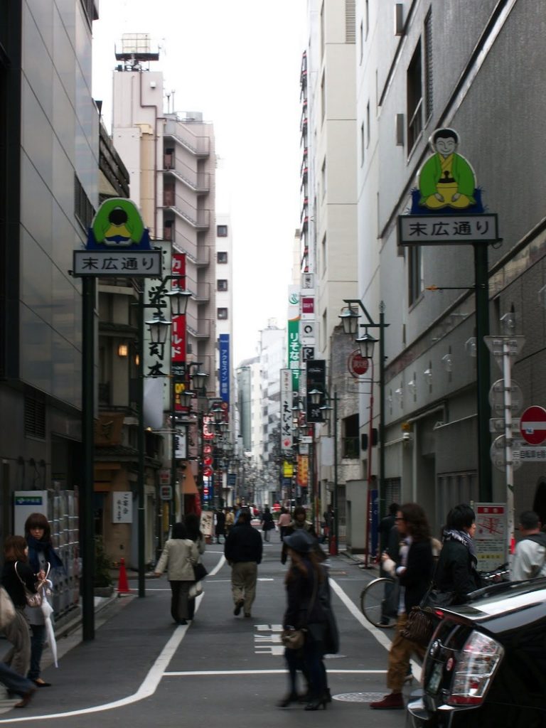
Here’s a street in the Shinjuku district of Tokyo. Contemporary concrete-box type buildings, but a wonderful environment for people on the street. A lot different than twelve lanes of traffic diluted by Green Space.
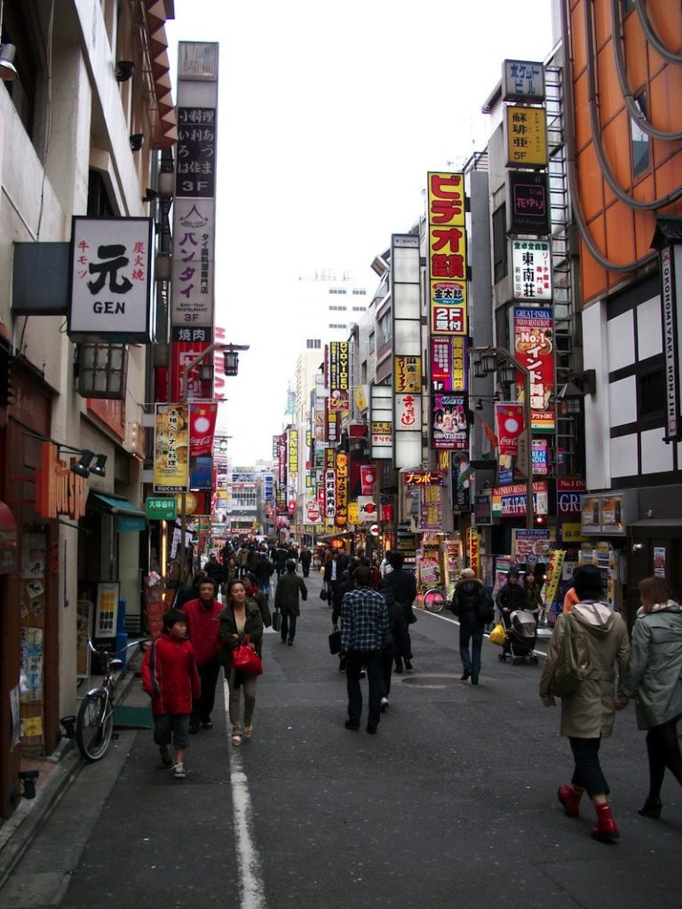
Another Shinjuku street.
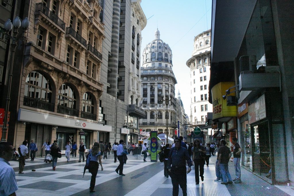
Buenos Aires, Argentina. High rises? Check. Beautiful pedestrian places? Check. This is so easy.
However, it is not really necessary to pair very large streets (which this is although devoted to pedestrians) and high rise buildings.
So, to summarize the problems we have with these two patterns:
19th Century Hypertrophism with highrises (Manhattan): The outside space consists entirely of “concrete canyons” with four lanes of roaring traffic in the middle. Positives: you can walk, and density is quite high.
20th Century Hypertrophism: The outside space consists of giant roadways up to twenty lanes wide, “green space” landscaping buffers, and parking lots. Also, you can no longer walk, but need to drive from place to place. Despite the tall buildings, density is rather low due to low building footprint/land area ratio.
Thus, our solution should look something like this:
High building footprint/land area ratio, somewhat like Manhattan (50%-60% perhaps).
Outside space consists primarily of people-friendly Places, such as Traditional City elements like:
Pedestrian streets (“Really Narrow Streets”) without automobile traffic
Plazas and squares (without automobiles)
Parks, gardens, sports fields and the like, but no “green space”
The combination of both of those elements will produce a walkable environment and a place where people of all ages and conditions can feel comfortable, which is then complemented nicely by the addition of a train system.
December 27, 2009: What a Real Train System Looks Like
Even if a train system is not forthcoming right away, we can have various arrangements to include automobile access, without compromising our design goals.
I think we will stop there today, and continue later.
Click Here for the Traditional City/Heroic Materialism Archive

