We’ve been discussing ways to mix high-rise buildings with Traditional City design elements, to make a much more pleasant environment than what you usually get with high-rise buildings. The two most common patterns today are what we’ve been calling 19th Century Hypertrophism with high-rises, and 20th Century Hypertrophism.
August 19, 2012: Corbusier Nouveau
August 10, 2008: Visions of Future Cities
July 20, 2008: The Traditional City vs. the “Radiant City”
I decided that what we don’t like about high-rises is generally not the building itself. Once you get inside, it works pretty well, even on the fiftieth floor. The problem is mostly when you step outside. You end up either in a concrete canyon with four lane of roaring traffic in the middle (19th Century Hypertrophism e.g. Manhattan), or in a sprawling wasteland of parking lots, giant roadways and Green Space, which is impossible to walk around in (20th Century Hypertrophism).
One thing that makes a Traditional City so pleasant is that most of the land surface area is used to make Places for people. Almost every urban environment is some sort of location where people come together and do what people do. In practice, this means that Places have a purpose, and there are little or no cars.
October 10, 2009: Place and Non-Place
Even in contemporary Traditional Cities, like most of Tokyo, we find that most of the land area is used for Places for people. These are things like:
Building footprint
Pedestrian streets where people can walk down the middle and there are little or no cars. Typically, these are 15-25 feet wide from building to building, although they can occasionally be wider than that. (“Really Narrow Streets.”)
Paved squares
Parks, gardens, private yards and courtyards, and other such places with vegetation that are designed for human enjoyment. This does not include “Green Space,” which is landscape buffering used to reduce the unpleasantness of paved parking lots and large automobile roadways.
So, let’s lay it out:
60% building footprint
25% paved squares, parks, gardens, courtyards, sports fields, and other public and private outdoor places where people can gather, and which have no automobiles
15% streets
In the Manhattan style, we will have no outdoor parking lots or Green Space.
Our basic guidelines for streets, in a Traditional City format, has been:
80% pedestrian streets, typically 15-25 feet wide, with little or no automobile traffic, no central automobile roadway, and no sidewalks.
17% “Arterial” streets, with two to four lanes of dedicated automobile roadway in the middle and sidewalks on either side.
3% “Grand boulevards,” major crosstown avenues of four to eight lanes. These may provide access to even larger roadways such as superhighways.
These ratios are by street length. Since the Arterial streets and Grand Boulevards are wider than the pedestrian streets, they take up a larger portion of total area. So, our land use breakdown looks like this:
60% building footprint
25% outdoor spaces
10% pedestrian streets
5% automobile roadways
Now we see that only 5% of the city is a Non-place, with automobile traffic. We have a lot of outdoor space, but no useless landscaping i.e. “Green Space.” Even those Grand Boulevards and Arterial streets probably have a nice sidewalk environment — think Madison Avenue, Broadway and the Champs-Elysees — so they are not concrete wastelands where people dare not go on foot.
You can’t build thirty-story buildings flush to the property line with fifteen foot streets. You would end up with a dim slot, which wouldn’t be very pleasant. Thus, we have to get away from the simple rectangular prisms that have characterized high-rise architecture, and begin to think about how we can best integrate these rather large buildings with the human-scale environment of a pedestrian street. The basic solution is the “pedestal building” or “ziggurat building.” These are two variations on the same basic idea, which is to make the base of the building in the Traditional City format, of about six stories high, and then put the tower portion of the building above that. This is a very old idea, from the early days of high-rise architecture.
The Empire State Building in Manhattan, completed in 1931 at a height of 102 stories, is a fine example of Pedestal Building.
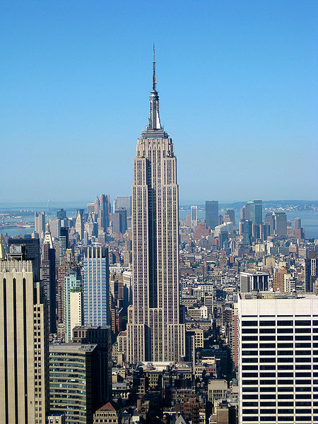
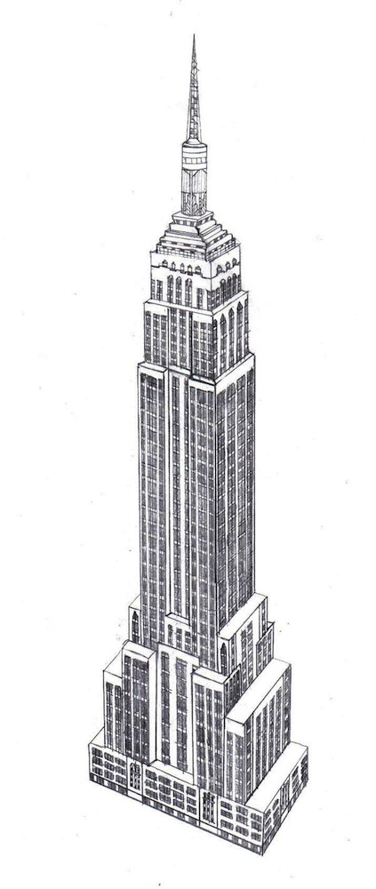
Empire State Building. This building is not a simple rectangular prism. It sits on a “pedestal,” has some intermediate levels, and then gets narrower as it extends into its tower section.
What does the “pedestal” section of the Empire State Building look like?
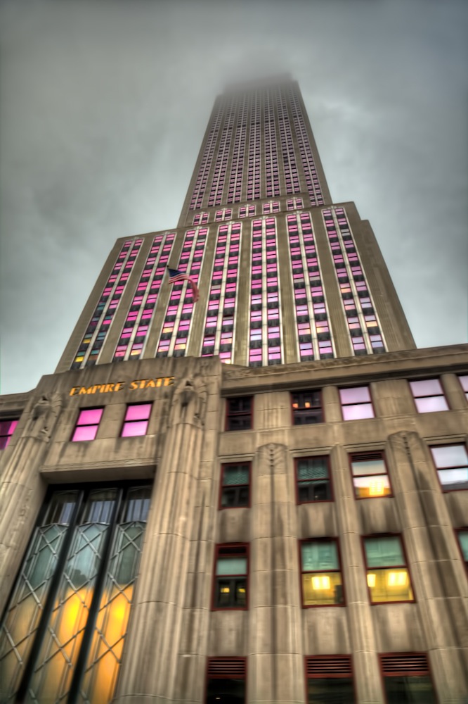
The Empire State Building on a cloudy day in New York City.
How many stories high is that “pedestal” section? Although it is not apparent in this photo, the pedestal is six stories high. That is exactly our typical Traditional City height, for dense urban areas. In other words, the base of the Empire State Building is basically a Traditional City building of six stories high. The upper levels have greater and greater setbacks from the edge of this pedestal section, in a “ziggurat” style.
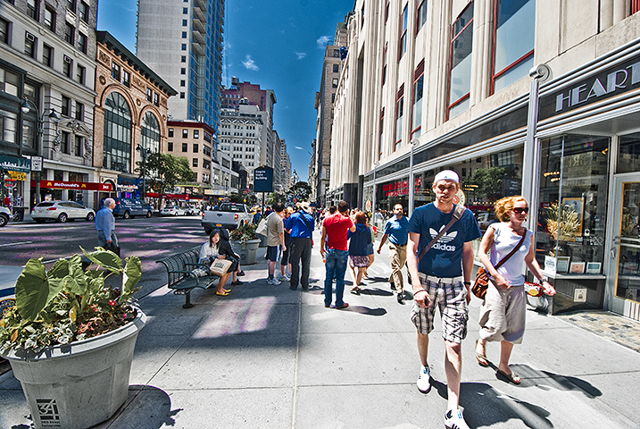
This is what the “pedestal” section of the Empire State Building looks like from street level. Notice that we don’t have a featureless stone wall. Instead, we have a string of small-scale storefronts at the street level, exactly in the Traditional City style. You could walk right past the building and have no idea that you are next to a 102-story skyscraper. Also note that we don’t have any paved plazas or Green Space. The building goes right up against the sidewalk. A very tall building can be perfectly pleasant from street level, if you pay attention to designing the lower floors in the Traditional City human-friendly style.
The Burj Khalifa, in Dubai, is also a very tall building in a “pedestal” style much like the Empire State Building.
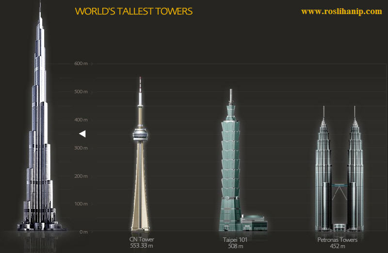
Note that the Empire State Building is adjacent to what I would call a Grand Boulevard, with about six lanes of automobile traffic. We can have some Grand Boulevards, but we want the street level to be mostly Really Narrow Streets, or pedestrian streets without a central automobile roadway. Like this:
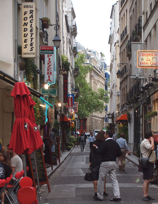
Paris, France. This street is about 15 feet wide, and building height is about six stories — the same as the Empire State Building’s pedestal section. Does this mean you could have 102-story buildings and also a street level that looks like this?
Why yes, I think it does!
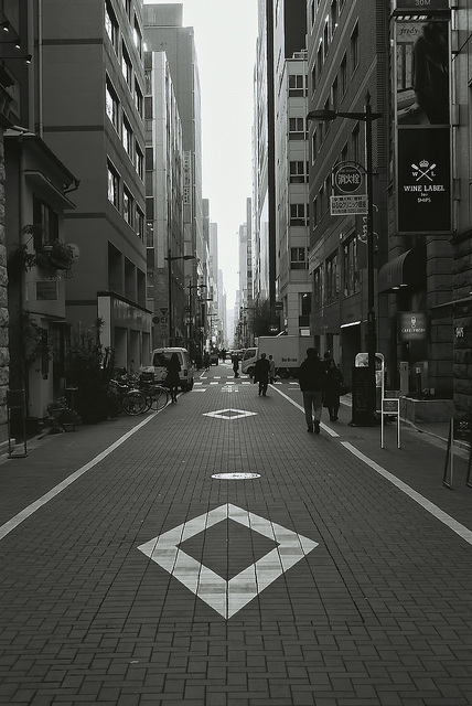
Ginza district, Tokyo. These are more contemporary-styled buildings, more like our existing high-rises today, but again we have a nice pedestrian street of about twenty feet wide, not six lanes of automobile traffic. The street level is again small-scale shops and restaurants.
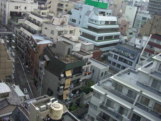
Here is another district of Tokyo, the Yushima area near Ueno. The buildings are in more of a contemporary style again, but the street is about twenty feet wide. Look how there is no automobile traffic, and people walk down the middle of the street.
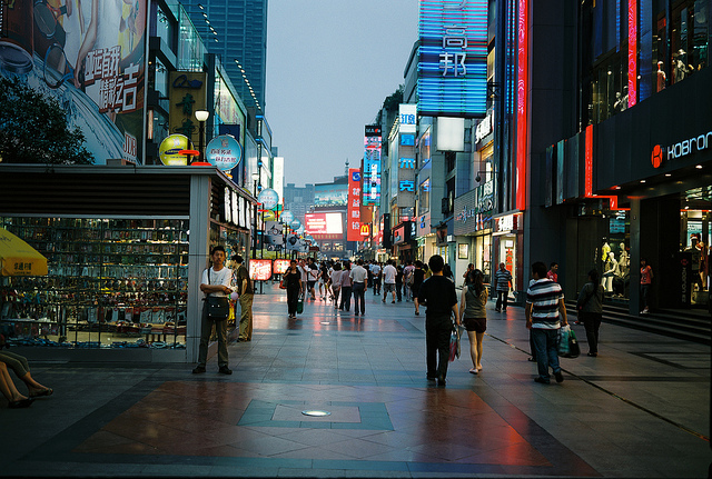
Chengdu, China. This street width is quite a bit more than twenty-five feet, more like 40 feet perhaps, but it is nevertheless a pedestrian street. Nice contemporary architecture. Can you have a street like this with 102-story pedestal buildings? Why not?
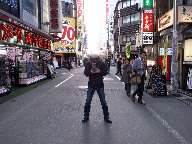
About twenty foot street width. Shinjuku district, Tokyo.
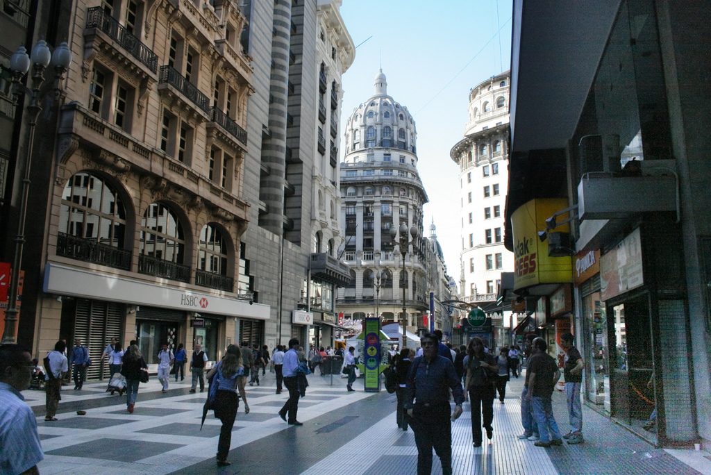
We saw this last week, but it’s worth a repeat. Buenos Aires, Argentina. This is again quite wide, nearly sixty feet I’d say, but it is quite pleasant. Much more human-friendly than six lanes of automobile traffic. I certainly would go no wider than this. You can have a pedestrian street wider than thirty feet, but if it is not filled with people it begins to feel quite barren.
You usually find that, if there aren’t enough people to fill up the space, it begins to be filled with either some sort of shrubbery or things like outdoor restaurants and markets.
These have been some good examples of what I mean by “pedestrian streets” (10% of surface area) in the context of high-rise architecture. Use pedestal/ziggurat buildings. (“Ziggurat” just means multiple pedestals on top of each other.)
Now let’s look at that 25% of the city that is devoted to paved squares, parks and so forth.
Unfortunately, most high-rise architecture tends toward a suburban design. The building is presented “in the round,” surrounded by either a paved plaza or some sort of greenery, much like the suburban house in the middle of the lawn, which itself is a facsimile of the country farmhouse surrounded by fields. This format is almost never seen in the Traditional City. Rather, you have a square surrounded by buildings. Like this:
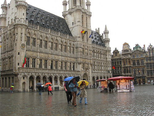
Brussels, Belgium.
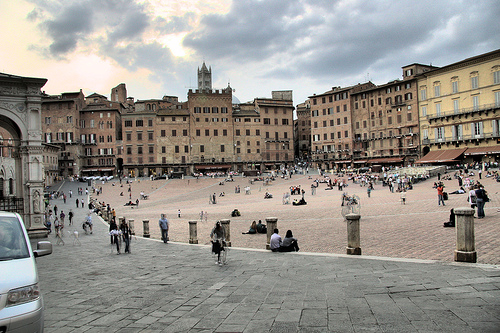
Siena, Italy.
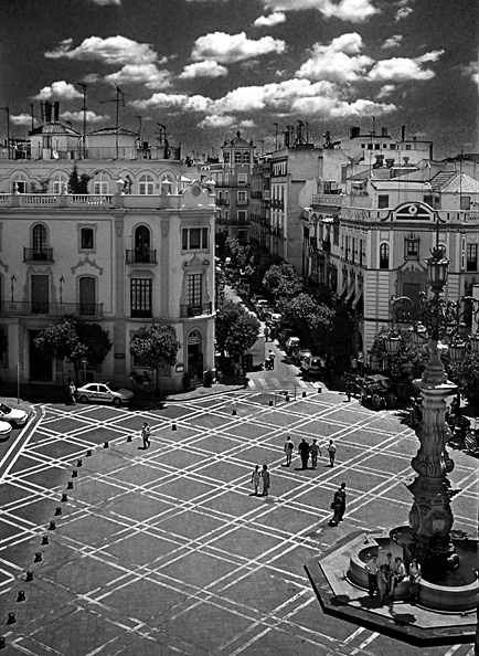
Buildings surrounding the plaza, not the plaza surrounding the building. Simple, but very important.
Also, don’t surround the plaza with an automobile roadway! The plaza should be a pedestrian place, bordered by buildings. The buildings can be very tall, but with a pedestal construction and a street level in the Traditional City style, of small-scale storefronts. No blank stone walls.
Now, let’s add some parks. We need some parks, because those high-rise apartments are very small. Moms, kids, the elderly, indeed all humans, want a pleasant outside place to play and relax. Note that this is NOT GREEN SPACE. It has to be a park. You can tell it’s a park because it has a name with “park” in it. Like Central Park. Or the Marion Wellesley Memorial Park. Parks can be very large, like New York’s Central Park, or they can be very small, even a 100×100 foot “pocket park.”
This is a park:
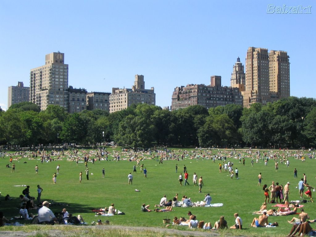
Central Park, New York.
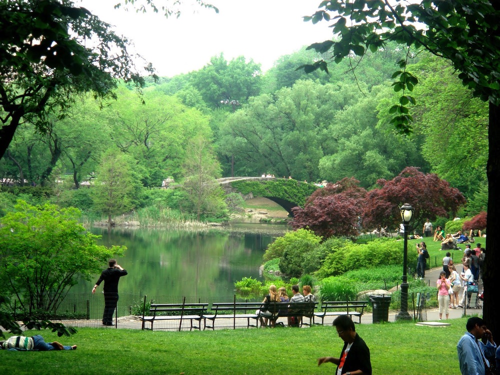
Central Park, New York.
This is not a park:
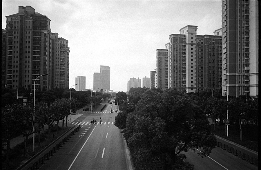
This is Green Space. Shanghai.
You get the idea, right?
This is also a park:
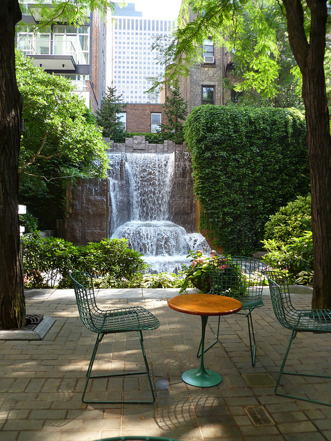 “Pocket park.” Greenacre Park, New York.
Parks can be very large, and they can be small. You want both. The most important thing is to have some sort of park available within no more than a couple hundred meters from any residence. The distance between the residence and the park should be, if possible, a pedestrian street. Then, you could go from your residence to the park, an easy walk with a baby and a stroller, without encountering any automobile traffic.
Just like paved squares, the parks should be surrounded by buildings, not the other way around.
“Tower in a park”: NO
Towers around a park: YES
Also, unlike Central Park in New York, the park should not be surrounded by automobile roadways. Just buildings opening right onto the park.
I think I will stop there for now. Maybe later, I’ll make up some specific plans and examples of what could be done. But, applying the principles here, you can also make up your own interpretations. I encourage you to do so.
Click Here for the Traditional City/Heroic Materialism Articles

