How to Make a Pile of Dough with the Traditional City 2: A Ski Resort Village
May 15, 2011
By happenstance, I began a conversation with a fellow who is in the process of developing what promises to be a major North American destination ski resort, along the lines of Killington, Vail, or Whistler. This involves lodging, vacation condos, commercial/retail including bars and restaurants, golf courses, and so forth.
Naturally, I suggested that he look into Traditional City ideas for this project. He thought this was a good idea overall, and in fact there is already a detailed architectural plan with many pedestrian areas planned. The architect seems to have made a real effort to make the place a pleasing area for vacationers. This is just good business when you are making a ski resort. However, like virtually all architects today, I would say that the designer didn’t really know what he was doing, so we get the usual hodgepodge of good ideas badly executed, and bad ideas thrown in without much thought, because it is what everyone else is doing and it seems so hard to do something that is different from everyone else.
August 22, 2010: How to Make a Pile of Dough with the Traditional City
I looked at the plan, and, in my brief exposure, it looked … OK. Which is to say, it stank, in my opinion, but I have very high standards in this regard. In comparison to other projects in North America, it would be well above average I am sure. Which is good, except that it could be so much better.
June 6, 2010: Transitioning to the Traditional City 2: Pooh-poohing the Naysayers
May 23, 2010: Transitioning to the Traditional City
One nice thing about this plan is that you can design true 100% pedestrian-only places. People will arrive by car, bus or train (there is a nearby train station!), and once they have moved their luggage to their residence, they don’t really need transportation anymore. You could put all the cars in a distant parking lot, and run some sort of shuttle service, with golf carts perhaps, to move people’s luggage to their destination. Plus, from a business perspective, it is a nice thing to have your visitors carless after they arrive, because then they are likely to spend all their dinner and drinks dollars in the base village rather than driving out of the area to some other place. (Because most visitors would not likely be coming from the small nearby cities, but rather arriving by air, most people would probably not come by car but rather by train or bus.)
Yes, you heard me right, the design imperative is to make a place that is attractive and fun to visitors, where there are no cars, and where people are within a short walk to the ski slopes, because it is real hard to walk in ski boots. Do you think this might be a good time to put all that Traditional City design stuff to work?
Winner winner chicken dinner!
I looked at the architect’s plan for the village, the heart of the development, which is of course right next to the ski slopes, and it consists of about 50% parking lots and green space. What do you think of a design for a place where nobody needs to drive that is 50% parking lots? Obviously it is dumb. This — the area right next to the ski slope — is the highest value land in the whole project! Don’t use it as a storage area for unused machinery. You want to use every square foot for the highest-possible-use-value, which means buildings, pedestrian streets, and maybe a few small gardens and courtyards.
October 10, 2009: Place and Non-Place
Remember my definition of Green Space: this is open area filled with greenery that is not a Traditional City Place like a park, garden, courtyard, sports field and so forth. It is typically used as a buffer space around parking lots and roadways. Nobody likes a giant rectangle of asphalt, or six lanes of roaring traffic, so they mix some trees and shrubbery in. Why not just get rid of the asphalt, and then you can dump the trees and shrubbery too? You can tell it is Green Space, not a park, because it doesn’t have a name. Parks have a name like Central Park or the Martha Richardson Memorial Park. Green space doesn’t have a name.
Let’s remember some of my principles of Traditional City design that can be applied here:
Really Narrow Streets: This is a roadway designed for pedestrian use. You can have vehicle access for deliveries and so forth, but for the most part it is a place for people. You can tell that it is a proper pedestrian space when people are comfortable walking in the middle of the street. There should be no sidewalks. Typically, a Really Narrow Street is about 12-18 feet from building to building. Some can be smaller, as narrow as eight or even four feet. Some wider, “Main Street” sort of places can be larger than that, maybe 30-40 feet. That is very narrow by vehicular roadway standards, but quite spacious by pedestrian standards. Making the streets the proper size for pedestrian use is the most important, and most overlooked, design aspect of creating comfortable urban places for people.
Buildings side by side and up against the street. No setbacks. No surrounding doughnut of Green Space. No shrubbery in front of the building. A building can include a courtyard, backyard, garden and so forth, typically in the rear, side or center, not in the front. (In practice, you can have a small front garden, and perhaps a fence and gate, particularly for single-family residences.)
No Cars. The place should be designed with pedestrian use as its highest priority. Cars do not have to be banned (although in this ski resort example they should be, except for resort-owned delivery or shuttle vehicles). This means no automobile-dedicated roadways (with sidewalks on either side), no street parking, etc.
I should add another idea, which is that a proper pedestrian-centric design should be 100% Places. This mostly means no parking lots, Green Space, or buildings surrounded by a moat of grass on all sides.
Let’s see what this looks like:
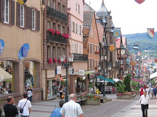
Here is a rather wide, “Main Street” sort of street in a village in Alsace, France. We can see that it is a pedestrian street, with no automobiles and no central asphalt roadway for automobiles. No sidewalks — in effect, the whole street from side to side is a “sidewalk.” I would say this is about 35-40 feet wide, although that is a guess on my part. The buildings are side-by-side with no surrounding doughnut of suburban grass. They are also right up against the street, with no setback. Note that there is no Green Space in this photo, although there are a few planter boxes in the middle.
Look how wide this street feels. It is very spacious — maybe, even, a little too spacious given the number of people present, which come nowhere near to filling this huge space. Note the addition of the planter boxes and benches in the middle, which I interpret as an effort to break up the otherwise featureless large expanse. In other words, this street is probably a little too wide. If there were four or five times as many people, then it wouldn’t feel excessively wide anymore.
Despite this minor complaint, the result is quite beautiful and lovely. Note that the buildings are about 4-5 stories high.
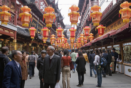
Here is another “Main Street” sort of place in an older district in Shanghai. The width is again about 35-40 feet by my guess, but there are a lot more people so we don’t have to add benches and shrubbery to fill it up. The buildings are once again right up against the street with no setback or bits of grass. This is a really spectacular example of Traditional City design at its very best.
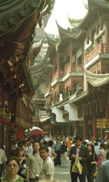
This is another shot of the same area in Shanghai, showing the buildings a little better. Wow wow wow!!!!! With lots of people, the street doesn’t feel too wide.
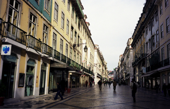
Here’s a shot of a large commercial street in Lisbon, Portugal. Again, this is perhaps 35-40 feet. See how wide it feels? It is not, I would say, “too wide” but this is plainly a major commercial avenue, not a little backstreet.
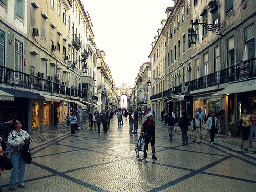
A similar large commercial street, in Madrid, Spain. Gorgeous!
I would say this is about the widest you would want to go, in the context of a pedestrian-only environment.
Branching off from this “Main Street,” you would have some narrower streets. These would feel more cozy and intimate than the main thoroughfare. Street width might be in the neighborhood of 15-20 feet.

This is another example from one of those wonderful Alsatian villages. This is more like 15-20 feet from building to building. This is not so much a major commercial street, more like a quiet residential street. This could be a good model for the more residential parts of the village.
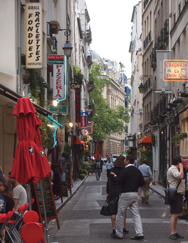
This looks like 12-15 feet to me. Isn’t that lovely? You could have shops on street level and then condos/residential/hotels above. Central Paris.
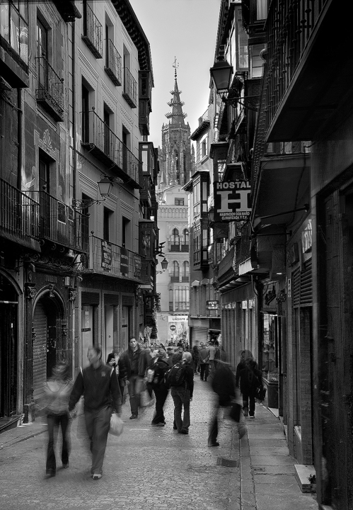
Toledo, Spain. Utterly beautiful. I’d say this is about 17 feet.
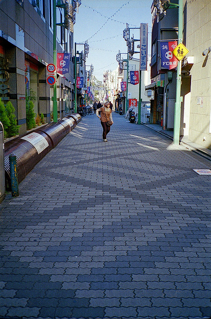
Japan, probably Tokyo. Looks like about 15 feet.
That doesn’t look too narrow, does it? This is a nice comfortable size for a pedestrian street. You could have either commercial or residential (condos, apartments, hotels) in this format. Or, mix them together with commercial (retail, restaurants) on the street level and residential above.
You can go a lot narrower than this if you want. It gets cozier and more intimate.
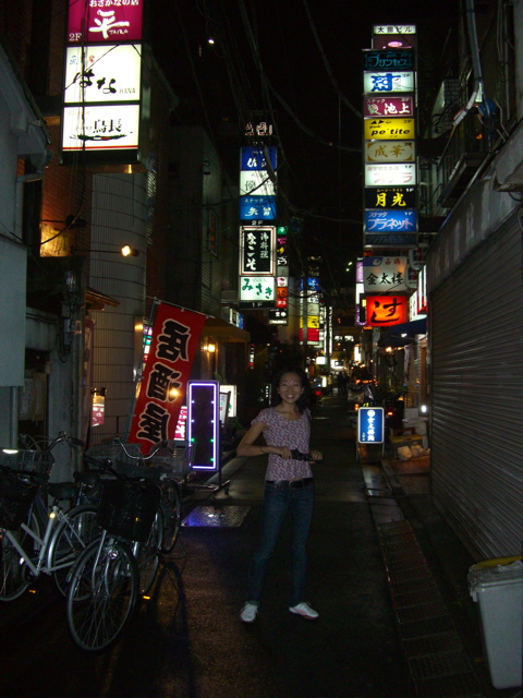
This is a very typical format in Tokyo. About ten feet I’d reckon. All of those signs are small bars, clubs and restaurants.
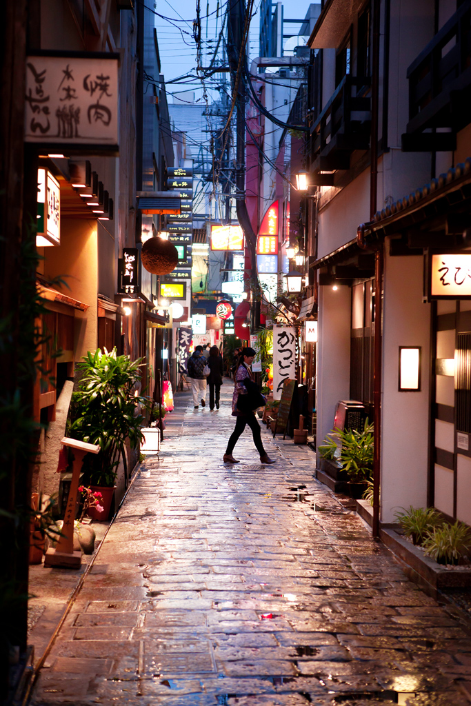
Wow, is that ever gorgeous. About seven or eight feet.
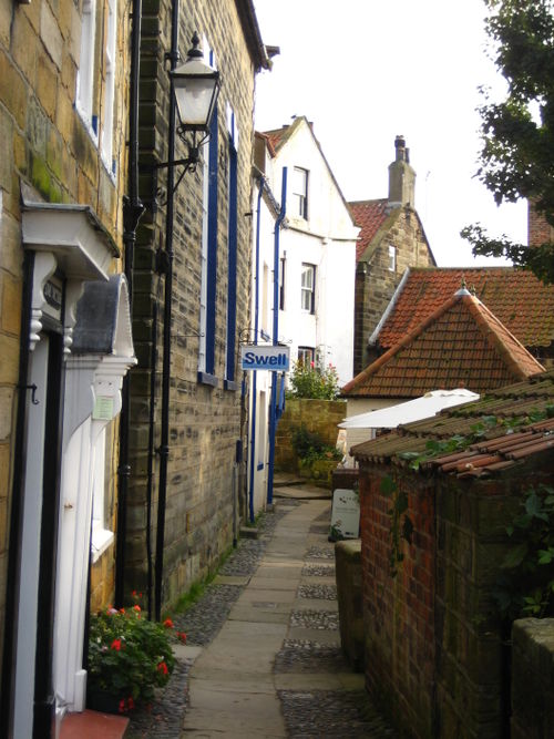
About four or five feet. Robin Hood’s Bay, England.
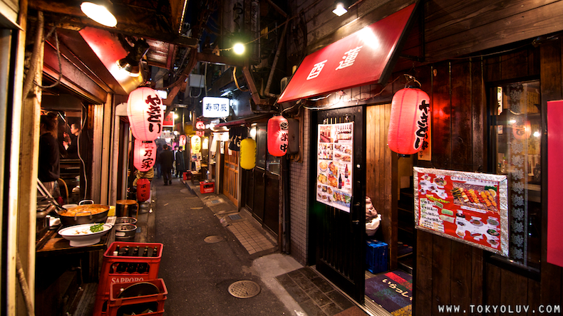
Four or five feet. Shimo-Kitazawa, Tokyo.
In my talks with the resort developer, I mentioned that I might choose Zermatt, Switzerland and Nozawa Onsen, Japan as two excellent examples of a ski resort village. Both are at the base of major destination ski areas. He agreed — Zermatt and also Whistler BC apparently served as a role model for the project.
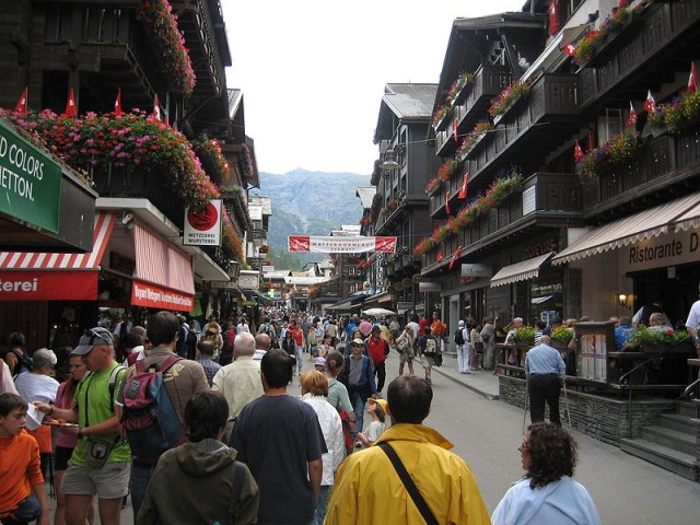
Isn’t that lovely? This is fairly wide, around 30-40 feet, but there are a lot of people so it is about right.
Zermatt.
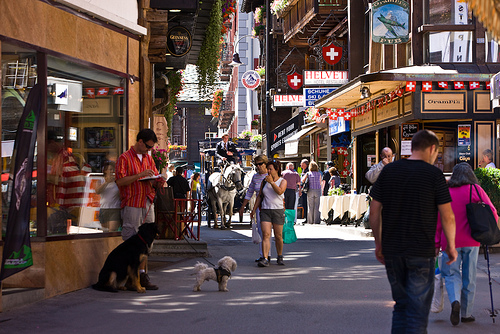
A bit narrower here, maybe 20-25 feet.
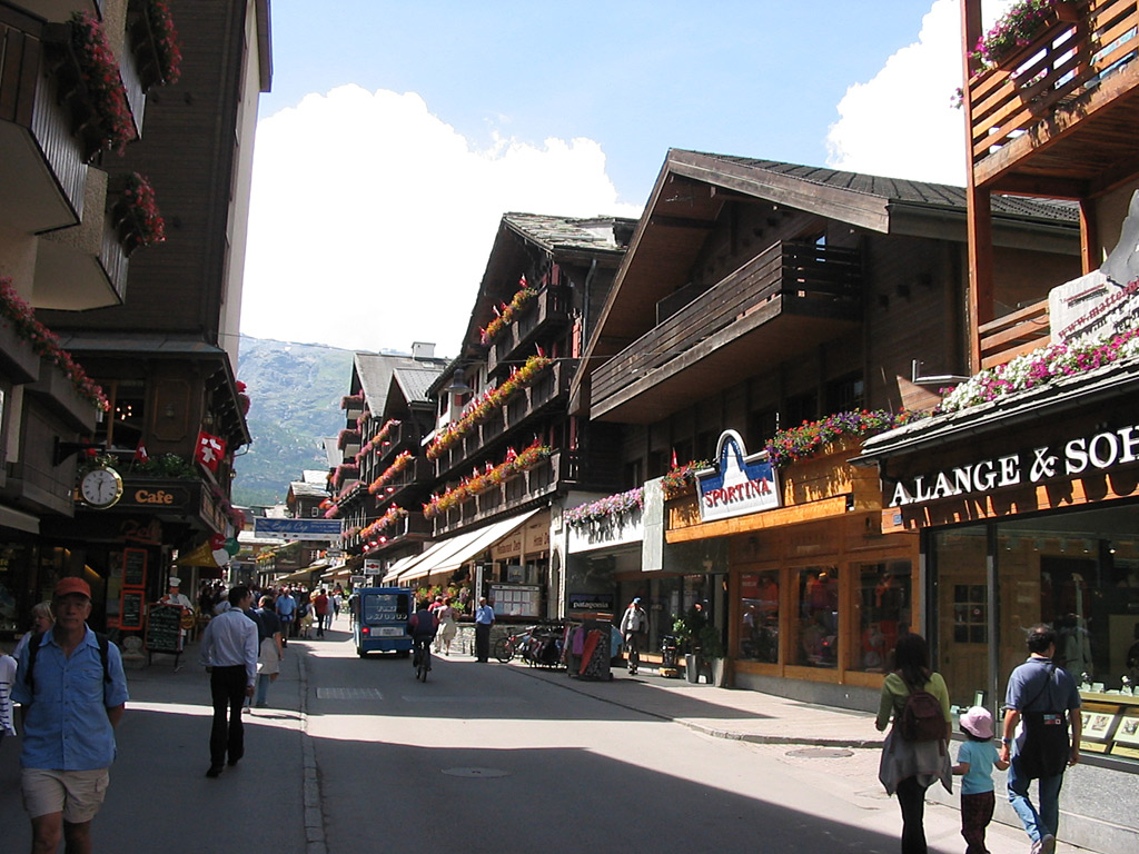
Those look like apartments/condos/hotel rooms/offices of some sort over the shops on the first floor.
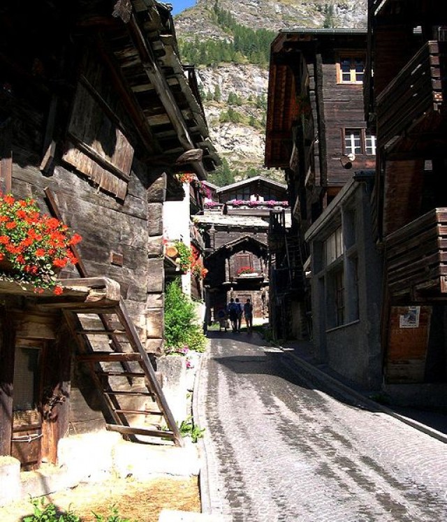
Side street. Look how much narrower it is. This is about 12 feet maybe.
I love++++ this rustic log-cabin architecture.
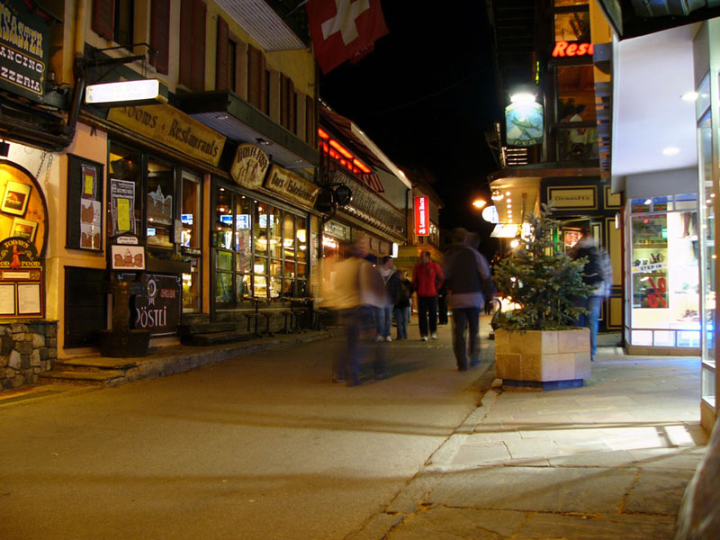
Another side street. About 15 feet.
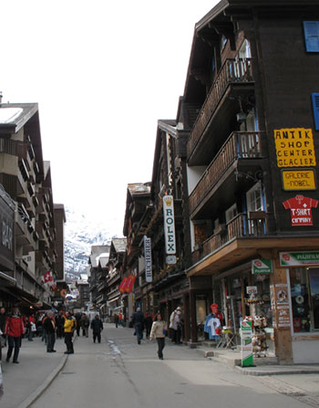
The main street is quite wide. But that’s OK especially if the side streets are narrower.
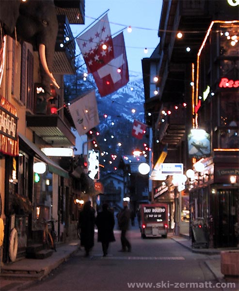
Like this. About 15 feet.
Let’s take a quick look at Whistler Village:
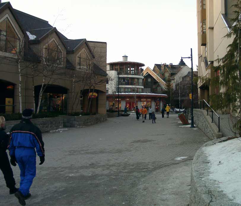
Not too bad. Could be a lot better. See how wide it is here? Feels way too wide, doesn’t it? Not very cozy. Look how the buildings are sprouting foliage in front of them. This is in part a reaction to the excessive width of the street. People subconciously don’t like such a big expanse of pavement, especially when it is empty. Compare to the Zermatt photos. Partially, however, it is a bad suburban habit — the purpose of these kinds of buffers and barriers is to provide a shield between the building and the parking lot or busy automobile street that the building would normally be facing. Not a problem here.
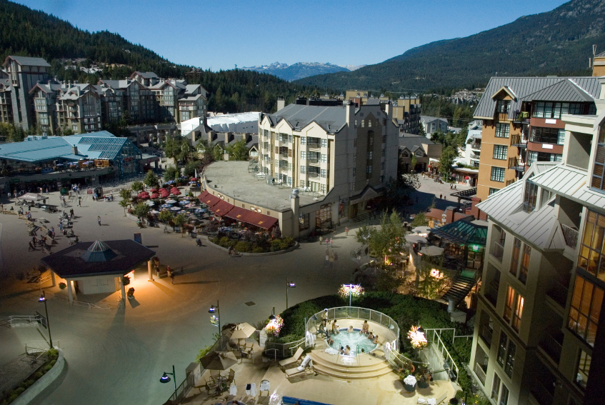
Some nice details here, but everything is way too big. This is what happens when you make a pedestrian-only environment, but you forget about the Really Narrow Streets. Note once again how all the buildings are sprouting foliage in front of them, which is a suburban detail. What I would do instead, if you wanted this much open space for some reason, is to plant a park in the middle of it. I mean a real, designed park, with a name, not just some space-filling foliage. You don’t really need a park, but it would be better than 200 feet of pavement.
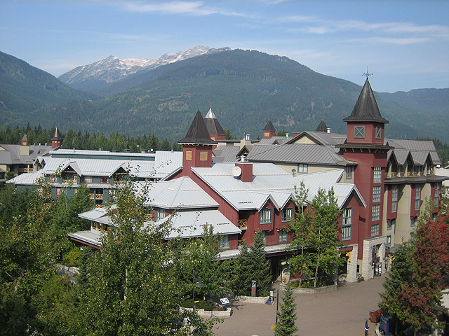
I am not actually against having some trees in a Traditional City environment. See my previous examples of the Seijo neighborhood in Tokyo, where the streets are lined with trees on both sides. However, the streets in Seijo are about 15-20 feet wide, not seventy like we have here. I think the foliage is once again an attempt to do something with all that blank pavement.
In favor of Whistler Village, however, this at least gets the basics right: buildings and pedestrian streets, with no space wasted on parking.
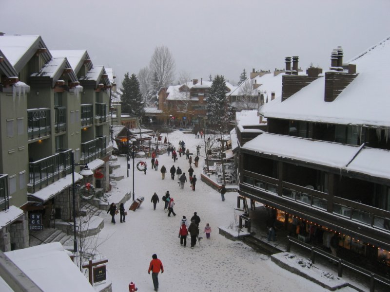
This is a little better. You can feel it, can’t you? This is a little narrower, more like 30-40 feet or so. Look how the Green Space foliage has mostly disappeared. You could make this street ten feet narrower, and it would feel a lot more comfortable and cozy. The buildings in Whistler also have a tendency toward giantism. You can feel that too, can’t you? This is a matter of scale: make a big street, and you need a big building to match it. People become little specks.
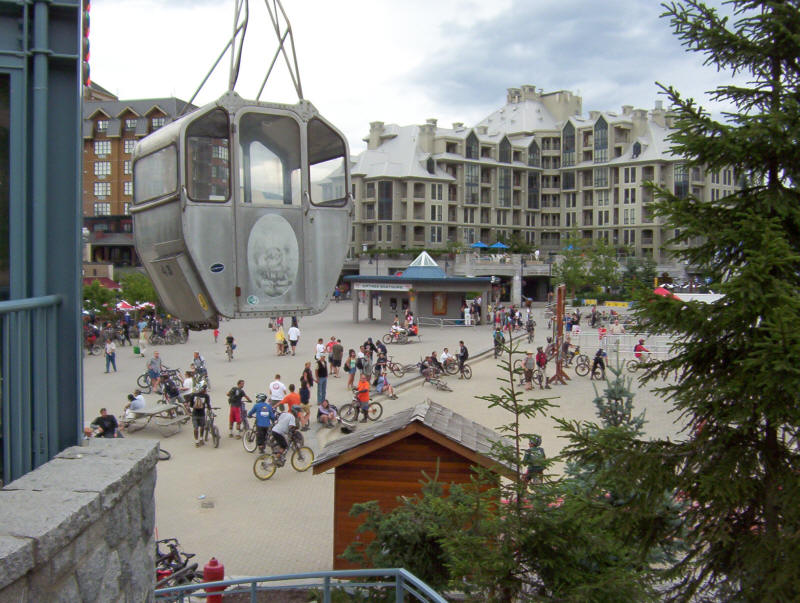
More Whistler village. Doesn’t really feel like a cozy European village, the way Zermatt does. You can tell right away, can’t you? I’m not making this stuff up you know.
Waaaay too much open space here. Look how many bicycles have sprouted up! Either people feel that things have become too gigantic to walk comfortably, or they saw this immense unused pavement and decided to use it as a bike playground.
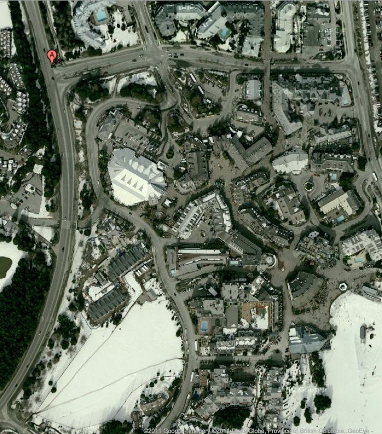
Whistler Village from above. See what I mean about streets that are NOT Really Narrow? Still, like I said, they have the right idea. There is no space wasted on parking or Green Space. It is all buildings or pedestrian streets. Pack it in there! I see about 50% of the land area covered with building footprints, in the central village area. Ski slopes are at the bottom of the photo.
And now we go on to Nozawa Onsen.

Eight foot street. On the right is a nice hotel.
A lot different than Whistler, isn’t it? Look at the scale of the hotel. It doesn’t feel overly gigantic, like a big cold concrete block. It is cozy and bursting with details. This is in part because it fronts a nice little pedestrian street, not 150 feet of pavement.
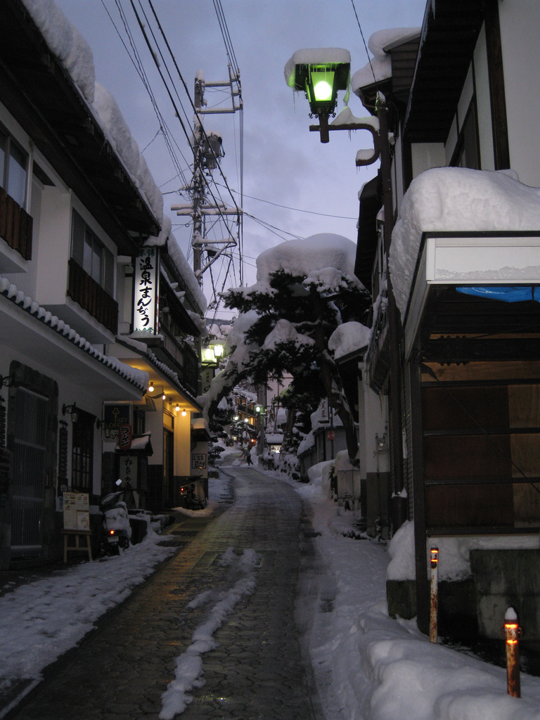
Ten foot street, and some small hotels.
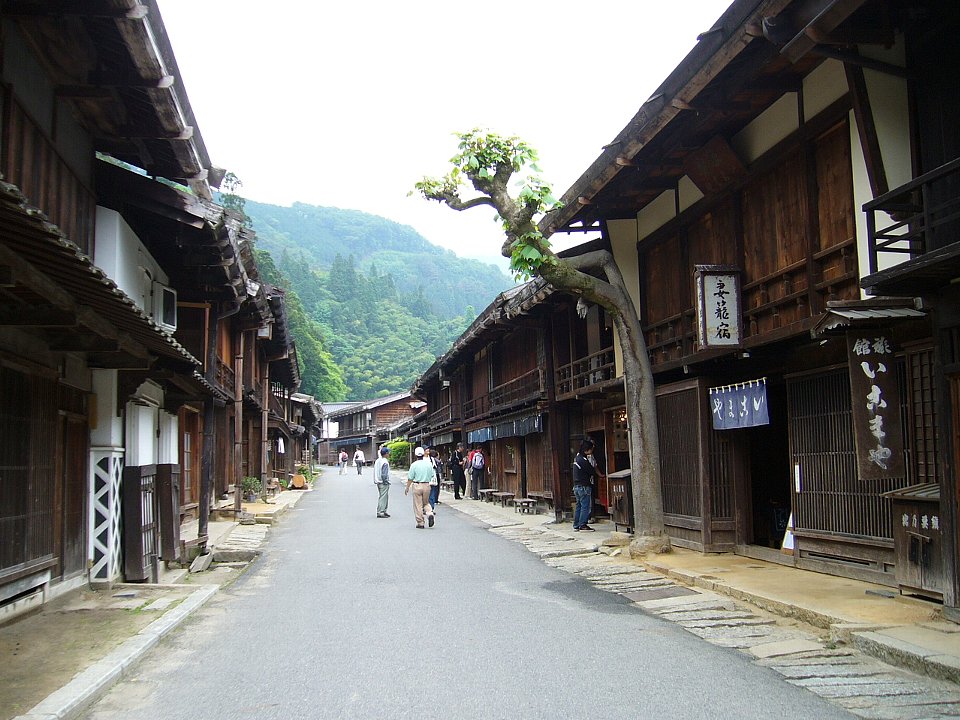
I don’t think this is Nozawa Onsen but … who cares. Nice! About 18-20 feet I’d say.
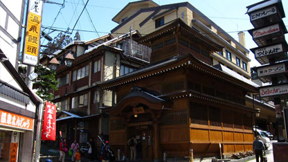
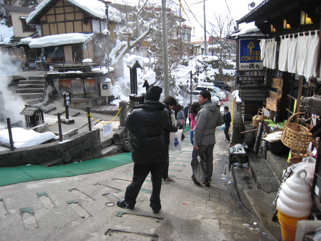
Ogama – source of Onsen
Ten foot street.
How different is this to Whistler Village? That’s a public hot spring on the left.
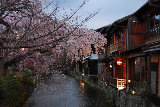
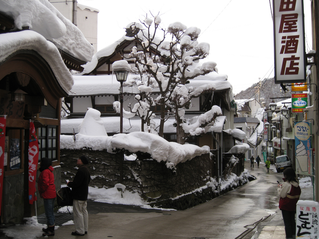
Actually, I think the present development plan incorporates a lot of these ideas. However, it incorporates them for only one street! The rest of the project is suburban-esque sprawl with lots of parking lots and Green Space. This is particularly poisonous when you’re specifically trying to make a walking environment, because it makes everything hard to walk to.
I thought about this, and I concluded that this is actually a reflection of Small Town America ideals.
Remember, Small Town America (19th Century Hypertrophism) also incorporates a commercial street that is more-or-less a walking construct. You could even say that today’s suburban enclosed mall is an extension of this idea — a walkable commercial area. However, in Small Town America, or the suburban mall, this one walkable place is surrounded by suburban sprawl, with huge roadways, parking lots, suburban houses surrounded by grass, and Green Space. The present development plan has the same characteristic.
July 26, 2009: Let’s Take a Trip to an American Village 3: How the Suburbs Came to Be
July 19, 2009: Let’s Take a Trip to an American Village 2: Downtown
July 12, 2009: Let’s Take a Trip to an American Village
So I would say, get rid of the sprawl. Don’t be afraid to pack it in there! The entirety of the village — every square foot — should be either a building, or a narrow pedestrian street of the sort shown above. You might have some gardens and courtyards. However, since we are of course adjacent to a major ski area, we shouldn’t have much need for parks.
It should look like this:
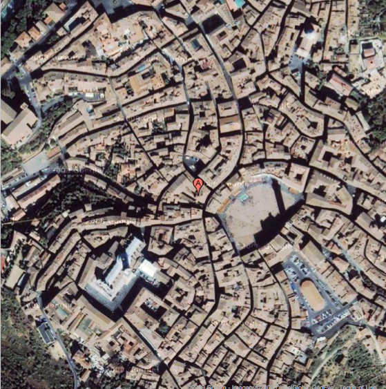
This is Siena, Italy, a world-famous tourist destination. Look how it’s all packed in there, with no parking lots or other wasted space.
Note the street width here compared to our Whistler example. About 80%-85% of the land is covered with building footprints.
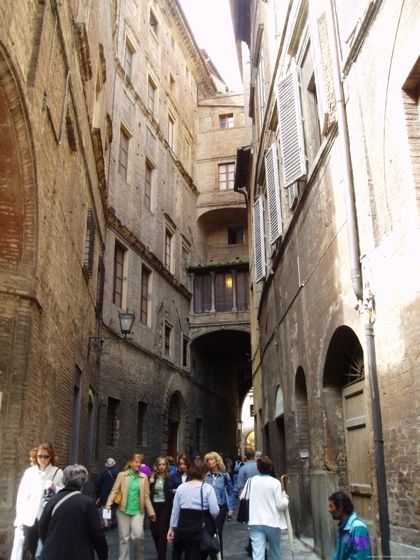
OLYMPUS DIGITAL CAMERA
Siena street. About 16 feet maybe.

Our group on the main (if narrow…) street in Siena
Siena street. Siena is a particularly dramatic example of what I mean — it could probably use a couple more parks and courtyards — but you can see what I mean right? It is a popular destination nevertheless.
This looks like about 20 feet to me, maybe a little more.
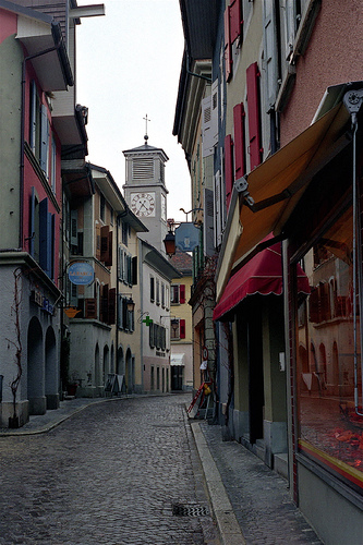
Swiss village. This looks like about 15 feet to me.
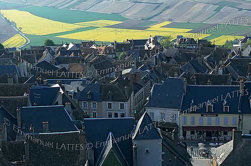
This photo is an example of a principle I have for villages. The village should all be done in a Traditional City manner, with no sprawl and wasted space. Pack it in there! Then, there is a hard-line transition to wilderness or farmland.
I bring this up because it is somewhat different than the typical American manner, in which we might have a compact central commercial core, then ever-expanding rings of lower-density suburbanification around that. The present resort plan reflects that, actually. No no no! If you don’t want suburbs, then don’t build suburbs. The entire village should be built to the compact, Traditional City design of the main commercial street. No parking lots or useless greenery. Just buildings and Really Narrow Streets.
I mentioned to the developer that his plan had some good elements, but that I would build it at triple the density. I think he thought I meant to build high-rises. Not at all — I meant to just fill in all the land now devoted to parking and the like, and make it into something useful. In other words: get rid of the sprawl.
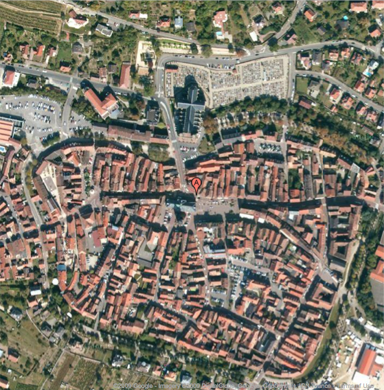
This is an example of what I mean. This is the village of Obernai, again in Alsace. We can see a compact village and then (more or less) a clean transition to the surrounding farms. This is basically what the ski village should look like from above. The main thing I would change is to eliminate the bits of automobile parking you can see — mostly by filling in the space with more buildings, or perhaps making it a pedestrian-only open plaza or square. I see about 75-80% of the land area covered with building footprints in the central village.
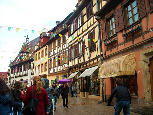
Obernai street. This one is fairly wide, maybe 30-40 feet. Retail at street level with residential above.
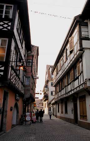
Obernai. More like 18 feet here. Something like this is a nice model for “condos” in the ski village plan.
Basically, I would take everything in the plan, and pack it all into the space between the two ski lifts. Build to a height of about 3-5 stories, with streets of 10-40 feet wide, mostly around 15-20 feet. Make the whole area a pedestrian-only place, where only resort-owned vehicles are allowed. You can still have single-family townhouses if you like, but they should be Traditional City townhouses on pedestrian streets, not suburban farmhouses surrounded by a lawn. This sort of development pattern can easily accomodate population densities of 65,000 per square mile, or 100 per acre — the average for central Paris, which is of course a major tourist destination. Think: Paris with skiing! Even 100,000 per square mile I think would be possible without any discomfort (basically this would be equal to Paris’ denser neighborhoods). Keep the golf courses, naturally. Put a parking lot at the bottom, near the “people mover.”
April 18, 2010: How to Live the Good Life in the Traditional City
March 20, 2011: Let’s Take a Trip to Julianne Moore’s House
April 3, 2011: Let’s Take a Trip to the Skinniest House in New York
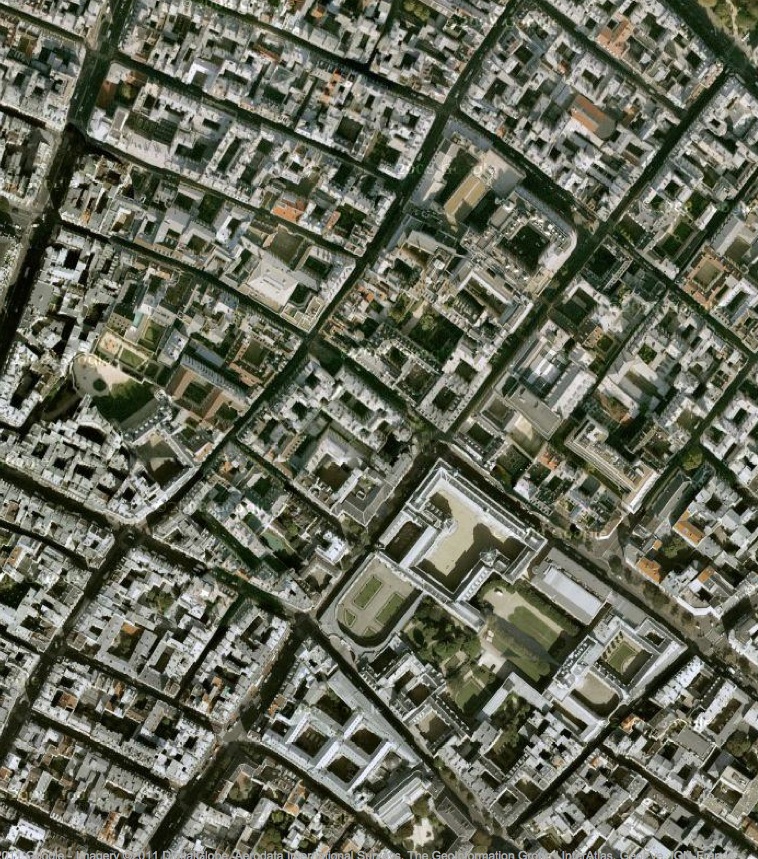
Central Paris from the air. Note the extensive use of central courtyards, which provide a wonderful sanctuary space with greenery. This is NOT “Green Space,” a bunch of landscaping scattered around to make the roadways and parking lots a little more tolerable. Streets are narrow. This area is built to a 3-6 story height. I don’t think you would want to use so many courtyards in this ski village example, as it is in the middle of the forest to begin with, but you could.
Then, everyone would be within a few minutes’ walk of the ski lifts and the bars and restaurants. And, you would have a gorgeous pedestrian village in the European style, not a suburban sprawl with vague “European village” pretensions.
It would be a little hard to do this. You would have to be pushy with the architect, or find an architect who is willing to deliver what you want. People don’t like to be kicked out of their ruts. But, it would be so worthwhile.
Addendum:
Let’s not be theoretical. Here are two examples of Traditional City type development built in the last ten years. Both are resort-type tourist destinations. Both are popular and successful. Both look great and are a total success.
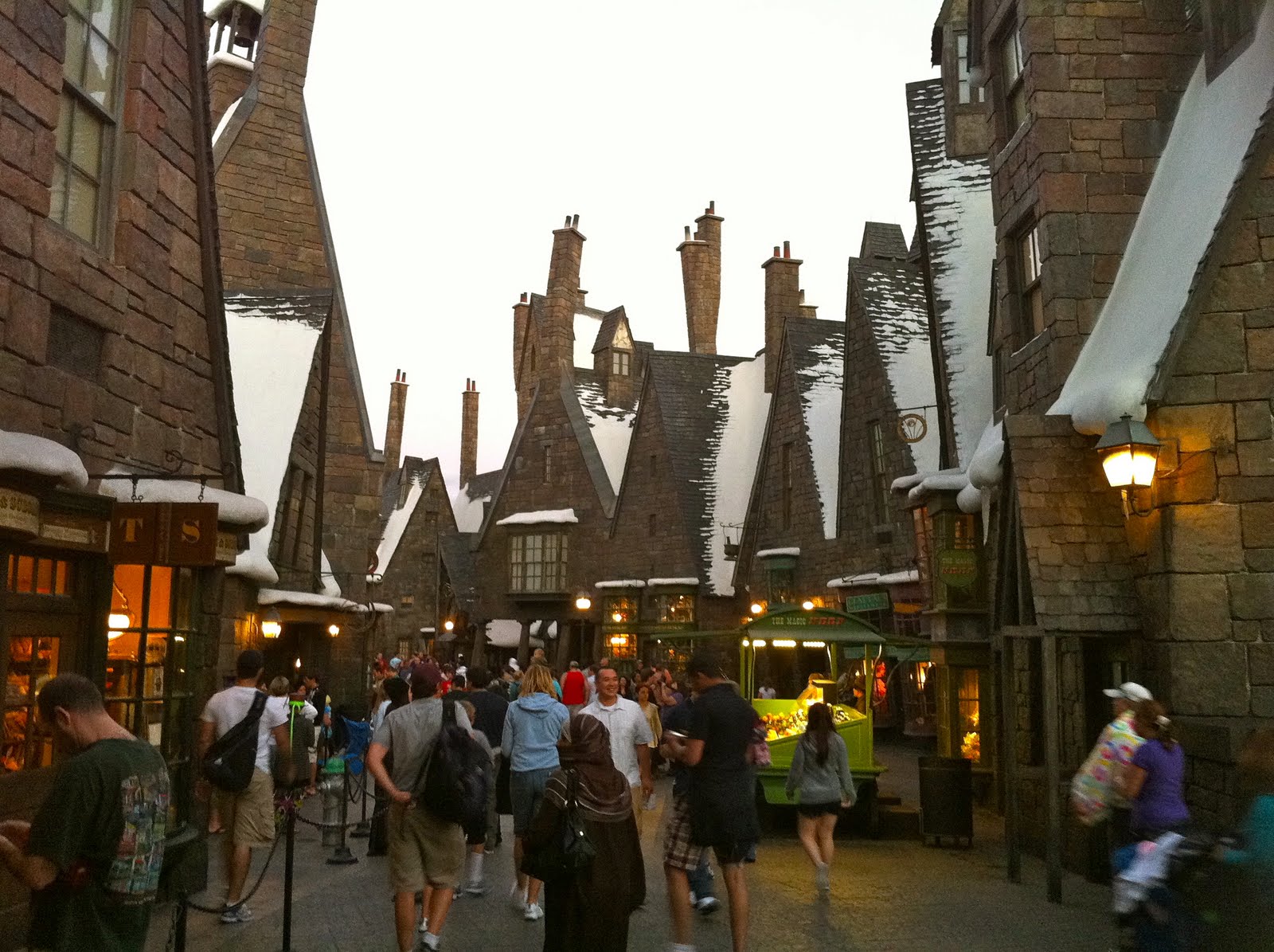
From Charles Gardner:
“This is the village of Hogsmeade from the new attraction The Wizarding World of Harry Potter in Orlando’s Universal Studios, a replica of the movie version of a fictional medieval town from J.K. Rowling’s series. Apparently this one traditional city street and its associated rides has revived the theme park’s fortunes, sending attendance soaring by 68% and turning a $35 million quarterly loss into a $45 million profit. One could argue this success is purely due to the books and movies, but why were those such a runaway success? Nathan Lewis can tell you.”
January 10, 2010: We Could All Be Wizards
I suppose if I was one of those types in English departments who try to make a career out of “unpacking the meaning” of this, I would say that we have reached a pathetic state indeed when, instead of just imitating the great successes of Olde England, which you will remember is our ethnic heritage, we instead have to imitate a movie based on a book which is based on Olde England. Duh. I suppose we are so stupid that although this is clearly a huge commercial success, for some reason we can’t build something like this unless we include it in a theme park dedicated to movie tropes. Why are people so unwilling to do what clearly makes money KACHINGO KACHINGO KACHINGO?
August 22, 2010: How to Make a Pile of Dough with the Traditional City
Here is something we’ve seen before. It is a resort called “French Village” in Malaysia.
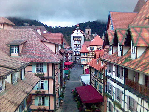
Isn’t that lovely. You could just build this at the base of some ski lifts and you would be done. I’d call the architect that made this place, rather than wasting your time with some bonehead who can only make suburban sprawl.
This isn’t difficult for Malaysians. They just say: “hmmm. Looks nice. Let’s build it!” Just like that.
Other commentary in this series:
May 1, 2011: Let’s Take a Traditional City Break 3: Life With Really Narrow Streets
April 3, 2011: Let’s Take a Trip to the Skinniest House in New York
March 20, 2011: Let’s Take a Trip to Julianne Moore’s House
February 13, 2011: Let’s Take a Traditional City Break 2: More Really Narrow Streets Than You Can Shake a Stick At
February 6, 2011: Let’s Take a Traditional City Break
December 19, 2010: Life Without Cars: 2010 Edition
October 17, 2010: The Problem of Scarcity 3: Resource Scarcity
August 22, 2010: How to Make a Pile of Dough with the Traditional City
August 1, 2010: The Problem With Bicycles
June 6, 2010: Transitioning to the Traditional City 2: Pooh-poohing the Naysayers
May 23, 2010: Transitioning to the Traditional City
May 16, 2010: The Service Economy
April 18, 2010: How to Live the Good Life in the Traditional City
April 4, 2010: The Problem With Little Teeny Farms 2: How Many Acres Can Sustain a Family?
March 28, 2010: The Problem With Little Teeny Farms
March 14, 2010: The Traditional City: Bringing It All Together
March 7, 2010: Let’s Take a Trip to Suburban Hell
February 21, 2010: Toledo, Spain or Toledo, Ohio?
January 31, 2010: Let’s Take a Trip to New York 2: The Bad and the Ugly
January 24, 2010: Let’s Take a Trip to New York City
January 10, 2010: We Could All Be Wizards
December 27, 2009: What a Real Train System Looks Like
December 13, 2009: Life Without Cars: 2009 Edition
November 22, 2009: What Comes After Heroic Materialism?
November 15, 2009: Let’s Kick Around Carfree.com
November 8, 2009: The Future Stinks
October 18, 2009: Let’s Take Another Trip to Venice
October 10, 2009: Place and Non-Place
September 28, 2009: Let’s Take a Trip to Barcelona
September 20, 2009: The Problem of Scarcity 2: It’s All In Your Head
September 13, 2009: The Problem of Scarcity
July 26, 2009: Let’s Take a Trip to an American Village 3: How the Suburbs Came to Be
July 19, 2009: Let’s Take a Trip to an American Village 2: Downtown
July 12, 2009: Let’s Take a Trip to an American Village
May 3, 2009: A Bazillion Windmills
April 19, 2009: Let’s Kick Around the “Sustainability” Types
March 3, 2009: Let’s Visit Some More Villages
February 15, 2009: Let’s Take a Trip to the French Village
February 1, 2009: Let’s Take a Trip to the English Village
January 25, 2009: How to Buy Gold on the Comex (scroll down)
January 4, 2009: Currency Management for Little Countries (scroll down)
December 28, 2008: Currencies are Causes, not Effects (scroll down)
December 21, 2008: Life Without Cars
August 10, 2008: Visions of Future Cities
July 20, 2008: The Traditional City vs. the “Radiant City”
December 2, 2007: Let’s Take a Trip to Tokyo
October 7, 2007: Let’s Take a Trip to Venice
June 17, 2007: Recipe for Florence
July 9, 2007: No Growth Economics
March 26, 2006: The Eco-Metropolis

