How To Make a Pile of Dough with the Traditional City 9: Townhouses With Parking
July 1, 2012
We’ve been working on a series of ideas for creating Traditional City-type neighborhoods that will nevertheless be compatible with Suburban Hell as it exists in the United States. In practice, this means that each home requires at least one space of off-street parking, and two spaces wouldn’t be bad. One of our first forays into the subject was the New New Suburbanist pattern, which combined 40×50 (2000 square foot) single-family house plots with 16-foot Really Narrow Streets, producing population densities roughly 3x higher than common Suburban Hell patterns today, while also providing both a nicer human-centric living environment and off-street parking for two cars.
July 31, 2011: How To Make a Pile of Dough With the Traditional City 5: The New New Suburbanism
March 14, 2010: The Traditional City: Bringing It All Together
In fact this is already a common format in Japan and elsewhere, and produces very fine results.
That was fun, so now we want to up the stakes a bit and double density once again, reducing the house plot size to around 1000 square feet, or 20-25 feet wide by 40-50 feet long. We will retain at least one and perhaps two off-street parking spots per site. Once again, we will use the Really Narrow pedestrian street of about 16 feet wide.
The high population density itself does a lot to solve the problem of automobiles, because, at that level, a lot of things are now in walking distance. Although a family will still want a car to interact with the rest of Suburban Hell America, nevertheless, within their neighborhood, it should be possible to walk to the school, bank, grocery, hardware store, restaurant, bar, dentist, friend’s house, and so forth, which cuts down the amount of trips necessary by car (and consequently automobile traffic within the neighborhood) considerably. As we noted earlier, when there are 30,000+ people within an easy walk, a business also doesn’t need to have twenty or a hundred parking spaces to be viable.
With a plot width of only 20-25 feet wide, the buildings become quite close together or even fully attached, a format commonly known as a “townhouse.” It’s called a townhouse because it’s found in a town, as opposed to a farmhouse which is found … on a farm. My point is, this is a very common format throughout the world, for people who live in towns, i.e. urban environments, as opposed to people who live on a farm. Unfortunately, Suburban Hell is based on the farmhouse format, which, not surprisingly, does not work at all well when you want to make a town out of it.
March 7, 2010: Let’s Take a Trip to Suburban Hell
July 26, 2009: Let’s Take a Trip to an American Village 3: How the Suburbs Came to Be
July 19, 2009: Let’s Take a Trip to an American Village 2: Downtown
July 12, 2009: Let’s Take a Trip to an American Village
So, when I talk about a 20-25 foot wide plot, you have to get over the “that’s insaaaaaaane!” reaction you might have, because it’s not insane at all. It’s normal. It’s a townhouse. For living in a town. What’s “insaaaaaaaane!” is trying to live in a farmhouse — the typical suburban house surrounded by a lawn (the analogue to the farm’s fields) on all four sides — in an urban environment, and expecting that there won’t be some unpleasant consequences involved, which are the hellish bits of Suburban Hell.
March 20, 2011: Let’s Take a Trip to Julianne Moore’s House
In a town — especially a walking-based town — you don’t waste space. 1000sf of land area is plenty. Let’s say that’s 300 sf of garden/backyard/courtyard, and 700sf of building footprint. If you build five stories high, which is common, just like Julianne Moore’s place, you get 3500sf of interior space, which is a lot actually.
The basic problem we face today is somehow integrating that off-street parking into our townhouse design. Of course, before cars, this wasn’t an issue. You just made your house and it was fine. No problem.
It still wouldn’t be a problem today, if you lived in a city — like most cities in the world, but alas unlike nearly all cities in the United States — where there was an adequate train and bus system, so you could live quite comfortably without a car. Many hundreds of millions of people already live like this, so it is no utopian fantasy, but normal life … outside of the United States.
December 27, 2009: What a Real Train System Looks Like
So, I cooked up a number of formats in which we could integrate our townhouses with offstreet parking.
Solution Number One: Make Do As Best You Can
The basic pattern we want is townhouses on 25×40-ish or 20×50-ish plots, with Really Narrow pedestrian streets like we saw in our New New Suburbanism example, which in practice are about 16-20 feet wide with no sidewalks or strips of “green space” buffers. This can actually be used quite nicely by both pedestrians and automobiles, with no particular ill effects.
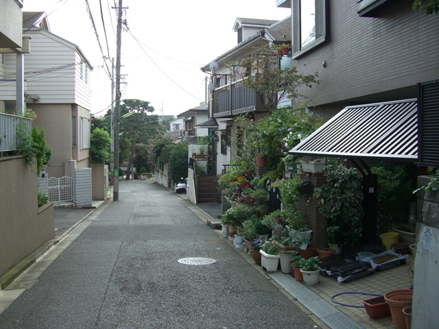
Just like this. This is a residential townhouse area in Tokyo. The street width here is more like 12 feet. You might think this is somewhere in the country, because there is no automobile traffic, but actually this is the Yoyogi district just west of Shibuya, quite near the center of Tokyo. You can walk from here to Shinjuku Station, the busiest train station in the world, and, on weekends, I often did. There are no restrictions on driving an automobile on this street, and many people living here own cars, but nobody drives here unless they really have to (i.e. they live there) because it is so narrow. You can see that it is also a pleasant place to walk or perhaps ride a bike.
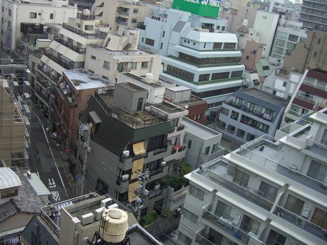
Here is another photo from central Tokyo. This is the Yushima district near Ueno. As you can see, this is quite a dense area, part of the central city and not a suburb at all. But, look at the streets. They are Really Narrow Streets of about 16-20 feet wide, no sidewalks, and people are walking right down the middle of the street. There’s hardly any traffic at all. Once again, although cars are not banned from these streets, they just don’t go there unless they really have to.
Here are a few historic examples of townhouses:
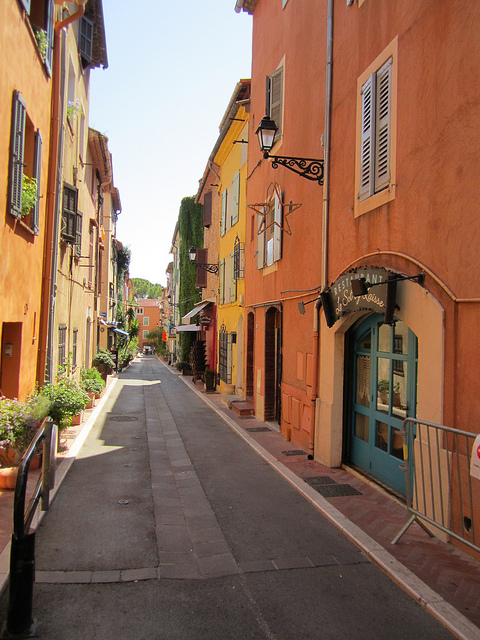
This is from a French village. It’s pretty easy when you don’t have to deal with parking. Just like this. Note the street width here. Also, the planters add a nice bit of greenery without “green space.”
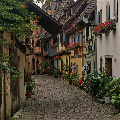
SONY DSC
This is one of our favorite images around here. How can you not love that?
French village, showing small townhouses.
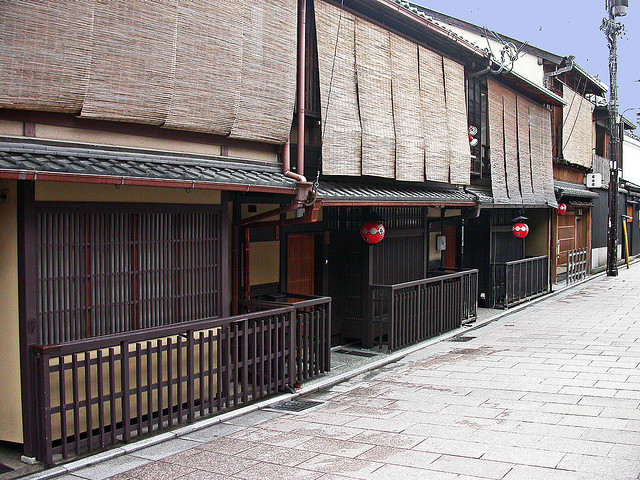
Here are some townhouses from Kyoto, Japan. Although the architectural tradition is very different, the basic format is the same. About 20 foot wide plots, up against a Really Narrow pedestrian street of perhaps 12-20 feet wide, no setbacks, sidewalks, “green space” etc. etc.

Townhouses on a narrow Kyoto street.
The basic problem with townhouses and parking is that you can tend to end up with the “wall of garage doors” effect. This is particularly true if you have two cars per household, and people don’t want to use stack parking (cars parked end-to-end), but rather want two cars parked side-by-side either indoors (in a garage) or outdoors (in front of the house). One solution is just to have a variety of solutions. Some houses have double-width garage doors, some have cars parked outside, some have single-width garage doors with stack parking, some just have parking for only one car, some have side parking. If you have a lot of variety, that helps a lot.
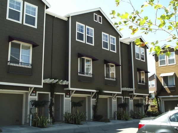
These townhouses actually look pretty good. This is from the San Francisco area, California. Tolerably good front facade treatment, but definitely a “wall of garage doors” issue at street level. I like that they really embrace the “townhouse” format here, without too many “we would really rather have a suburban farmhouse format but there’s not enough space” kinds of visual elements.
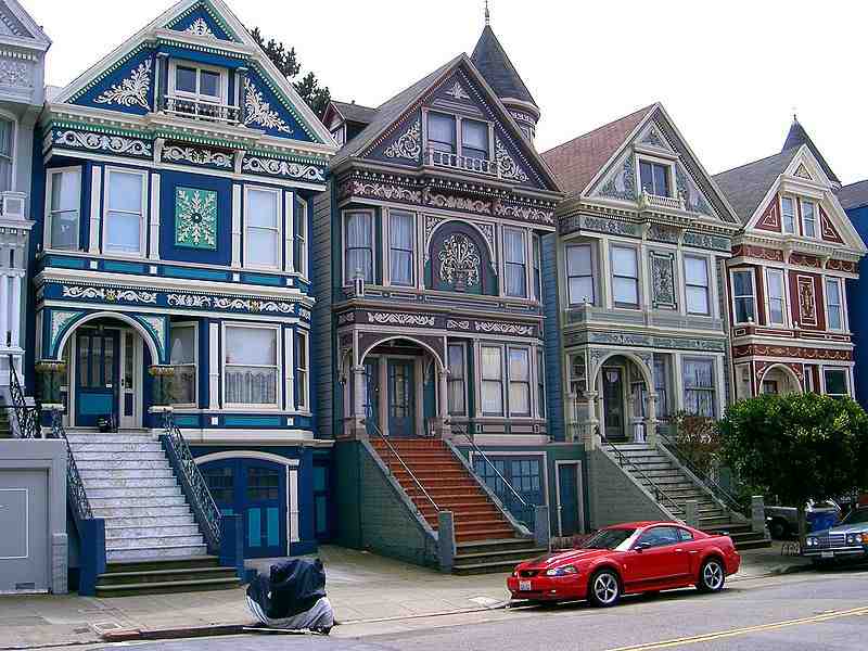
It helps if … you just try to make the whole thing a little more pleasant. For example, these 19th-century townhouses in San Francisco are quite beautiful, integrating the ground-floor garage door (single width, stack parking for two cars) into a lovely total facade. It doesn’t really cost any more to make it nice, but it does take some effort and ambition and vision and imagination.
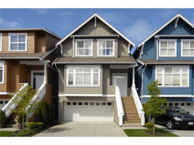
With a little more attention, you could maybe even manage to get a double-width garage door in there. Again, the large setback and very large stair wouldn’t work when fronting a 16-foot-wide Really Narrow Street, but the point is, if you make a bit on an effort, you can probably figure out a way to integrate that big garage door into a pleasing overall front facade.
These houses are really beautiful. Why not make it beautiful? You just have to try. It’s just a bit of paint and decoration. And, only one side — the street-facing side. You can make it ugly or beautiful. So make it beautiful.
Solution Two: Front and Back “Streets”
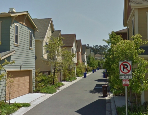
Even so, these are kludges. Parking is just plain ugly. Some designers have come up with the idea of separating the parking by “putting it in the back.” This creates a lot of issues. Now you need not just one but two streets per house, one in front and one in back. It doesn’t work at all when the streets are very wide, 19th Century Hypertropic type streets. This has led some designers to make the “front” street very narrow, actually more like a pedestrian walkway. This is not a bad idea, but what happens is that the “back” street, where the cars go, begins to be perceived as the “front” street because it is larger, and in fact probably used more because, actually, we drive a lot. The result in many cases is that the “back” street (for automobiles), which is treated as a utility alley, can tend to be ugly, while the “front” street (pedestrian) gets some confused treatment (Suburban Hell elements such as front yards/setbacks). I would just turn it around, and say that the “back” (automobile) street is really the front street, and should be treated as such, so you end up with something like our Solution #1 examples once again, integrating parking into the front facade of the house in some pleasant fashion, and a backyard in back. The “front” (pedestrian) street becomes the back street, and the “front yard/setback” becomes the (much more usable) back yard, and in the end it is pretty much the same except that you have a pedestrian walkway in the back separating people’s backyards.
Courtesy of Charles Gardner of Oldurbanist come more examples from California. Here’s the “back” street.
Here’s what the “front” looks like:
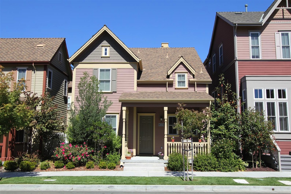
This is quite good, actually — one of the few examples from the U.S. which doesn’t make me laugh out loud immediately. Relieved of the difficulty of integrating parking into the front facade, designers managed to make a rather attractive and pleasing building. It is still in something of a “suburban farmhouse” format, with more space between houses than is typical of townhouses, and a substantial front setback. If you made the space between houses just four or five feet wider, you could use side parking, and then you would be at the New New Suburbanist pattern and you wouldn’t need the back street and the wall of garage doors at all. Despite the setback, we don’t have a typical “front yard” of thirty feet of mown grass here. Some setback is tolerable and even expected, because the street it is facing would be not a pedestrian-only street but probably a mixed-use street with some automobile traffic.
July 31, 2011: How To Make a Pile of Dough With the Traditional City 5: The New New Suburbanism
Unfortunately, despite these promising elements, the “front” street is exactly as I feared, a full-size 60-80 foot wide 19th Century Hypertrophic street with a segregated automobile roadway, onstreet parking, “green space” buffer strip, sidewalks, and all the rest. Fail!
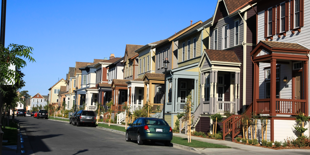
In this nearby neighborhood, we have an even more compact, “townhouse-like” format, and the front setback has shrunk still further. Good. However, we still have that giant Suburban Hell-style 19th Century Hypertrophic street. This is really comical because the “rear” street, which is dedicated for automobile access to the house (garage), is a fine example of a Really Narrow pedestrian street, while this “front” street, which provides pedestrian access to the house, and no offstreet parking, is designed with a giant dedicated automobile roadway! How stupid is that? Not only that, but this huge street chews up a huge amount of land, especially since we already have another street in back. With all the excess land wasted here, you could have built a whole additional row of houses, real Places for People.
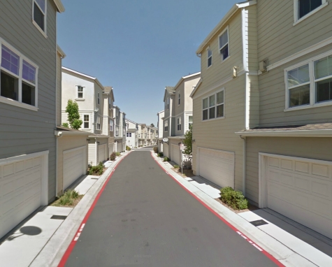
Here’s another “rear” street, in a newish development in Richmond, California. Once again, the basic pattern here is quite promising: a Really Narrow pedestrian street of about sixteen feet wide (twenty with the concrete drainage areas), no sidewalks, “green space,” onstreet parking (the red strips say “no parking”), etc. etc. So you see, the Really Narrow Street and townhouse combination can be used quite easily, even in the Suburban Hell environment of California. Of course we have a “wall of garage doors” issue here. If you made this “rear” the front, and added an entrance and a little more attention to beautifying the facade, the overall result would be quite nice and you wouldn’t need another “front” street.
Below is an example where we have a “rear” street which is a Really Narrow pedestrian street of about 16 feet wide, which serves (ironically) as access for the garages in the “back,” and in the “front” we have a little pedestrian walkway. This is good, because we got rid of the ridiculous 19th Century Hypertrophic Suburban Hell street that we saw in previous examples.
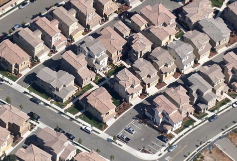
However, the “back alley” is much larger than the “front” street (pedestrian walkway) and is probably perceived as the “front.” The pedestrian walkway is not a bad idea, but we see some confused “suburban front yard” type setback here, which basically wastes this area on a low value “green space” buffer when you could have a nice, useful backyard. Also, the house designs are close together, but not really in a “townhouse” format like our San Francisco Victorian example, more like a “we wish we could do a suburban farmhouse format but our plot size is really small” effect. There is some confused area between the houses, sort of a “green space” buffer that is not really a yard, garden, or other usable human space. I would just make the houses closer together, as in the San Francisco Victorian example, with a few feet of airspace between them. When space is at a premium in a design like this, you want to make the most of it!
Another alternative would be to make a sort of three-sided courtyard on the side, sort of like this:
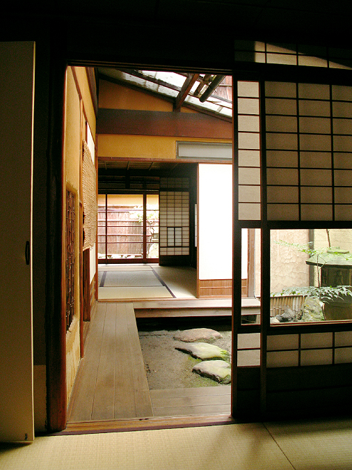
Here’s a three-sided courtyard from an old house in Kyoto, Japan — a dense urban area of townhouses on small plots. You can see that the courtyard is bordered by the house on three sides, and one side is the property border, where there is a wall and the side of the adjoining house. This space is quite compact — about 10×10 feet perhaps — but it is a beautiful, usable space for people, and allows a lot of light and air into the center of the house. This is so much better than just having some wasted “green space” buffer between houses.
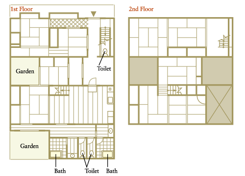
Here’s the floorplan of the house in Kyoto. The total square footage is 210 square meters, about 2260sf. This is a big house, with three toilets and two baths.
(This stuff in Richmond is such an abortion by comparison.)
I would make the “back alley automobile access road” into the “front street,” treating the front facade of the house in a beautiful and dignified manner rather than as a utility automobile storage area, and make the other side of the house into a functional backyard, with a small pedestrian walkway if you want one. You would end up with essentially Solution #1, but with a little pedestrian walkway in the back.
What if you insisted that the pedestrian street is the “front” and the automobile street is the “back”? This is fine too, but a lot depends on treating the “front” (pedestrian) street properly — in a Traditional City manner. I would suggest very little front setback or yard of any kind, which is actually the norm for these situations throughout the world, in both Europe and Asia. Like this:
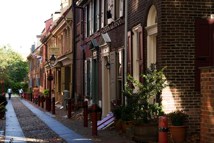
Philadelphia, Pennsylvania.
Note the street width. This is a pedestrian-only environment, so you don’t need a setback to create a buffer between the house entrance and automobile traffic. Definitely no “wall of garage doors” issues here. Look how the houses open right onto the street with no need for a setback or other buffer. This would be the “front” street.
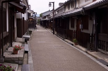
A similar format in Japan.
No setbacks, no front yards.
For the “back” (automobile) street, I still think you should do your best to avoid the “wall of garage doors” effect, but maybe you can just do that two-car garage and be done with it.
The problem we have now is: no backyard. We have a garage in the back and nothing in the front. So, here I would put a deck/patio/garden on top of the garage in the back. Now we have a beautiful pedestrian “front” street, a two-car garage in back, and also a very pleasant deck/patio/garden area built on top of the garage. This is the basic format:
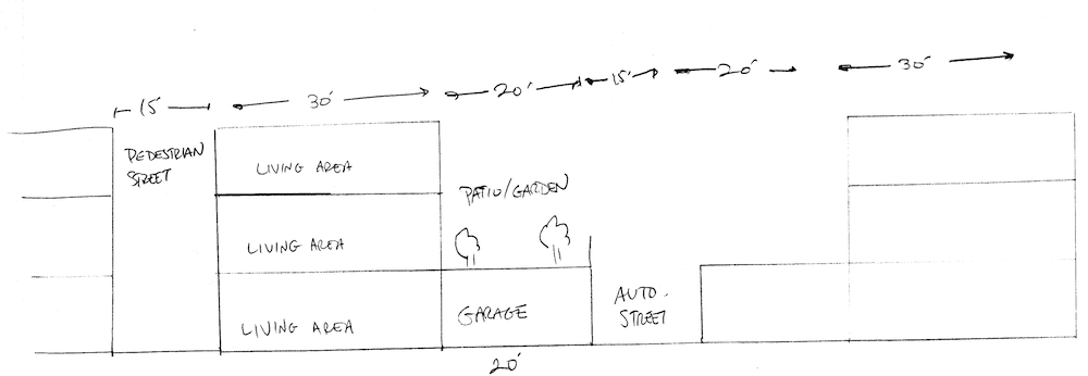
We still have an issue with having two streets per house, which chews up valuable land in the form of roadways. However, this would still be a workable design in my opinion, and much better than so many other options. Our density is already pretty high due to the 1000sf plots, so maybe we can slack off a bit when it comes to roadways. We now get to design the beautiful front facade of the house any way we like, without having to try to integrate a garage door or some other form of parking. And, we get a real pedestrian-only street. So, there’s a lot to be gained here too.
Solution Three: Shared Parking
Once we’ve come this far, it is not much of a stretch to deck over the entire “rear automobile roadway”, and in effect make the whole thing into a shared parking structure. It looks like this:

I already mentioned this sort of thing before, but it is worth looking into with a little more detail.
April 22, 2012: How to Make a Pile of Dough With the Traditional City 8: Shared Parking
In some ways this is similar, but I think it would be perceived very differently. Rather than having “two streets,” and a “wall of garage doors,” instead we have a large shared parking garage. We don’t have any confusion about which is the “front” and which is the “back.” The shared parking garage could have just one entrance and exit, and there are a lot of options on how that could be organized. Plus, we get some extra backyard/garden/patio space — great! Our land use is now “100% Places for People” because although we have a large garage, we’re also using the entire space as a wonderful garden/patio area by building over the garage. You could even make the garden/patio area into a shared area, like a sort of public park, although I think that people would prefer to have their own private space. You can also have a public park somewhere in the general vicinity. It’s not one-or-the-other. Have both!
This is a pretty good solution, in my opinion.
This solution is 110 feet from street to street. You can increase the density still further, reducing the total street-to-street distance to 70 feet, with something like this:
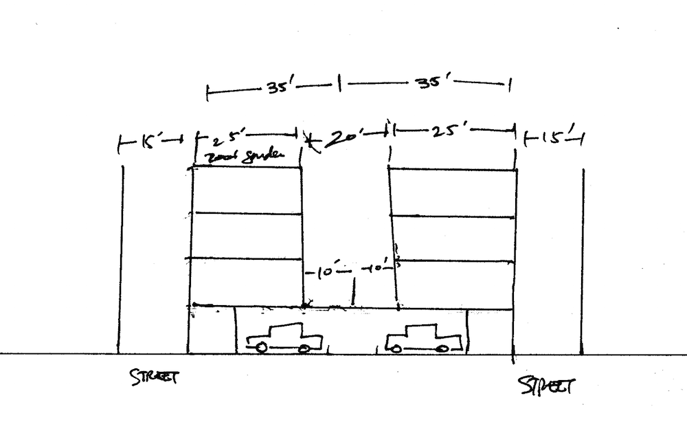
Now we have reduced the backyard to ten feet in depth. This is not a lot, but you can do a lot with a space that size. I have also added an optional roof garden or balcony on top. The first story is now only ten feet from front to back, which is plenty for an entrance area, coat closet, and maybe a bathroom or small bedroom. The “lot size” shrinks to 20×35 feet, only 700 square feet, but we still have offstreet parking for two cars per house, a small backyard and a rather roomy roof patio.
Solution Four: the Teeny New New Suburb
This is a rather different approach. We are still using a plot size of about 1000sf, but instead of a traditional attached townhouse, we are basically using a downsized version of our New New Suburbanism pattern, i.e. single family detached residential with outside parking, fitting it into a 1000sf plot instead of the 2000sf plots we used for that example.
July 31, 2011: How To Make a Pile of Dough With the Traditional City 5: The New New Suburbanism
I’ve mentioned it before, but it is even more clear to me now the extent to which Americans really own waaaay too much house. They kill themselves for their stupid shelter. What if shelter were something cheap and easy, and you didn’t have to become an indentured servant for thirty years to own some?
September 20, 2009: The Problem of Scarcity 2: It’s All In Your Head
September 13, 2009: The Problem of Scarcity
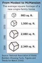
Our housing is killing us. It’s been this way for a long time. We see today how so many families have destroyed themselves financially by trying to own more house than they could afford. What we don’t often realize is that this has been going on for the last two hundred years. Henry David Thoreau noted that the very same thing was happening to families back in the 1840s.
When I consider my neighbors, the farmers of Concord, who are at least as well off as the other classes, I find that for the most part they have been toiling twenty, thirty, or forty years, that they may become the real owners of their farms, which commonly they have inherited with encumbrances, or else bought with hired money—and we may regard one third of that toil as the cost of their houses—but commonly they have not paid for them yet. It is true, the encumbrances sometimes outweigh the value of the farm, so that the farm itself becomes one great encumbrance, and still a man is found to inherit it, being well acquainted with it, as he says. On applying to the assessors, I am surprised to learn that they cannot at once name a dozen in the town who own their farms free and clear. If you would know the history of these homesteads, inquire at the bank where they are mortgaged. The man who has actually paid for his farm with labor on it is so rare that every neighbor can point to him. I doubt if there are three such men in Concord. What has been said of the merchants, that a very large majority, even ninety-seven in a hundred, are sure to fail, is equally true of the farmers. With regard to the merchants, however, one of them says pertinently that a great part of their failures are not genuine pecuniary failures, but merely failures to fulfil their engagements, because it is inconvenient; that is, it is the moral character that breaks down. But this puts an infinitely worse face on the matter, and suggests, beside, that probably not even the other three succeed in saving their souls, but are perchance bankrupt in a worse sense than they who fail honestly. Bankruptcy and repudiation are the springboards from which much of our civilization vaults and turns its somersets, but the savage stands on the unelastic plank of famine. Yet the Middlesex Cattle Show goes off here with éclat annually, as if all the joints of the agricultural machine were suent.
The farmer is endeavoring to solve the problem of a livelihood by a formula more complicated than the problem itself. To get his shoestrings he speculates in herds of cattle. With consummate skill he has set his trap with a hair spring to catch comfort and independence, and then, as he turned away, got his own leg into it. This is the reason he is poor; and for a similar reason we are all poor in respect to a thousand savage comforts, though surrounded by luxuries.
Read the rest of Thoreau’s Walden.
Even people who are quite well off – Nicholas Cage and Annie Liebowitz being two recent cautionary examples — seem driven by this peculiar American urge to blow yourself up with too much house. And the corporate 1%-ers — the Wall Street bankers, lawyers and so forth making perhaps $250,000-$600,000 per year — are so often up to their eyeballs in debt and financial commitments that it has become a cliché. I’ve seen even genuinely wealthy people, who end up with perhaps $60 million in cash from the sale of a company, blow every penny of it on personal residences.
As a general rule of thumb, a house that costs three times a year’s income is about the most you can realistically afford — with a thirty-year mortgage! But that doesn’t mean you should buy a house that costs that much. That is the heaviest financial burden you can bear while being reasonably capable of avoiding bankruptcy. But why should we all try to bear the heaviest financial burden that we can bear? That seems like a recipe for unhappiness. (If you want to make money on your house, go with an investment property, i.e., one with a tenant.) Instead, I propose that we have a very light and easy financial burden, such as one times a year’s income. Since the median household income these days is about $50,000, for many people that means a $50,000 house.
I think Henry David Thoreau would know exactly what I’m talking about. He built himself a cabin that was 10×15 feet, for a total cost of $28.125 in materials, which even then was only 1.36 ounces of gold.
Even one times a year’s income is no joke. That is still a lot of money. The Native Americans could build themselves a nice long-term shelter with about two weeks of work. Not fifty-two weeks. Just two weeks. So, maybe even one times a year’s income is … kinda pushing it. But, let’s not be too silly here.
You can’t buy a lot of house for $50,000. Certainly not the American Dream House. Certainly nothing like those San Francisco Victorians, which would cost something like $500,000+ to build new, for construction costs alone. If we’re going from 3x income (and 5x income during the bubble) to 1x income, then you should expect the square footage to also decline by two-thirds or more. This is not some magic trick where everyone gets their American Dream House but doesn’t have to pay for it. But, even within that downscaled context, you can buy a perfectly pleasant, dignified and functional place to live, and it would fit very easily on a 20×50 (1000sf) piece of land. Because that’s so much smaller than the typical suburban 1/8th acre (5400sf), our land costs would also be a lot less, even in relatively expensive cities.
Let’s say you could have 350 square feet. That might not seem like much — it isn’t — but it is enough, certainly for one or two, and even for a family of four. (You could do something like a sleeping loft to help stretch this a bit.)
Using regular wood-frame construction, you can do a lot with 350 square feet. Here’s a family of four that lives in a 168sf house that the father built himself for $12,000:
Click here for video on family of four living in 168 square feet.
That is only half the size of our 350sf proposal.
Four people in 168sf is pushing it. The family in the video is planning a new house, to better accommodate the family. The new house they have planned is: 16×24 feet. That’s 384 square feet. Of course, they plan to do it without borrowing money. They’re saving so much by living in their 168sf tiny house that they’ll be able to build their new house with cash.
That’s another nice thing about a small house: you can probably built it yourself. If you have more time than money, you can probably build your “$50,000 house” for under $25,000 in materials. This is what people do in Mexico, which is one reason the homeownership rate there is 80% and only 13% of homeowners have a mortgage. If Mexicans (per capita GDP $10,153) can do that, don’t you think that Americans (per capita GDP $48,386) should be able to do the same?
Here’s a very nice 280sf cottage that was built by the owner for $28,000.
Here are a bunch more plans for small houses in the 68-400 square foot range.
Let’s see what they look like:
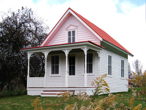
261 square feet.
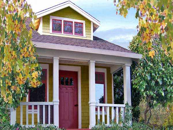
261 square feet.
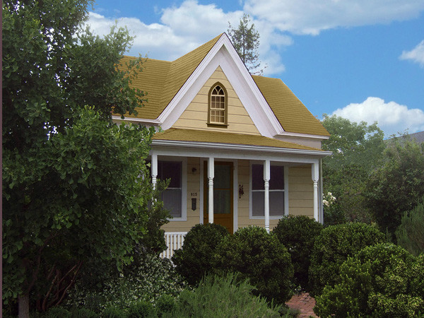
289 square feet.
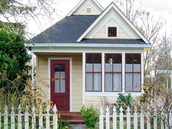
310 square feet.
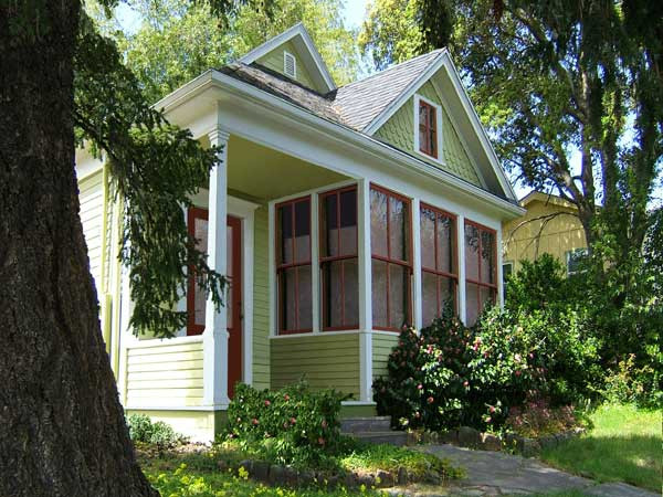
461 square feet.
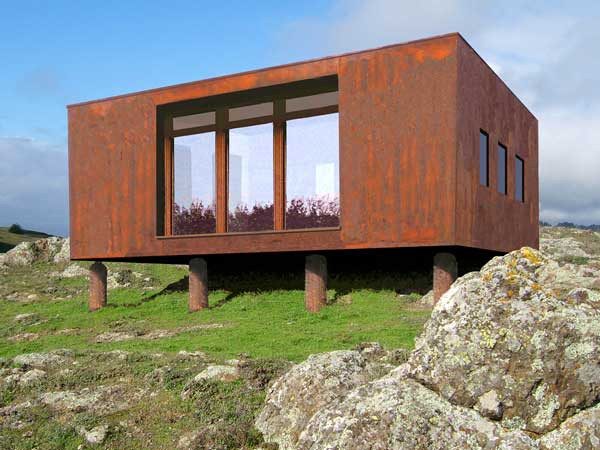
370 square feet.
These houses are all presented in something like a country environment, but they could also fit in nicely in a 20×50 plot in an urban area. The largest house, the “Whidbey,” is 15.5 feet wide.
What I really like about these designs is that they are beautiful, dignified and well-built. We can live in a little house, but we don’t have to be shabby about it. Indeed, when you are only building 400 square feet, you can really go all-out on design and quality because you aren’t killing yourself on quantity.
If 350 square feet really isn’t enough, you can add a second story. Now you’re up to 700sf with the same building footprint.
However, the problem with all of these designs is: where do you put the car? Obviously, there is no garage, so the natural thing to do would be to leave about twenty feet in front of the house, which would serve as parking for two cars side-by-side.
This is a tolerable solution, so maybe you can leave it at that. However, the overall effect would be to have a street that is, instead of a “wall of garage doors,” is rather a “wall of parked cars.” That’s maybe not the worst thing in the world, and with a little care — like some trees and shrubs — you could probably make a nice environment out of it. And, you would own your house for as little as $25,000, if you built it yourself. Not a bad solution at all.
However, another possibility would be to use side parking, just as we used in our “New New Suburbanist” example. You could just about barely fit it in with a plot size of 25×40 (1000 sf), which would allow you to use a design like the “Whidbey” (fifteen feet wide) with ten feet between houses. The houses would move up against the street, with just a little setback of a few feet, and the cars would go on the side. The “Whidbey” is about 22 feet deep, so if you had three feet in front, that would leave 15 feet in back for a nice little backyard. The other nice thing about side parking is that it also creates a space between houses, which allows effective side windows.
Solution Five: The New Shotgun House
In decades past, lower-income people often lived in a “shotgun house,” which is a very long and narrow house. This was because they had very long and narrow land plots, for the simple reason that it is not too easy to make the land plots shorter (that would involve making the streets closer together), but it is quite easy to make them narrower. If you had some land that was, say, 12 feet by 100 feet (because 200 feet between streets is a common 19th Century Hypertrophic layout, for example in Manhattan), then you made a very long and narrow house.
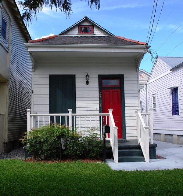
Shotgun House, New Orleans.
Note the side parking on the right.
As you can see, they can be quite charming and nice. But narrow. Real narrow.
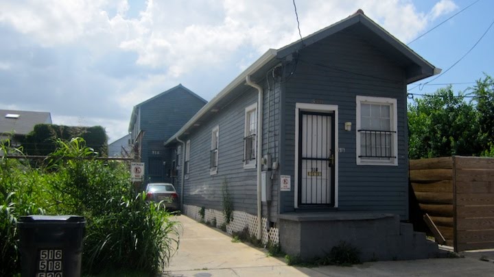
Shotgun House, New Orleans (with side parking).
Shotgun houses were zoned out of existence in a lot of towns, which is one reason why we seem to have an “affordable housing” problem all the time. Traditional affordable housing designs became illegal.
However, we are still building a lot of shotgun houses. We call them “manufactured houses.” “Manufactured houses” take two forms: one is the basic camping trailer, which is repurposed for full-time use. A luxury brand in this sector is Airstream, with the iconic rounded silver sheet metal exterior.
As we know, a lot of people live in really shabby, cheap travel trailers full-time. They are ugly as anything, but … they are cheap. You can buy a used one for less than $10,000. Then, you can live in it, with all the basic features of modern living, like flush toilets and a shower and electricity and a gas range and a refrigerator and hot and cold running water and television, especially if you are in a warm climate. And, it is about eight feet wide and maybe 25 feet long. Which is only 200 square feet.
I decided to focus on one of Airstream’s new luxury models, because it looks really good (on the interior). Of course, the exterior still looks like a stainless-steel suppository, because this is still intended for travel and highway towing, not long-term residency. We’re just looking at the interior here. The point is, you can take a space of these dimensions and you don’t have to be shabby about it. With a little care, this basic format can be really nice.
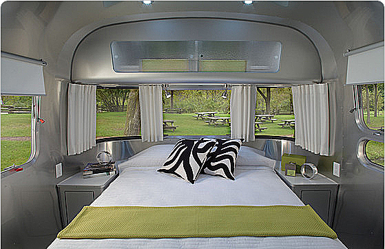
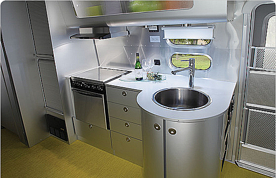
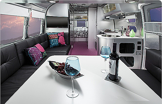
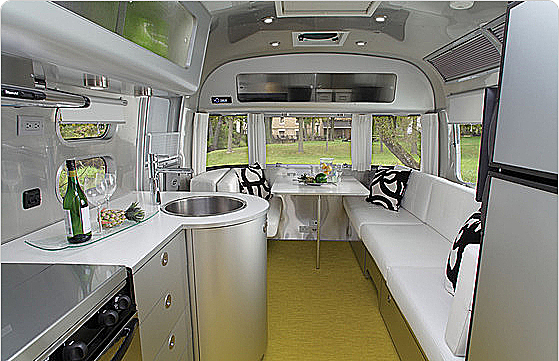
So you see, the eight-foot-wide house is not silly at all. About 32 million Americans are already living in them. Instead of a trailer, you could just build a normal structure of the same dimensions, and live there in a respectable way, without thirty years of debt slavery. On a 20×50 plot, you would have enough room on the side to park two cars end-to-end, and also have a nice backyard of about twenty feet deep.
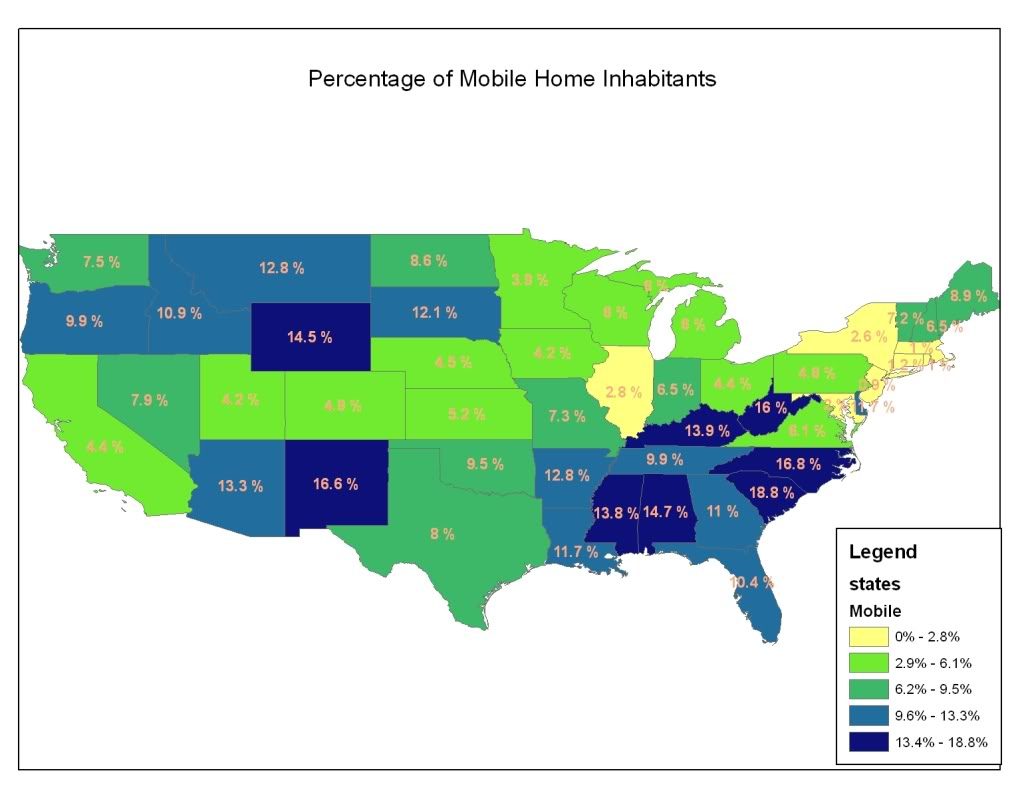
The other form of “manufactured housing” today is actually something much like a normal house, for long-term residence, although they too tend to be long and skinny. One manufacturer of these houses is Clayton Homes, which is part of Berkshire Hathaway, Warren Buffett’s company. (Clayton accounts for 47% of total industry production.)
I was hoping that I could find a way to simply plug these existing manufactured home models, from companies like Clayton, right into my overall design. However, that didn’t work as well as I hoped. The basic reason is that they tend to have pretty large footprints, of about 800 square feet. It is hard to fit an 800sf footprint into a 1000sf plot and have enough room left over for parking and a little yard.
However, we can say this about them: they are cheap. Clayton makes 800sf models for as little as $45,000, which is only $56 a square foot for new construction. I’ve seen similar size models from other companies for as little as $21,000, although I bet the build quality is truly hideous.
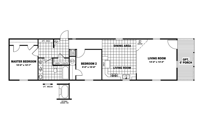
Clayton Homes 800sf house plan. The dimensions are approximately 15×53 feet.”Our country’s social goal should not be to put families into the house of their dreams, but rather to put them into a house they can afford.”
–Warren Buffet, 2012
This particular plan, as you can see, is in “shotgun” configuration (the front door is along the narrow side), with a nice porch in front. The price for the basic model is $45,000.
However, the footprint is quite large, about 15×53. You could fit it in a 25×60 (1500sf) plot with side parking, or in a 17×70 (1190sf) plot with parking for one car in front. If density wasn’t that much of a concern, you could do something on a 25×80 foot plot (2000sf), which is still pretty dense actually, and the result could be pretty good. But, that isn’t our design goal here.
What I’d like to see is for a manufacturer like Clayton to provide smaller models, for example 15×25 (375sf), which is still nearly twice the size of that Airstream, and which would allow us to fit it in a 25×40 (1000sf) plot with side parking and a little backyard. Plus, you’d think they could do it for $25,000, since it’s smaller. For a larger model, could they do two stories? They could also do a narrower version, perhaps ten feet wide and 35 feet long, which is still two feet (25%) wider than that Airstream, and a lot longer too.
Mostly, these manufactured homes, especially the cheaper models, look pretty awful, particularly when viewed “in the round” in the middle of a big lawn. They’re cheap and they look cheap. However, if you used them in “shotgun” configuration, you would only see the front facade. It wouldn’t take much to make a nice front facade, since it is only 15 feet wide, or maybe even ten feet. Build a nice porch out of Genuine Wood, paint it cheery colors, and the result would be pretty respectable.
So, there you go: Get a Clayton 15×25 home for $25,000, put it on a 25×40 plot, and you are done. If you want more space, get the “deluxe” two-story version for a big $50,000.
We are already not too far from these design formats. Here are some photos I took of places in my own little town:
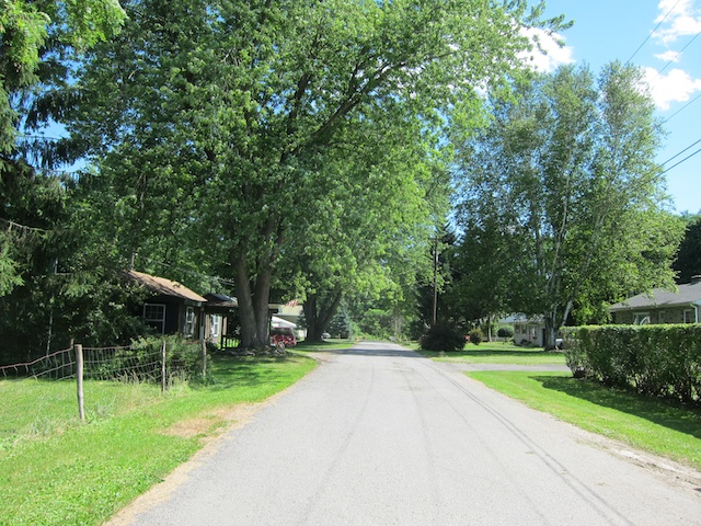
Most of my town is laid out in 19th Century Hypertrophic format, with a street width of 60-80 feet including two dedicated automobile lanes, on-street parking, and segregated sidewalks with a Green Space buffer between the sidewalk and the road. Your basic Suburban Hell pattern. However, this street, as we can see, is in the Really Narrow Street format, of about 16 feet wide with no segregated sidewalks. There is no paint stripe in the middle either, delineating automobile traffic lanes. You would feel comfortable walking right down the middle of the street. No traffic.
March 7, 2010: Let’s Take a Trip to Suburban Hell
July 26, 2009: Let’s Take a Trip to an American Village 3: How the Suburbs Came to Be
July 19, 2009: Let’s Take a Trip to an American Village 2: Downtown
July 12, 2009: Let’s Take a Trip to an American Village
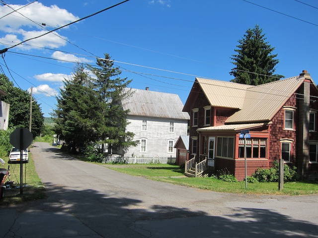
Here’s another street, once again a Really Narrow Street of about sixteen feet wide, etc. etc. The interesting thing here, I think, is the fact that the house doesn’t have much setback at all. There’s only about seven feet from the street edge to the front stair. This is despite the fact that this town is actually rather low density and land is not at a premium at all. But, if you make a Really Narrow pedestrian street, people don’t feel the need for thirty feet of green buffer between them and all that roaring automobile traffic. If you were aiming for higher density, you could make a setback of as little as three feet and I think it would be OK.
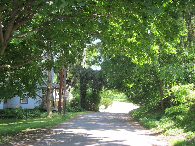
Another Really Narrow Street from my town. I often walk here on the way to the post office.
The density is in fact quite low here. However, you can see again that the house doesn’t have much front setback at all. This street is not threatening.
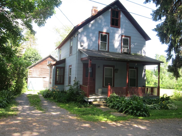
Here’s that same house. As you can see, it is not real wide. Maybe about twenty feet across the porch. Which is a little wider than our 15 foot examples, but not that much wider. Two stories. Side parking. Works fine. Definitely avoids the “wall of garage doors” look. This house is probably from the late 19th century.
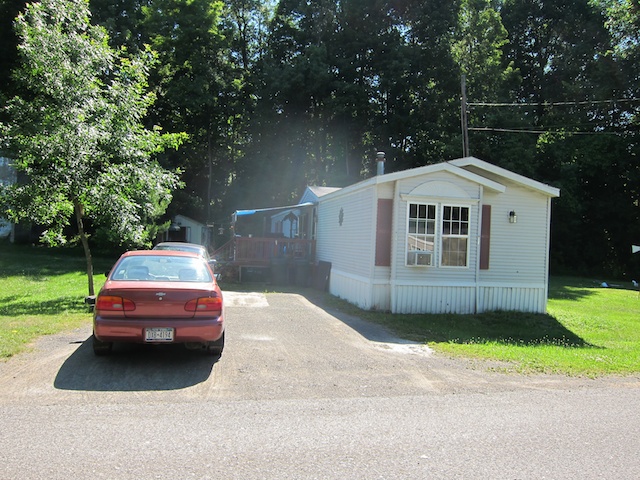
Here’s another neighborhood in my little town. This is the “manufactured housing” I was talking about. The houses here are pretty old and run down. This “manufactured housing” stuff doesn’t age well. It’s cheap for a reason. But, as you can see, we have about a 15 foot house width and side parking. If you put the front door in the front, in “shotgun configuration,” with a nice porch and front facade, I think it would look better. More like the 19th century house we looked at just previous.
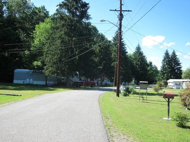
Same neighborhood of “manufactured homes.” Once again, a Really Narrow Street of about sixteen feet wide, no sidewalks etc. etc. High density is not a goal here at all, but nevertheless we are coming pretty close to my design goals. The overall effect isn’t bad, especially with the nice trees.
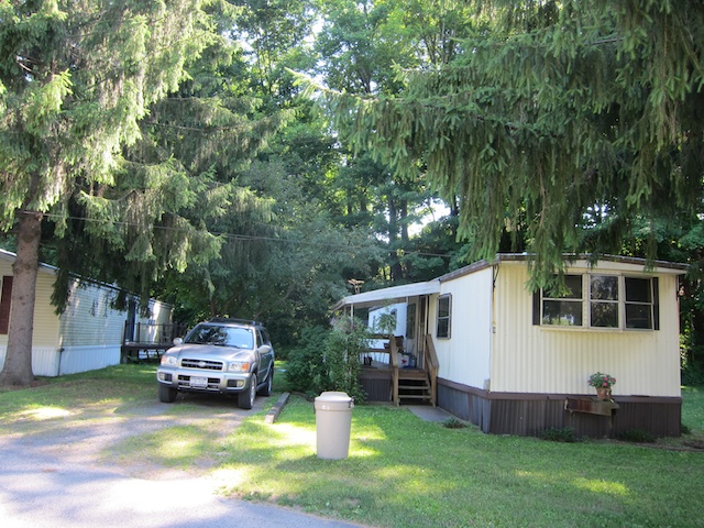
Side parking.
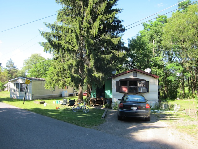
Front parking.
We see most of the elements I’ve been talking about, although at a much lower density.
Another thing not apparent here is: if we are in a high-density human-centric neighborhood — the natural result of the combination of 1000sf plots with 16-foot wide Really Narrow Streets — and you can walk to school, the bank, the grocery store, the post office, the local cafe, bar and restaurant, the bus stop and maybe train station, and maybe to work, then maybe the family can get by without that second car. A car costs about $600 a month, all-in. If you could get rid of that second car, you would be saving enough money to actually pay for the entirety of your $50,000 house.
By living in the Teeny New New Suburb, where you only need one car, in a sense you would get your house for free!
I know what you’re thinking: “I don’t want to live in such a teeny house.” OK, fine. Don’t. Live in a 3500sf McMansion on the beach in Hawaii. If you can afford it. And pay that mortgage for thirty years — if you can. Ha ha ha. Sucker.
If you can buy the 3500sf McMansion on the beach in Hawaii, and pay cash, and it really doesn’t meaningfully change the amount of assets you have left over, then please do so. You have my permission. I am all for big spectacular houses, for people who can easily afford them.
April 18, 2010: How to Live the Good Life in the Traditional City
For most Americans, I think they would be better off living in something like the examples above. Because, there are other things to do in life than slave away for decades for your stupid shelter. (Watch the video of the family living in the 168sf house for examples of how greater financial freedom has changed their entire lifestyle.) Also, if you haven’t noticed recently, capitalism is tough. There is a lot of turmoil and uncertainty. It’s bad enough as it is without making things much more difficult, with too many financial commitments. If you own a house free and clear, even if it is a little one, and have a 30% savings rate — which is less than the 50% that Chinese families save — then that occasional round of unemployment becomes a lot less threatening. Maybe Mom can even stay home to raise the kids. That might be nice.
I hope a developer will actually make something like this. Really Narrow Streets of about 16 feet wide. 1000 sf plots. Small, affordable, respectable, dignified, beautiful houses. You can plug it into Suburban Hell easily … but, this is actually quite close to a Traditional City format. The developers might find that it is pretty popular.
Click Here for the Traditional City/Heroic Materialism Archive

