Let’s Kick Around Carfree.com
November 15, 2009
I don’t know of anyone who has come closer to my ideas of the Traditional City than Carfree.com. While I have allowed for some motor vehicles, these cities are carfree from first principles — which is a fine idea I think, at least as a thought exercise, and maybe in real life too. We saw a few weeks ago that Venice functions perfectly well with no cars at all, not even commercial vehicles. This is no surprise, because all cities were carfree only a hundred years ago. Cities had been carfree for over two thousand years, even 5500 years if you go all the way back to Sumeria.
I like that term “carfree.” It sounds like you are released from bondage — which is about right. If you say “No Cars,” that immediately makes people think they are lacking something, or being banned from something.
Venice is one of Carfree.com’s central role models. So, you would think that the proposals made by Carfree.com of the Carfree City of the Future would be a lot like Venice, or at least the Traditional City of which Venice is such a fine example.
Nope.
Instead, we will use Carfree.com as an example of how not to do it — because so many of the mistakes made (in my opinion) are exemplary of the common modes of failure we find today when people try to design cities. We really are complete retards. Why do you think I make things so simple? Just make Really Narrow Streets with Buildings Side by Side and No Cars. It’s supposed to be so simple that even retards can do it, and get a good result.
Carfree.com begins with the “six lobe city design.”

“The Design Standards for carfree cities as established in the Introduction can be achieved in a city that offers an excellent quality of life.
Considerable thought has been given to the arrangement of a city which best fulfills the design standards.
The resulting Reference Design described below and on the Districts and Blocks pages is for a city of about one million people, but the design can be adapted to cities with populations between about 300,000 and 3,000,000.
The Reference Topology was developed in great detail for Carfree Cities.”
The text is right off the website. I swear I am not making this up.
OK, let me ask you a question.
Does this:
A) Look Like Venice?
B) Not Look Anything At All Like Venice?
I know this is difficult, especially for retards, so you may want to consult your local Professor of Urban Studies before proceeding.
Here’s another question:
Where the heck IS this city?
OK, I already know the answer. In The Middle of the Green Box. I have always assumed that the carfree cities of the future would be the cities of today, rebuilt. Because, that is what we have always done with cities, at least in Europe and Asia. Build them over and over again. This idea of building a city from a green field is really an American notion, and not really appropriate even for the U.S. What we have actually done is expand existing cities with greenfield development — mostly Suburban Hell development, with a little Hypertrophic City development. New York is still New York, and it will continue to be for some time hence. You don’t just go rebuild New York in the middle of Utah. This “topology” apparently makes no allowance for terrain of any kind — an ocean (most big cities are on oceans), a river (the rest are on rivers), cliffs, hills, mountains (Los Angeles? San Francisco?). I suppose we are building this in the middle of Kansas. Which then begs the question: Why build in the middle of Kansas? (“Because that’s where the Green Box is!”) A city needs to have some economic purpose, known as “jobs” in layman’s terms.
More questions…
What the heck is a “Reference Topology”?
Does any Traditional City have a “topology”? Does the city you’re living in have a “topology”?
This was not just a careless slip of the tongue, either. The whole page is named “Topology”.
Is this city connected to the outside world in any way?
Is there a road out? A rail line? An airport? A helipad? A zeppelin dock? A port or marina? A space shuttle launch facility? It apparently exists in perfect symmetric self-sufficiency. I suppose the economy is based on photosynthesis.
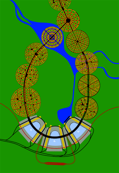
At first glance, this pleasing little pattern looks like a nice design for a necktie. It is only a bit later that you realize that this is really supposed to be a real city. I have mentioned that one of the major failings of City Design in the last century has been the tendency towards the helicopter viewpoint. Traditional Cities, as I’ve said, look like grey mush from the helicopter. When you design anything from the perspective of a helicopter, you are almost certain to fail, because cities (especially carfree ones) are actually used by people on foot. It is almost impossible to design something that actually works, for a person on foot, from the helicopter viewpoint. Especially if you are a retard.
How would you do it? “Get in the helicopter and design some grey mush!” You can’t. It’s like trying to write a love letter with a paint roller.
However, we begin here not from the helicopter viewpoint, but from the satellite viewpoint. From the satellite viewpoint, all cities look like grey mush, even Hypertrophic ones. Carfree.com’s primary objective, it seems, is to make something that looks like a nice necktie design when viewed from the space shuttle. They even use it as the site logo. This is such a 100% guarantee of the most miserable failure that I chuckle to even consider it.
I bet if you suggested a seven-lobe city design — just for kicks, because, you know, mine goes to 11 — the Carfree.com people would have a shit fit. “Noooo — it’s gotta be six and only six!” I get the impression they are rather attached to their six-lobe Reference Topology.
What could cause such a person — well-meaning and intelligent by appearances — to make such colossal errors right out of the box? Let’s talk about motivations.
1) The primacy of “innovation.” This design is conceived from the perspective of the Professor of Urban Studies. The Professor of Urban Studies will never design a city in his life, not even a little neighborhood. Thank God for that! The goal of the Professor of Urban Studies is to get tenure. Getting tenure and designing cities have absolutely nothing to do with each other. You don’t get tenure by saying “make it just like Venice.” You can design a city that way — a good one! — but you can’t get tenure that way. No, you have to be creative. You have to be a contributor to your field. Throughout the 20th century, this has meant making up nonsense that is nothing like what has come before. It must be innovative. It must be revolutionary. It doesn’t actually have to be any good. Today, we have these highly institutionalized rituals by which organization dweebs demonstrate the asked-for revolutionary spirit on demand.
2) The tendency towards central planning. Urban planning (not City Design) is one of the last great holdouts of pure Soviet central planning ideology. For some reason, when people think about City Design, they think they are planning a moonbase. Thus the tendency to start from the satellite perspective. Real cities grow in a somewhat organic fashion, and are motivated by capitalistic considerations.
We see, thus, not just some clumsy thinking by Carfree.com, but rather the manifestation of certain repetitive mid-20th-century thought processes, which are common to many academic sectors (and arts).
Moving right along, we come to a description of Districts:
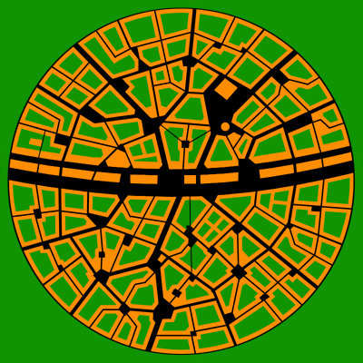

We see some great ideas here. First, the Really Narrow Streets. Good! I also have to congratulate Carfree.com here for avoiding The Grid, which seems to have imprisoned the minds of city designers for two hundred years. The 19th Century Hyptertrophic City has The Grid in the form of the grid of streets, exemplified by Manhattan. The 20th Century Hypertrophic City has The Grid in the form of the placement of its identical megabuildings.
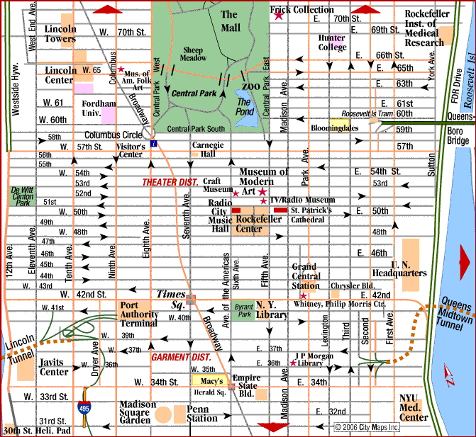
The Grid, 19th century style.
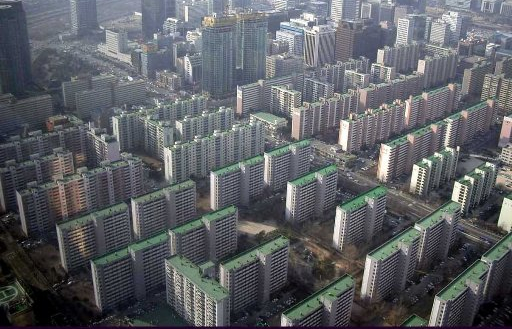
The Grid, 20th century style.
I could write a whole page (or two) just on The Grid. It wasn’t confined only to street layout, but also expressed itself in architecture.
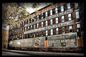
The Grid, 19th century style.
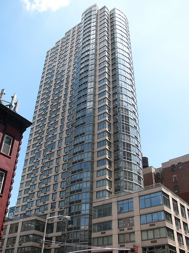
The Grid, 20th century style.
People were absolutely insane for the stupid Grid. It was part of the factory aesthetic of the first two centuries of industrialization.
Maybe they were into tennis rackets rather than neckties in those days.
So, I am not kidding when I say that to design anything that is not based on The Grid represents a major step forward. Really, it is. Plus, we see some little squares and plazas, which are a traditional element of the Traditional City. And, we see that the buildings are side-by-side, and about four stories high. Wow, that’s great! No more ersatz-farmhouses, the standard pattern of Suburban Hell. Really Narrow Streets … buildings side by side … no cars … we are really on track to success here.
At first, I thought this was a sort of standalone example of the basic pattern of Traditional City design. Like Venice.
Ummmm, what’s with the circle?
And then it dawns on you …
The circle is the same circle that makes up the six-lobed necktie design.
Oh my GAAAAAD.
Could anyone actually be so retarded?
It makes me weak in the knees to even consider that people take this seriously. Honestly, I had no idea that things were this bad.
I could mention some funny features, such as the fact that two of the “districts” are plopped right in the middle of a river. Nothing must come in the way of the Reference Topology! Ummm … do you know what happens to rivers when it rains?

I should probably make some jokes here about the “sustainability” of cities built on floodplains. After many decades of bad experience, people finally figured out not to build on river floodplains. In fact, the floodplain can be a great place for all your Green Space fantasies, like golf courses and soccer fields, which can be easily replaced after The Event From Which The Floodplain Derives Its Name.
Anyway, this is nothing remotely resembling a Traditional City.
Obviously.
Let’s just take a moment to catch our breath.
For our purposes, lets just forget about the whole six-lobe thing, and the circles and all that crapola. Let’s just take this pattern as a representation of a portion of our sorta-traditional Carfree City of the Future.
There sure is a lot of green in this picture. Indeed, the legend says that the green represents “green area.”
Uh oh.
You know what I think about Green Space.
October 10, 2009: Place and Non-Place
The Traditional City has all sorts of elements that include vegetation. These are:
1) Yards (often an urban townhouse will have a backyard)
2) Interior courtyards
3) Parks
4) Sports fields
5) Squares and plazas can have grass. This is more common in the English example than the Italian, where squares and plazas are usually paved.
However, this “green area” is none of those. The designer has apparently picked up the tendency for people to think that Green Space is an improvement (why?), even a necessary part of the Sustainable City of the Future. (“Where will we graze our goats?”) I don’t know of any actual Traditional City that has large amounts of Green Space. It doesn’t need any, because Green Space is really a buffer to make the car-stuffed roadways and parking lots a little more tolerable (“the solution to pollution is dilution”). Once you get rid of the cars, you don’t need Green Space anymore.
Let’s take a closer look:
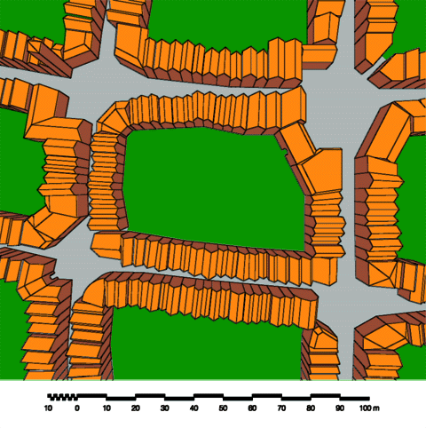
Here we can see the individual buildings. And there’s that Green Area.
What is this Green Area?
1) Is it a park? It is publicly owned, like most parks? Can someone sell it? Does it have public access? It doesn’t appear to. If it is a park, do we need so many parks?
2) Is it a backyard? It doesn’t appear to be divided into individual backyards. Are there any trees, or is it just mowed grass? It appears to be communally-owned. Like a condo-backyard?
3) Is it a square or plaza? A square or plaza is normally located at the intersection of streets. In any case, we certainly don’t need so many squares and plazas.
4) Is it a sports field? You would normally find a sports field associated with a park or a school, or occasionally as a professional arena.
5) Is it an interior courtyard? An interior courtyard is normally surrounded by a single building. A courtyard for a personal residence might be 9×13 meters or so, or even smaller, while this appears to be about 70 meters across. You could have a larger interior courtyard, for an office or large apartment building/complex. However, that does not appear to be the case here. This is not an interior courtyard.
Of course it is none of those things. It is Green Area — just as it is labeled. Duh!
“Interior courtyards admit daylight to building interiors and provide green space adjacent to virtually every building.“
This “Green Space” concept really is deadly poison. Beware of it.
One thing’s for sure: it looks nothing like Venice.
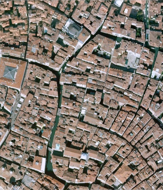
In the end, Carfree.com was not able to fully embrace the Traditional City, in the form of Venice. We ended up with a sort of Suburbia/Venice hybrid, with plenty of Green Area.
One of the reasons that the Traditional City does not have a lot of Green Space is that the land is valuable. You could build some buildings on it, which would be a much higher-value use of the space than devoting 40% of your city to make a nice place for your dog to take a dump. If you owned that much empty space, you would sell it off or develop it. This can go a little overboard, actually, which is why the city government intervenes and introduces some parks, which are normally publicly owned. These parks are known as “parks,” not “green area.” I’m all for parks, even large ones. The classic Italian cities are definitely a little short on parks. However, you don’t need a park on every block. The amount of space devoted to parks could be about 25% of the space devoted to “green area” in this design (or about 10% of the total), and the area devoted to buildings could be 2x what we have here. Then, it would be more Venice-like, with 100% Place, and no Non-Place in the form of “green area.”
I think that what actually happened here, is that Carfree.com came upon some guidelines for “urban planning,” which were really directed toward Suburban Hell. The guidelines stated that a certain percentage (“a minimum of 25%” for Clackamas County, Oregon) would be “green space.” This idea got incorporated here, although it is completely inappropriate.
Finally, Carfree.com has some notes on street width:
Narrow Streets
Streets average 25 feet (7.5 M) wide. A boulevard 100 feet (30 m) wide connects all the districts in a lobe and provides a high-speed bicycle thoroughfare. The metro system is constructed beneath this central artery. Other streets should be at least 16 feet (5 meters) wide to allow for access by emergency vehicles. Small alleys not long enough to require direct emergency access can be much narrower – as little as 6 feet (2 meters). Varying widths add interest to an area.
Hmmm. “Narrow Streets.” Not Really Narrow.
When I say “Really Narrow Streets,” I don’t mean that they are, actually, really narrow. They are ridiculously narrow if you are trying to drive. But, for a pedestrian, they are a perfectly appropriate width, and not “too narrow” by any means. So, I really mean a normal-size pedestrian street, not an automobile street.
Since this is a Carfree City, doesn’t it make sense to have pedestrian streets? I think the answer is yes.
I am absolutely apeshit about Really Narrow Streets, which is to say pedestrian streets, because we’ve already seen how the American Village (and eventually all American urban places) were fucked up from the start by streets that were waaaaay too wide — not at all like the Traditional Cities of Europe or Asia. They had buildings side-by-side (at least in commercial areas), and of course there were no cars since this was over a hundred years before cars were invented. Nevertheless — it was a failure, and the beginnings of 19th Century Hypertrophism, which I promise I will write about someday. In large part, I think we created our automobile disaster because we started off with streets that were sized for automobiles, instead of people. Once you’ve built automobile-sized streets, doesn’t it make sense to fill them with automobiles, even if it took over 100 more years to get to that point?
July 26, 2009: Let’s Take a Trip to an American Village 3: How the Suburbs Came to Be
July 19, 2009: Let’s Take a Trip to an American Village 2: Downtown
July 12, 2009: Let’s Take a Trip to an American Village
So, what is the width of a Really Narrow Street, exactly?
Let’s go back to Venice and find out.
October 18, 2009: Let’s Take Another Trip to Venice
October 7, 2007: Let’s Take a Trip to Venice
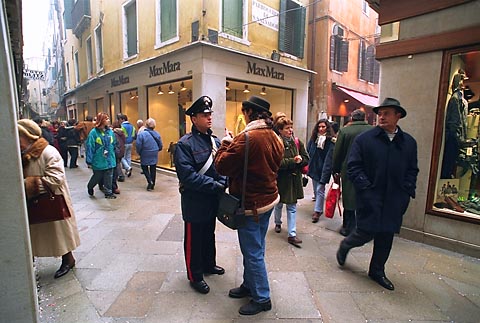
About 12 feet. This is not a tiny side street either, it’s a fairly significant commercial street.
There are plenty of people, but it doesn’t seem “crowded.”
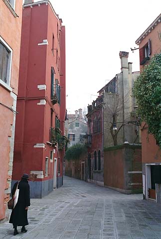
About 16 feet, narrowing to about 10 feet.
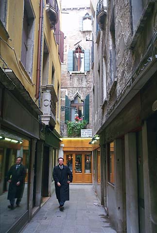
Seven feet.
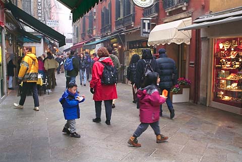
About 14-15 feet.
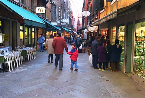
15 feet.
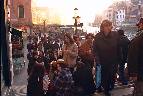
12 feet.
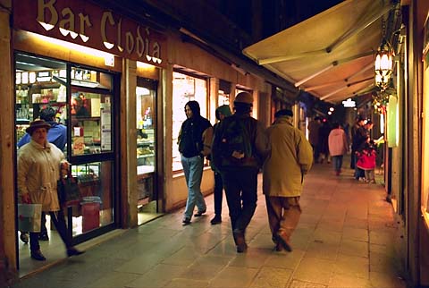
Ten feet.
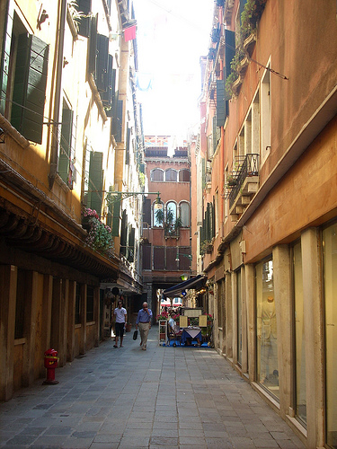
Twelve feet.
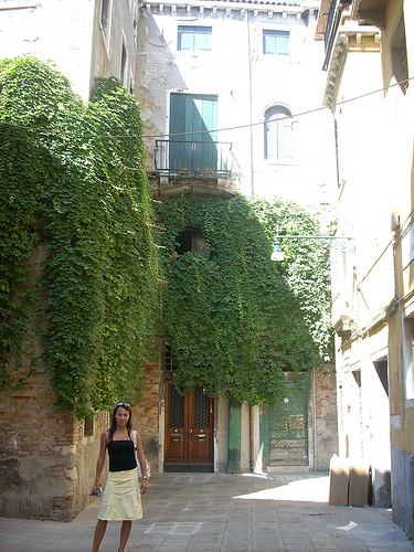
About 14 feet.
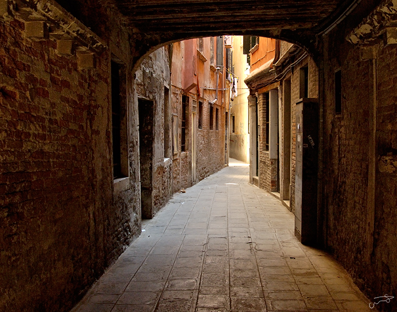
Eight feet, narrowing to about four feet.
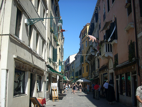
15 feet.
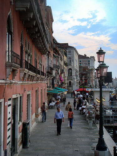
15 feet.
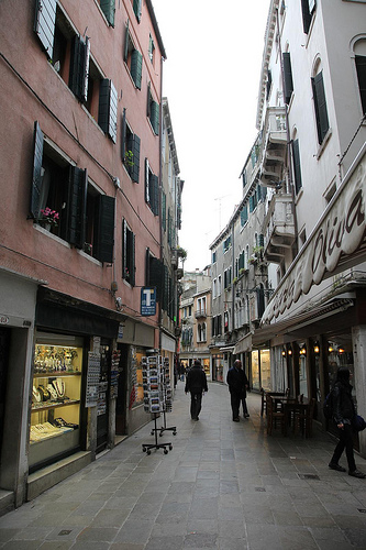
13 feet.
So you see, the average street width in Venice is nowhere near 25 feet. It is perhaps half of that. Certainly a “minimum” of 16 feet is excessive. However, these streets do not seem “too narrow” do they? Even where there are plenty of people, it is not “crowded.” Venice is not a particularly exaggerated example of typical pedestrian streets, either. You find about the same street width all over the world.

Kyoto, Japan. This is reconstructed to represent a typical pre-1850 Kyoto street.
Look at the kooky rationalization given by Carfree.com for their wider streets:
“Other streets should be at least 16 feet (5 meters) wide to allow for access by emergency vehicles.”
Talk about a bad reason for fundamental urban design choices. It reminds me of the superwide streets of 19th Century Hypertrophism, supposedly to allow wagons to make U-turns. Once again, we end up with a sort of Suburbia/Venice hybrid.
Actually, Venice’s 10-15 foot streets are perfectly fine for the occasional emergency vehicle. I am sure there are a few medical emergencies from time to time in Venice. They get by somehow. A standard automobile traffic lane is about eight feet wide, so 10-15 feet is more than enough. Plus, there’s no rule that says you can’t make the vehicles smaller too. In general, European and Japanese vehicles are quite a bit smaller than the U.S. versions.
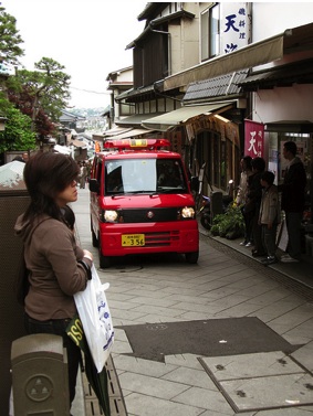
Japanese ambulance, Enoshima. This street is about 11 feet wide.
Making a carfree Traditional City is easy. There’s no reason to make it difficult.
Other comments in this series:
October 18, 2009: Let’s Take Another Trip to Venice
October 10, 2009: Place and Non-Place
September 28, 2009: Let’s Take a Trip to Barcelona
September 20, 2009: The Problem of Scarcity 2: It’s All In Your Head
September 13, 2009: The Problem of Scarcity
July 26, 2009: Let’s Take a Trip to an American Village 3: How the Suburbs Came to Be
July 19, 2009: Let’s Take a Trip to an American Village 2: Downtown
July 12, 2009: Let’s Take a Trip to an American Village
May 3, 2009: A Bazillion Windmills
April 19, 2009: Let’s Kick Around the “Sustainability” Types
March 3, 2009: Let’s Visit Some More Villages
February 15, 2009: Let’s Take a Trip to the French Village
February 1, 2009: Let’s Take a Trip to the English Village
January 25, 2009: How to Buy Gold on the Comex (scroll down)
January 4, 2009: Currency Management for Little Countries (scroll down)
December 28, 2008: Currencies are Causes, not Effects (scroll down)
December 21, 2008: Life Without Cars
August 10, 2008: Visions of Future Cities
July 20, 2008: The Traditional City vs. the “Radiant City”
December 2, 2007: Let’s Take a Trip to Tokyo
October 7, 2007: Let’s Take a Trip to Venice
June 17, 2007: Recipe for Florence
July 9, 2007: No Growth Economics
March 26, 2006: The Eco-Metropolis

