Let’s Take a Trip to New York 2: The Bad and the Ugly
January 31, 2010
We’ve been on a trip to New York, which is our representative of the 19th Century Hypertrophic City. Here are some of the characteristics of 19th Century Hypertrophism compared to the Traditional City, the common form of urbanization in all place and all times up until 1780 or so.
January 24, 2010: Let’s Take a Trip to New York City
1) Very wide streets, which I am interpreting as an aesthetic decision in line with the Heroic Materialist aesthetic of the Industrial Revolution. BIG BIG BIG is one aspect of this aesthetic, and it is very easy to make a big street. You just space the buildings farther apart. It is not so easy to pave a big street, unfortunately, which is why they were often unpaved, and thus, unfriendly to people (pedestrians) for about a hundred years. More consequences spun out of this first decision, such as a fascination with personal transportation. Here was this huge, enormous, mammoth street, sitting unused because there weren’t any cars in those days, and not that many wagons either. And, it was dirt, or often mud, which means that you didn’t want to walk in it, and would rather be suspended off the ground on wagon wheels. Next, we had a tendency towards BIG BIG BIG in all other things as well, to match the scale of the extremely wide street.
July 26, 2009: Let’s Take a Trip to an American Village 3: How the Suburbs Came to Be
July 19, 2009: Let’s Take a Trip to an American Village 2: Downtown
July 12, 2009: Let’s Take a Trip to an American Village
2) Traditional-style buildings. Except for the very large roadway, the 19th Century Hypertrophic City for the most part does not suffer from Non-Place. There’s no parking, or acres and acres of Green Space to try to compensate for the stinking horror of automobiles. However, the trend toward Non-Place and sprawl was set in motion from the beginning. This took the form of using freestanding farmhouses as residences, with the typical suburban “yard” all around. Thus, we have the first Green Space in the form of the suburban yard. This is a format that dates from the beginning of Heroic Materialism, around 1780, not from the post-WWII “suburban” period. Bigger cities often had townhouses, a Traditional City format, but even this often took on a Hypertrophic aspect, to relate aesthetically to the Very Wide Street they were often located on. In general, architecture had a tendency toward the monolithic, in part because it was facing the Very Wide Street, instead of a pedestrian area. By “monolithic” I mean “like a big block of stone.” For example, long blank walls with no entrances, or details, or anything a person on foot could relate with.
October 10, 2009: Place and Non-Place
3) The Grid. Most Traditional Cities have a sort of organic, curvy layout, a bit like the way plants grow. The Heroic Materialist aesthetic appears again in the form of The Grid, omnipresent in all U.S. cities of the 19th century. Oddly, this passes away after WWII a little bit, as we get some swoops, curves, cul-de-sacs and so forth in Suburbia.
The Traditional City often has many sizes of streets, a lot like the system of arteries, veins and capillaries. There are a few large avenues — perhaps 3%. Then, there is a set of smaller, but still quite wide, access streets, of the sort that allows two to four lanes of wagon or truck traffic. This might be 10% of the roads. Finally, there are lots and lots (80%+) of Really Narrow Streets, about 8-15 feet wide, which is a very comfortable pedestrian size but rather difficult for a wheeled vehicle. Although most of the streets in the city are Really Narrow Streets, in fact the larger avenues are never more than a few hundred meters away. So, if you were going to deliver a sofa or some construction materials to a site, you could drive on the big streets most of the way and then pass (slowly) through the Really Narrow Street only the last 200-300 meters or so. This is hardly any problem at all. Also, the Traditional City needed some larger streets to serve as firebreaks.
With The Grid, however, we find that streets tend to be all the same size. So, instead of a progression of large avenues to Really Narrow Streets — where most of the action is — we have a sort of sterile, middling size that is not much good for anything.
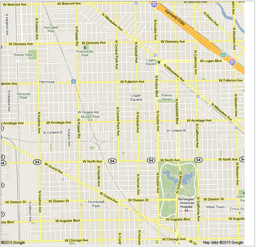
Chicago. The tyranny of The Grid.
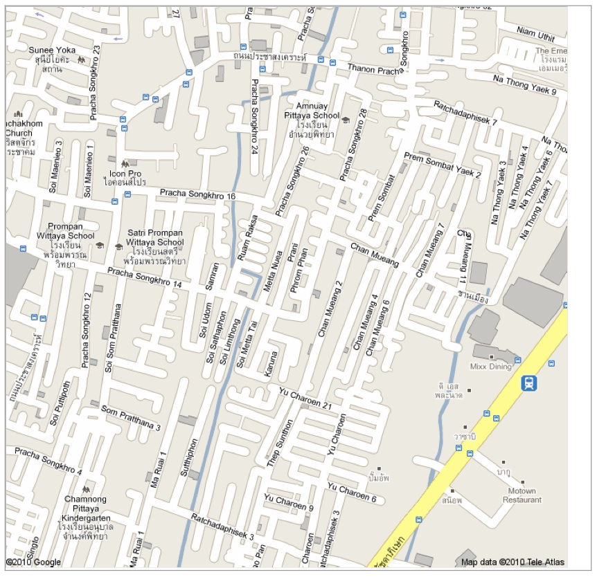
Central Bangkok. The typical hugger-mugger of the Traditional City. We don’t need no stinking Grid!
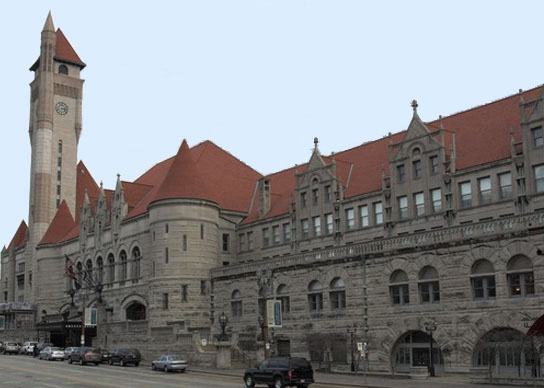
Courtesy of Jim Kunstler, this is Union Station in St. Louis. A beautiful 19th century train station. But, with a tendency toward the Monolithic. For example, you could have put a row of shops or something along the street there, something for humans to interact with. And hypertrophic, although that is maybe a little unfair for a major train station. Note the size of the roadway it faces. This is apparently no longer used as a train station.
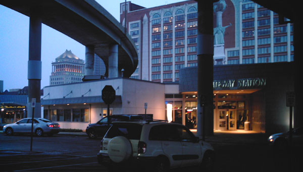
DCFC0009.JPG
A side view of the new St. Louis Amtrak station, three blocks away. A piece of shit, obviously.
Although there are some very fine buildings from the 19th Century Hypertrophic era, they are a little unfriendly to people. Big, impressive, majestic, a little cold and uncomfortable. Definitely not cozy.
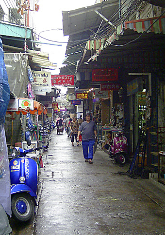
Like this. A Really Narrow Street in Bangkok. Cozy, right? A Traditional City has a lot of this sort of thing. You never see it in the 19th Century Hypertrophic City. In terms of people, compare all the detail and potential for interaction of this row of shops to the monolithic facade of the Union Station.
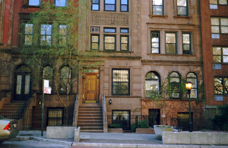
Some brownstone townhouses in New York. This is about as cozy as it gets the 19th Century Hypertrophic City. Good things: this is basically a Traditional City format, the townhouse. It might have a small yard in the back, but no proto-Green Space surrounding it like the typical house of the American Village and, later, Suburbia. However, this is not quite Traditional, it has been tweaked to fit into its Hypertrophic environment.
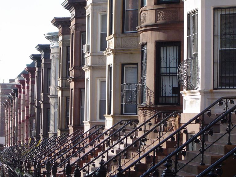
Look how the stairs jut out into the street. There is what: six feet taken by the stairs alone here? If you add another six feet for stairs for houses on the opposite side of the street, you get 12 feet — the typical width of the Really Narrow Street — consumed by stairs alone! Hypertrophic.
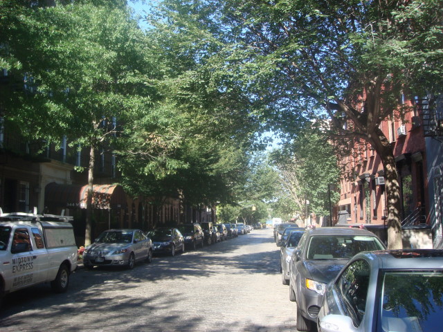
The typical street where brownstones are found. Wide enough for two lanes of traffic, plus two lanes of parking on either side, plus two sidewalks, plus twelve feet of stairs. About fifty feet all together — three times the width of a Really Narrow residential street! I told you this stuff is Hypertrophic. Not real cozy either, despite the addition of trees. Here we begin the process of trying to compensate for the excessively wide, unpleasant roadway with early forms of Green Space. I think the addition of the big stairs was also an attempt to create a sort of “buffer” between the living spaces (houses) and the increasingly human-incompatible roadways.
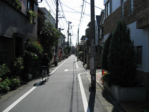
Here is a typical residential street in the downtown Meguro district of Tokyo. It is about 13 feet wide. No cars. See how it is comfortable and cozy? We don’t need a “buffer” here.
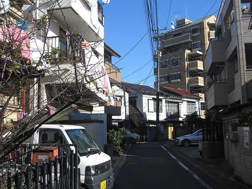
Another typical Meguro residential street.
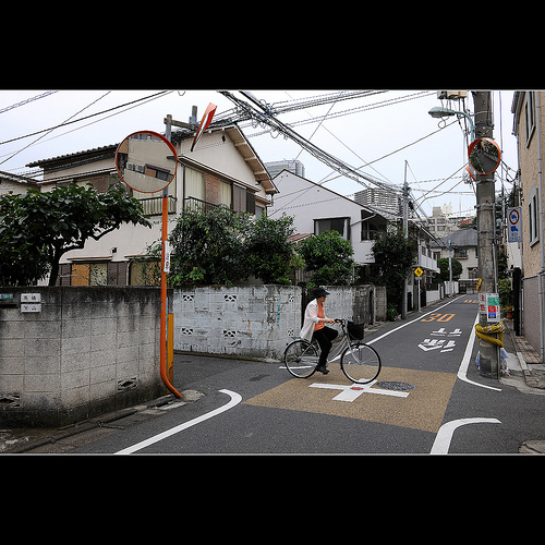
Biking around Meguro. No cars. Note that she is right in the middle of the street. It’s a human-friendly place.
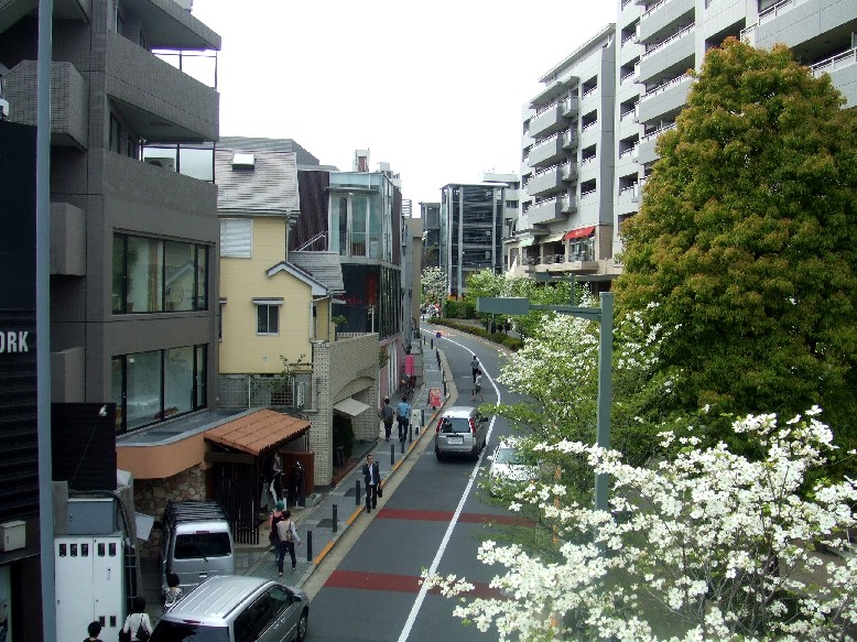
This is what I mean by a larger street. Two dedicates lanes for automobiles — hardly used. Sidewalks. Even this larger “arterial” street is narrower than the narrowest streets in the 19th Century Hypertrophic City. Daikanyama district, central Tokyo.
Along with industrialization, in the major U.S. cities, came a huge wave of immigrants, both from foreign countries and also U.S. citizens migrating from farms or elsewhere in the country. This exploding need for housing (mostly cheap housing) with the Heroic Materialist aesthetic of stripped-down functionality translated into rather crude, plain brick buildings. The combination of the excessively wide streets and this sort of crudely functional brick architecture has not aged well. We can look at very simple but beautiful boxy buildings in Florence for example, which could be five hundred years old, and they are fine.
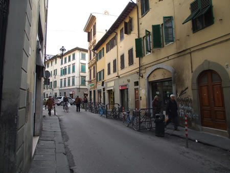
Florence back street. Note that it is Really Narrow. This architecture is pretty simple.
Italy has been an economic backwater for most of the past two hundred years, while the United States was the most successful, wealthiest country in the world. And this stuff is old — very old. But, it’s still presentable, dignified, and usable, while almost all of the United States — 19th and 20th century hypertrophism — is a dump.
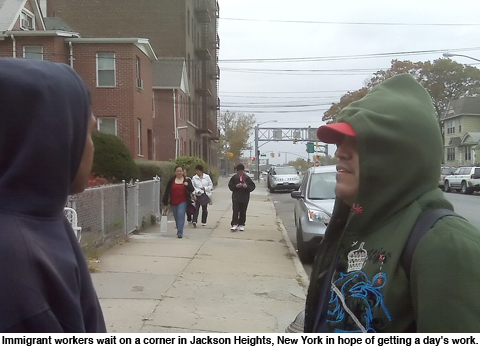
If you leave the part of Manhattan where the beautiful people live, it gets ugly real quick. This 19th Century Hypertrophic stuff just didn’t last. This is what the vast majority of New York City looks like, everything north of 110th street in Manhattan, the Bronx, Brooklyn (most of it), Queens, Staten Island, and also most of every other 19th Century Hypertrophic City in the U.S.
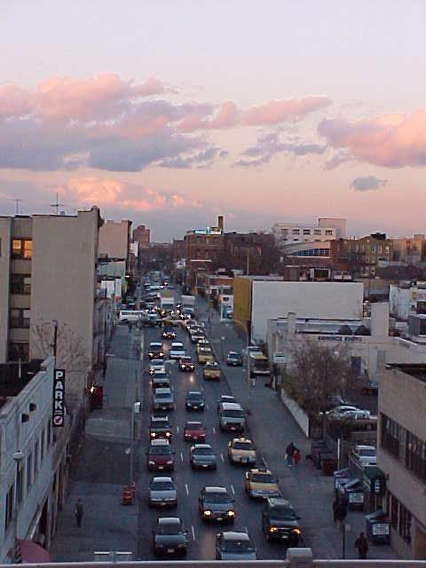
Queens, New York.
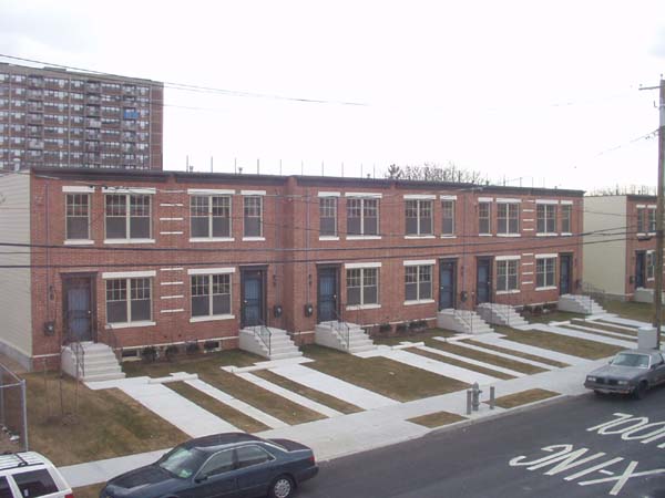
OLYMPUS DIGITAL CAMERA
This is such a collection of bad ideas I just had to throw it in. Queens. But, if you lived in Queens, you would want a buffer between the horror of Queens and your living space, right? There it is, in the form of the Big Stair and of course the Green Space.
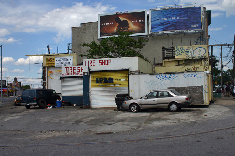
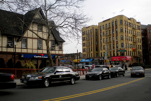
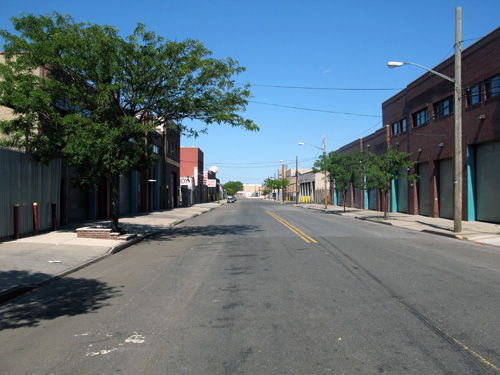
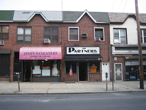
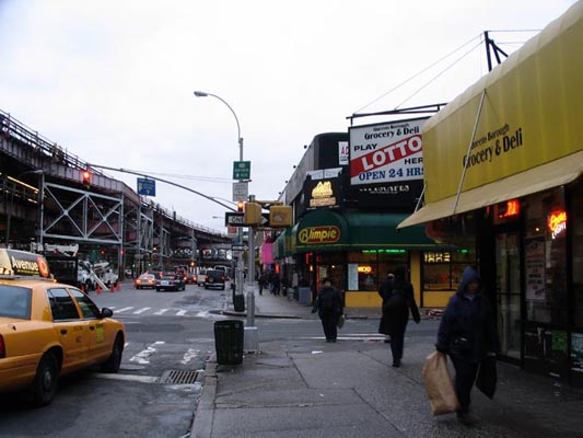
Ain’t New York grand?
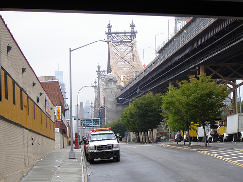
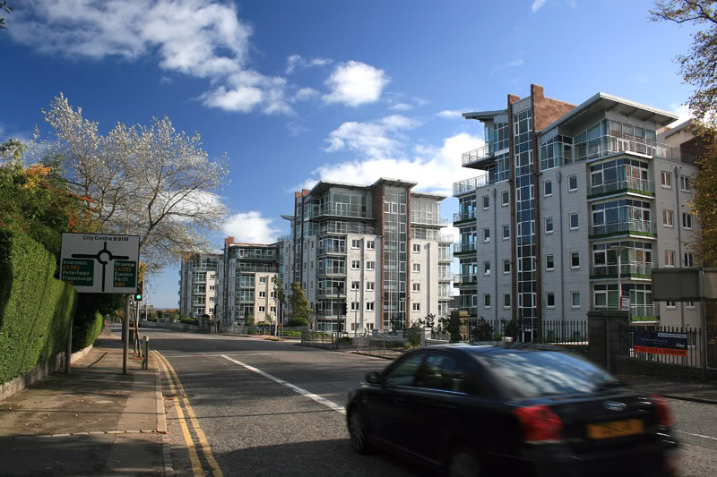
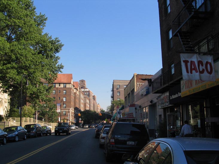 \
\
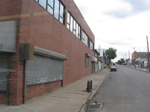
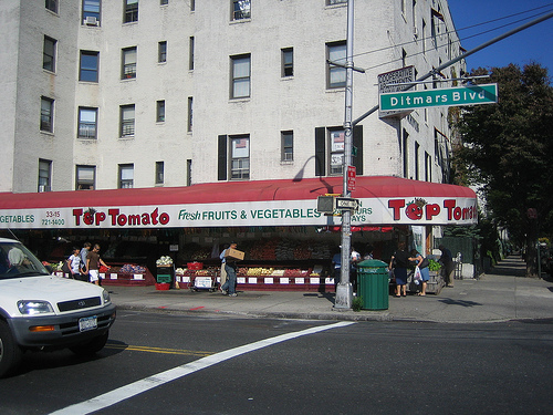
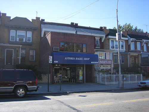
Makes me want to move to the suburbs just looking at it.
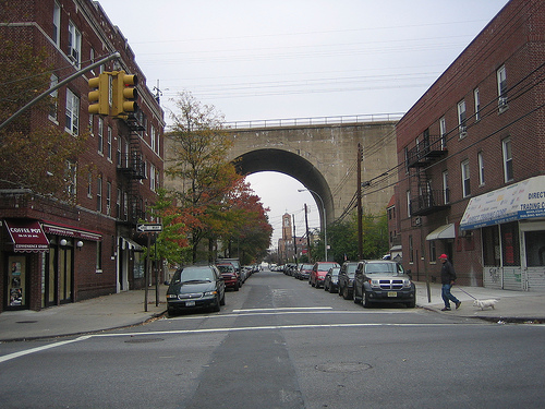
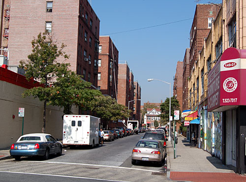
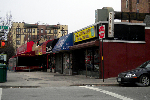
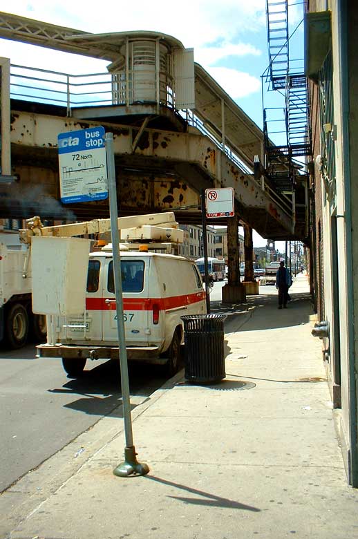
Just so we aren’t picking on New York too much, here’s a typically crappy corner of Chicago.
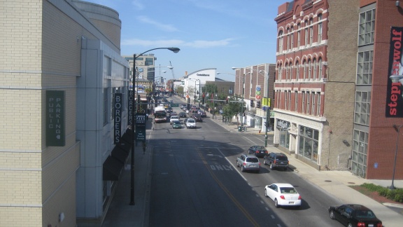
More Chicago. See what I mean about being unfriendly to humans? Gimme some Green Space, please!
Let’s try to imagine what life was like in the 19th Century Hypertrophic City, in the U.S. in the 19th and early 20th centuries, before the burst of suburbanization after WWII. We’re cataloging the failures here so we can understand why Americans generally dislike cities. They should dislike them! They stink!
In addition to these basic design flaws, the 19th century period was very difficult. The cities were deluged by a flood of immigrants, from other countries and also other places in the United States. There was a flood of blacks from the South in the decades after the Civil War, for example. Unlike perhaps France or Japan, where there was an established culture, expectations of behvior, a community spirit, and a long history of successful urban living, this was a mishmash of humanity tossed into a city environment that was basically flawed to begin with. They had all the problems we associate today with poor immigrants and cities, particularly crime and a sort of bleakness and lack of any shared cultural endeavor. Like a bunch of rats in a box. We can add to this some of the problems of early industrialization, such as the everpresent black coal soot, exploding populations, overtaxed sanitation services, and all the depradations of early industrial capitalism. Sixty-plus hour workweeks in some steaming industrial hell. Child labor. Debtors prisons. Dickensian? Yes, it was exactly what Charles Dickens was writing about.
We in the U.S. have no experiences except for these. We have a failed 19th Century Hypertrophic model, exacerbated by all the other problems of that time, and then a failed 20th Century Hypertrophic model, either Suburban Hell or its high-rise equivalent.
If you don’t understand the problems with 19th Century Hypertrophism, you are bound to recreate them. 19th Century Hypertrophism is closer to the Traditional City than Suburban Hell, although not very close, so it is common to find that people who are fed up with 20th century Hypertrophism, such as the so-called “New Urbanists” (really New Suburbanists) tend to migrate toward a 19th Century Hypertrophic ideal. This is ultimately a failure, although not so much of a failure as Suburban Hell.
Try this article for example:
Ideal Living Magazine: New Urbanism Communities Herald A Return to the Small Town Atmosphere of Old
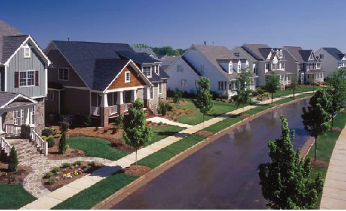
This is a photo from the article. Yes, it looks just like the Small Town America of Old. We looked at that a few months ago. This is exactly identical to the 19th Century Hypertrophic Format, Small Town edition. It is also identical to the Suburban Hell format — because, for the residential areas, they are the same. Yes, this neighborhood was purposefully designed to be an example of “New Urbanism.” You know we are going to have a good time kicking around the New Urbanists at some point in the future. They’ve been working at this for thirty years, and this is all they can do? Pathetic.
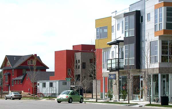
Another example of New Urbanism, from Colorado. Really Narrow Street? I think NOT. This is again a 19th Century Hypertrophic format: an acceptably Traditional building (three stories, right on the street, enticing street-level storefront) combined with a huge Hypertrophic roadway complete with plenty of Free Parking.
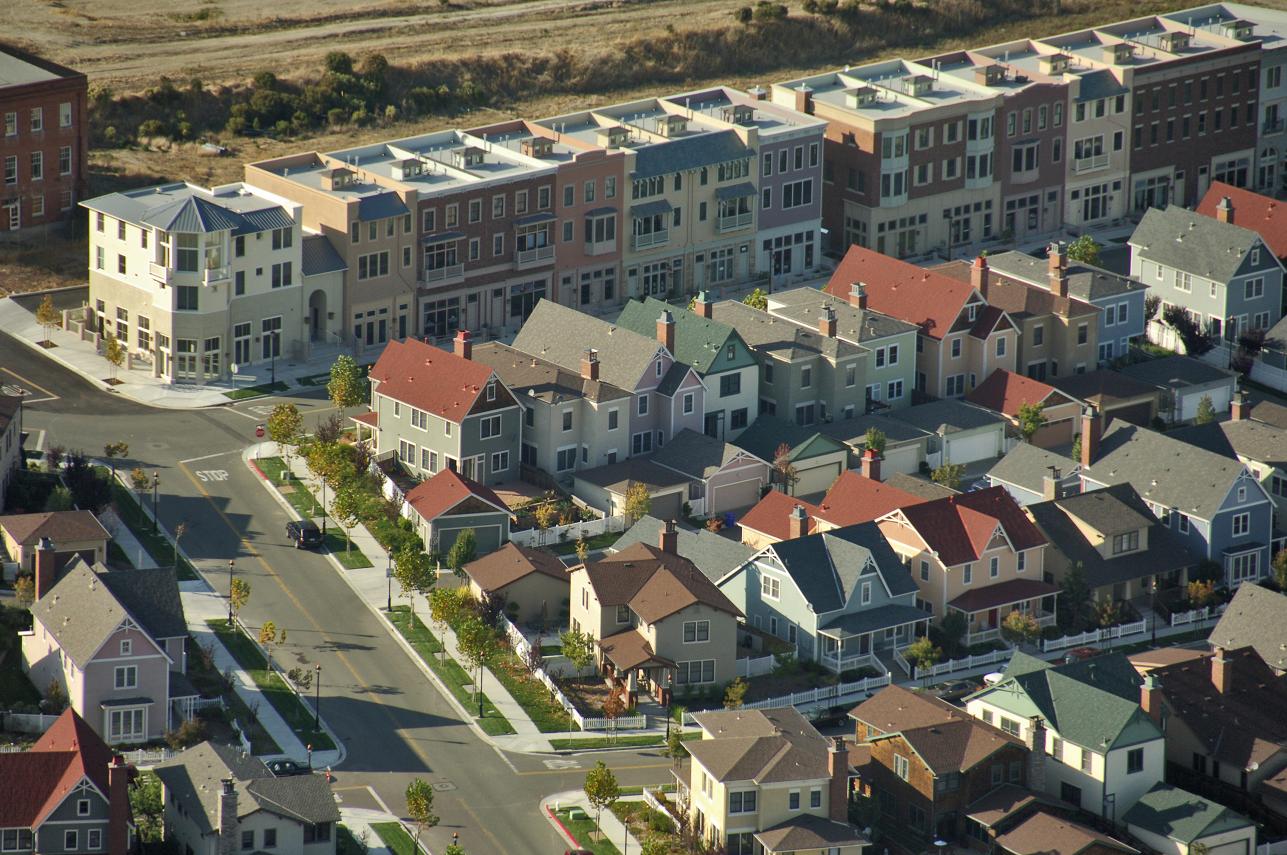
Here we have another New Urbanist project. Once again, it is 19th Century Hypertrophism, straight out of the Small Town America playbook. White picket fences! Note that these are NOT townhouses, a Traditional City format (which can even include a garage on the ground level), but suburban standalone ersatz-farmhouses. In the back, where there should be a yard, there is no yard, but rather a garage! The commercial street is a little better, but once again it is not a Really Narrow Street, like a European commercial street, but a Small Town America commercial street complete with two strips of Green Space on either side. Failure failure failure.
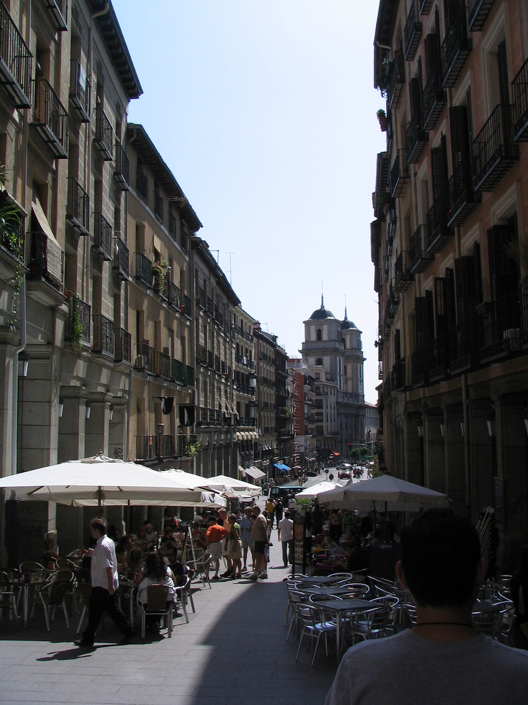
Commercial street, Madrid, Spain. See the two strips of Green Space on either side?
No?
Good.
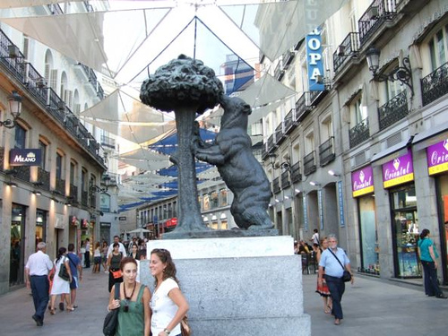
Another commercial street in Madrid.
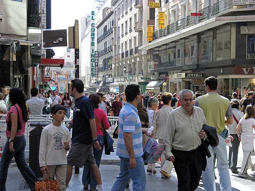
Busy day in Madrid. No cars.
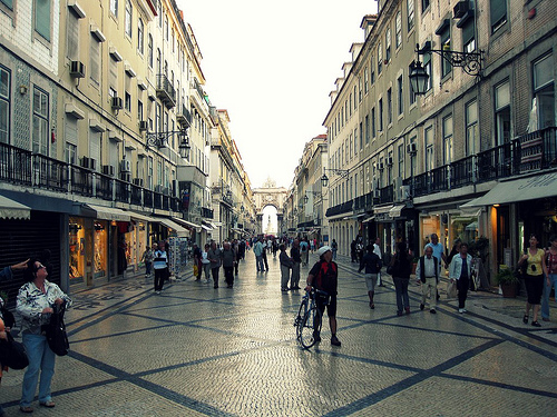
Madrid (looks a lot like Lisbon)
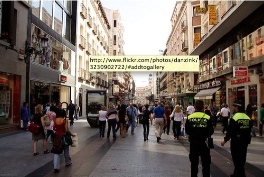
Madrid.
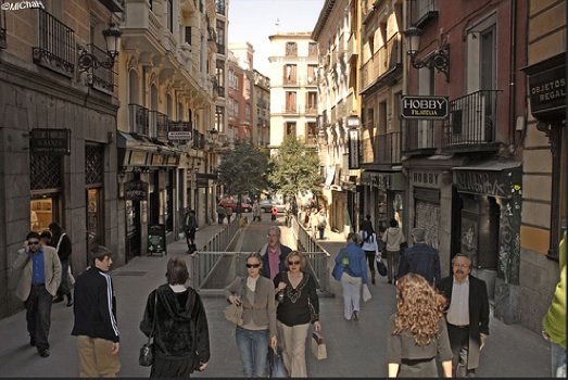
Another shopping street in Madrid.
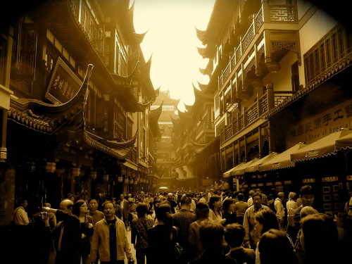
Old Shanghai.
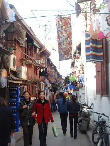
Shanghai backstreet.
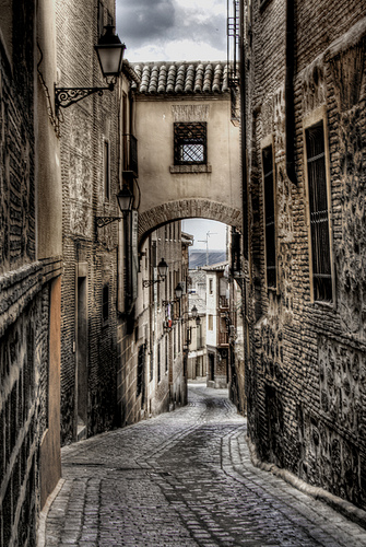
Toledo, Spain. This could be a decent residential area.
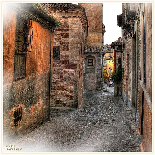
Toledo back street.
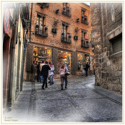
Walking around Toledo.
I hope I’ve burned into your brain by now the differences between the Traditional City and 19th Century Hypertrophism, both in its Small Town America format and also its big-city format. 19th Century Hypertrophism basically doesn’t work, and besides, it’s close enough to the Traditional City anyway that there’s hardly any reason to use it at all. I also wanted to illustrate the problems with 19th Century Hypertrophism so that we could see how they led to 20th Century Hypertrophism, both the high-rise variety and the Suburban Hell variety.
I will leave you with this one photo of 20th Century Hypertrophism, which differs from the Manhattan example by the introduction of mega-roadways and lots of Green Space. While Manhattan is mostly walkable, even if quite a bit more unpleasant than Toledo, we see that 20th Century Hypertrophism is completely hostile to humans aka “pedestrians.”
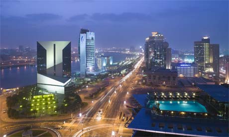
Dubai. How’s that for a mega-roadway? Impressive big buildings, but they are spaced so far apart that the actual land area/floor space ratio is rather poor. Can you imagine walking in a place like this? Me neither.
Other comments in this series:
January 24, 2010: Let’s Take a Trip to New York City
January 10, 2010: We Could All Be Wizards
December 27, 2009: What a Real Train System Looks Like
December 13, 2009: Life Without Cars: 2009 Edition
November 22, 2009: What Comes After Heroic Materialism?
November 15, 2009: Let’s Kick Around Carfree.com
November 8, 2009: The Future Stinks
October 18, 2009: Let’s Take Another Trip to Venice
October 10, 2009: Place and Non-Place
September 28, 2009: Let’s Take a Trip to Barcelona
September 20, 2009: The Problem of Scarcity 2: It’s All In Your Head
September 13, 2009: The Problem of Scarcity
July 26, 2009: Let’s Take a Trip to an American Village 3: How the Suburbs Came to Be
July 19, 2009: Let’s Take a Trip to an American Village 2: Downtown
July 12, 2009: Let’s Take a Trip to an American Village
May 3, 2009: A Bazillion Windmills
April 19, 2009: Let’s Kick Around the “Sustainability” Types
March 3, 2009: Let’s Visit Some More Villages
February 15, 2009: Let’s Take a Trip to the French Village
February 1, 2009: Let’s Take a Trip to the English Village
January 25, 2009: How to Buy Gold on the Comex (scroll down)
January 4, 2009: Currency Management for Little Countries (scroll down)
December 28, 2008: Currencies are Causes, not Effects (scroll down)
December 21, 2008: Life Without Cars
August 10, 2008: Visions of Future Cities
July 20, 2008: The Traditional City vs. the “Radiant City”
December 2, 2007: Let’s Take a Trip to Tokyo
October 7, 2007: Let’s Take a Trip to Venice
June 17, 2007: Recipe for Florence
July 9, 2007: No Growth Economics
March 26, 2006: The Eco-Metropolis

