We’ve been discussing in greater detail some of the characteristics of what I call Narrow Streets for People, including things that work well and things that don’t work so well.
March 8, 2015: Narrow Streets for People
Click Here for the Traditional City/Heroic Materialism Archive
I finished our last episode with the beginnings of a discussion of various subtle ways of organizing the street space, such as the use of paint stripes or different color or pattern street surfaces. We will continue that talk, but first I want to look a little more into the issue of street width, and the various effects that are created at different widths. Previously, we looked at some very, very wide Narrow Streets for People, on the order of 80 or 100 feet building-to-building. Most examples of this very wide (for People) street are probably Arterial conversions, where a street had a typical 19th Century Hypertrophic Arterial format, of a segregated central roadway for several lanes of vehicular traffic, plus sidewalks on either side, plus perhaps some buffer space between the roadway and sidewalk. When this is converted to a typical Narrow Street for People of one flat surface entirely for use by people walking, the result is quite immense and works well only for major commercial destinations with thousands of visitors.
April 13, 2014: Arterial Streets and Grand Boulevards
We also saw some extremely narrow Narrow Streets for People, of under 8 feet wide. This can be quite a lot of fun, but these widths prohibit all vehicles so are probably not appropriate for the majority of streets. Remember, I suggest a rough outline of perhaps 80% of all streets (by length) in a Narrow Streets for People format, so that is a lot of streets. You can have 5% or 10% in the width of under 8 feet, which is quite a lot actually, but that leaves 70%-75% with a wider configuration.
Thus, we concluded that the best range for our Narrow Streets for People tends to be in the 8-25 foot range, perhaps widening out to 40 or 50 feet in a few situations but that should be rare and doesn’t necessarily produce any particular advantages.
Most streets are not going to be major commercial destinations. Most streets are just average streets, with apartments or townhouses where people live and maybe a little commercial activity at street level, mostly for the people who live in the neighborhood. A cafe or convenience store perhaps. Thus, there aren’t going to be thousands of visitors, and you wouldn’t want that anyway because it gets a little old when that’s right outside your apartment window or townhouse front door. Most people want to live in a place that is a little quiet, although it is nice to have a bustling commercial street within perhaps a five minute walk.
My point here today is to be careful not to make a street to wide, especially if there is no reason to expect thousands of visitors. It doesn’t take much width at all before a street can begin to feel “barren” and “empty,” and thus rather forbidding and uncomfortable, which is not what we want at all in a street For People. This can begin to happen even at widths of twenty feet.
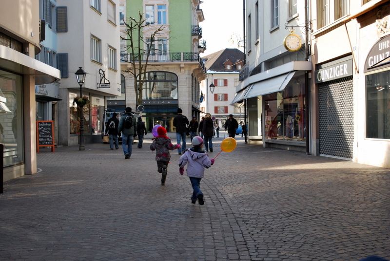
Here’s a street in Switzerland. This is a fairly successful result, but we are on the edge here of getting that “big blank expanse of unpleasant pavement” effect. The width here is about 25 feet I’d guess. I’m suggesting that for this street, a light-use commercial street with perhaps some apartments above, the designer might be better off if the street was about ten feet narrower.
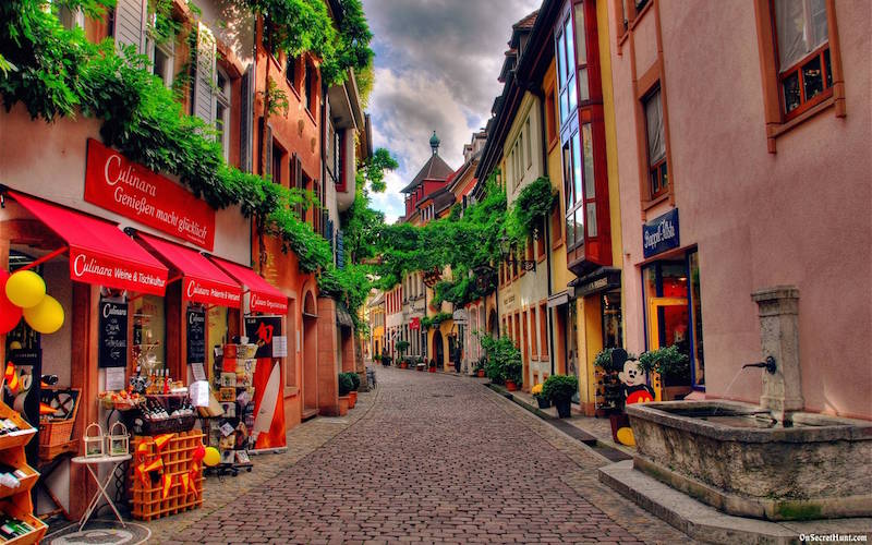
For example, like this. This is Freiberg, Germany. The width is perhaps 15 feet. Doesn’t that feel comfortable and pleasant in a way that the upper street does not? Here we also have quite a lot of greenery, used to wonderful effect. However, this greenery (and fountain) is not being used here to compensate for a street that is too wide.
We often find that, when a street is a little too wide for its purpose, that people feel the need to break up and fill in that overly-large expanse of pavement with some kind of filler. This often takes the form of planter boxes or some other greenery, a fountain, benches, or some other filler. While these are good solutions for an overly-large street space, I suggest that it is better just to not make it too big in the first place.
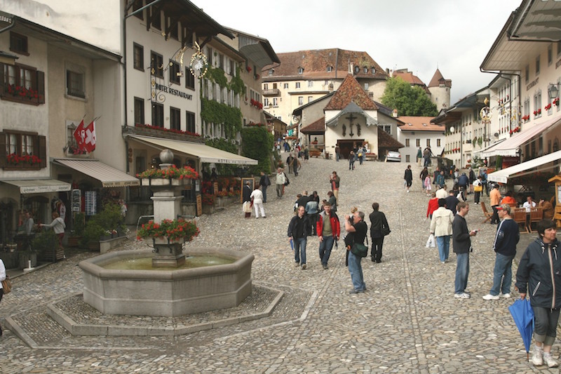
This street in Switzerland is definitely a little wide, and functions almost as a square. However, it is not clearly a square (with a name that includes the word “square,” “plaza” or somesuch), but is rather apparently a street. Nevertheless, the overly-large (for a street) space has been filled in with a fountain. We can sense that if there was no fountain, but just blank pavement, this space would begin to feel quite barren and empty indeed. Note also the use of greenery and planter boxes along the sides. People want a “buffer” from the harsh blank pavement, even if there is no vehicle traffic at all.
“Squares” are a common and often quite wonderful element in cities worldwide. However, they are definitely “squares,” they serve a certain role, and there aren’t all that many of them. You don’t just want to make sort-of-squares by accident because you made the street to wide.
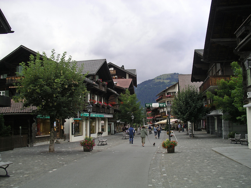
Here is another street in Switzerland. Again, rather wide. Here we have trees and planter boxes, plus benches and lampposts, plus a change of street surface to in effect create a street-within-a-street. Note that this street-within-a-street is about 12 feet wide. What this amounts to is a street of about 12 feet wide, plus areas along the side that function as a sort of super-crappy long skinny park. It is better just to have a proper not-too-wide street, and a proper park, with a name that includes the word “park.”
We also find that, when a street is really wider than it needs to be, the excess area can be filled in with things like outdoor restaurant seating or outdoor vendors of some sort. While outdoor restaurants and markets can be a lot of fun, this is not a solution for everywhere, because there is a need for only so many outdoor restaurants and markets. Restaurants and markets need customers, and there are only so many customers. Restaurants and markets are not just a sort of decorative planter-box that one can throw around here and there to solve the problem of excess street width.
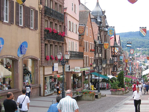
Here’s another example which is very beautiful in many ways; and yet, the street is rather wide. Note the use of planter boxes and benches to fill it up. Imagine how barren it would feel without them. Alsace region, France.
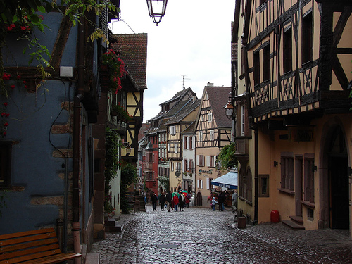
Here’s another example, also from the Alsace region. This is much narrower, perhaps 18 feet. It doesn’t feel blank and barren, and doesn’t need planters and benches to fill it up and break up the monotony.
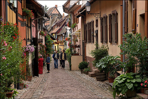
Here is a narrower street, also in France. Planter boxes here too, but not to solve the problem of excess street width.
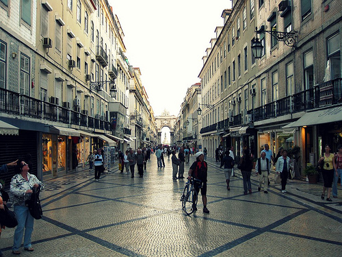
This example from Madrid shows about the widest you can go without starting to feel “too wide” unless you have literally thousands of people to fill it up. The width here is about 25-30 feet I’d say. Although this is quite successful, it might be even better if it was about ten feet narrower. With the same number of people, it would feel more like a “place.”
We also find this tendency toward excess street width in many contemporary developments which are actually modeled loosely on Traditional City examples throughout the world. Many are overtly no-car places, such as shopping centers. But, the “streets” are way too wide.
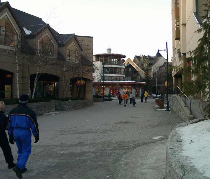
Here’s an example from Whistler Village, part of the Whistler ski resort in British Columbia. It was roughly modeled on Traditional City ski resort towns in Europe.
The pavement here is even rather nice brick. However, the effect is of a barren blank expanse. It looks like about 50 feet building-to-building here. In response to this blank pavement, the buildings themselves have begun to sprout “buffer” elements, such as stairs, ramps, walls of greenery, and so forth — the same elements we often see in strip malls facing a parking lot. If this street was half this width, the architects would sense unconsciously that they don’t have to design to a big blank pavement, so they wouldn’t need all this filler/buffer stuff.
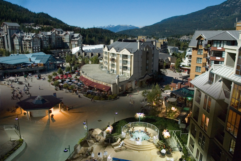
Whistler Village has some funny blank areas. However, there is no clear delineation between “streets” and “squares.” It is not clear if this funny blank area is supposed to be a “square,” or if it is perhaps a sort of very wide street. Note the profusion of “buffer” and “filler” elements. Also note how the buildings have begun to “insulate” themselves from the “street” (or “square”?) area. The outdoor restaurant seating, for example, is well separated from the blank street area. Note that this is explicitly a no-car area.
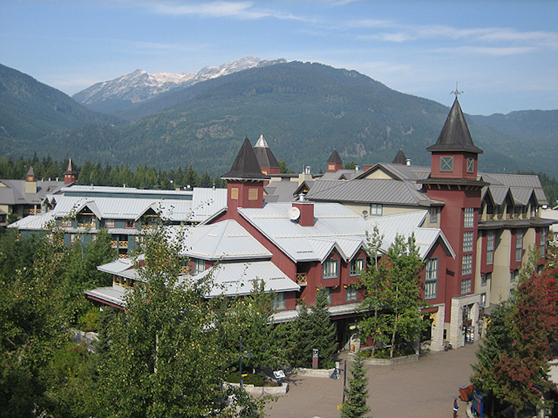
More from Whistler Village. Again, we have excessive street width, and a profusion of buffer/filler elements to compensate.
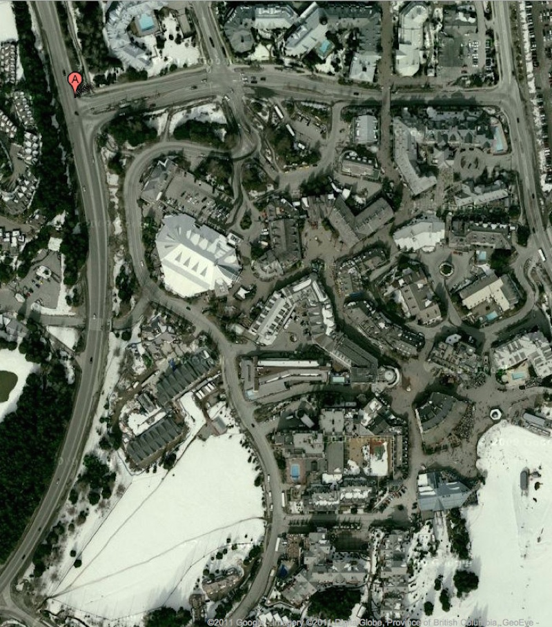
Here’s an aerial view of Whistler Village. Note how we do not have clear “streets” and “squares.” Everything is a sort of amorphous blob. The streets are too wide, and are suggestive of squares. The “squares,” if that’s what you want to call them, are not clearly delineated from the “streets.”
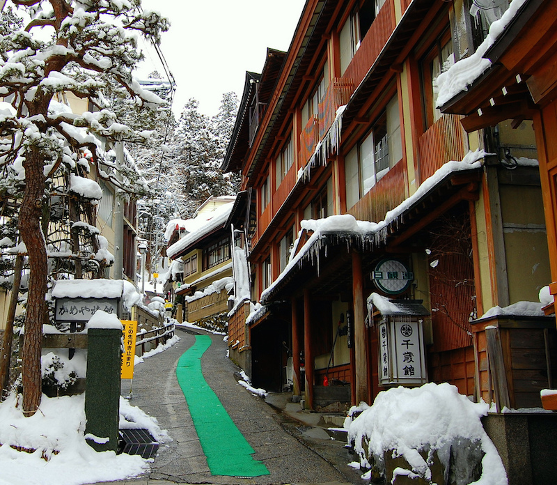
Here is a typical street in Nozawa Onsen, Japan. This is a ski village that is part of one of the largest and best-known ski destinations in Japan. It is about seven feet wide. Here we have some nice trees, but no need for filler/buffer elements. Note how the hotels open right on to the street, without the need to hide behind some kind of wall of shrubbery.
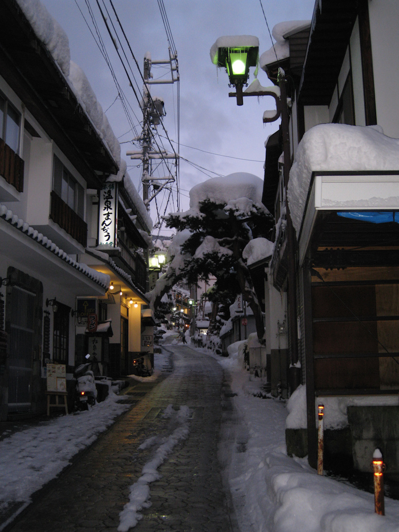
Another street in Nozawa Onsen.
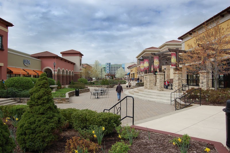
This is a shopping center, and explicity no-car place. However, the area here is very wide. It is not really clear whether it is supposed to be a “street” or a “square” or a “park.” In fact it is none of these: just some disorganized space. The excessive width is filled in with practically an encyclopedia of filler/buffer elements, including very large planters, and outdoor seating which seems very out of place. This place could look something like this:
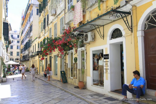
Corfu, Greece.
Here’s a more contemporary, more commercial example:
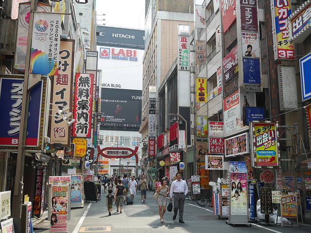
The amount of visitor traffic on this street is probably a good ten times (without exaggeration) what that shopping center would ever see, and yet, this twenty-foot street width is plenty. Shinjuku district, Tokyo, Japan.
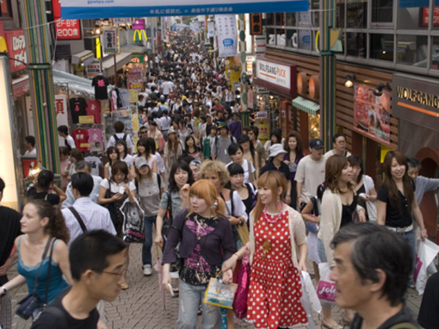
This street in Tokyo is about 16 feet wide. It is obviously a major shopping destination. Yet, despite the huge crowds in this really quite confined area, we do not sense that it is “too narrow.” The shoulder-to-shoulder foot traffic does not seem to discourage people; indeed, they probably go there just because it is so popular! So, it appears that even with literal thousands of visitors, sixteen feet is not necessarily a problem, and might actually be a lot of fun.
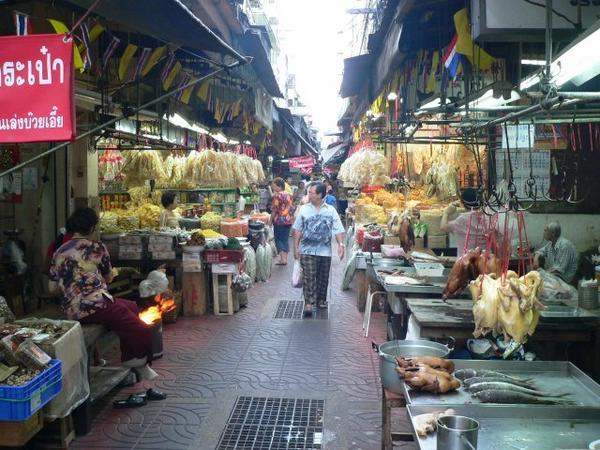
Here we have a market street in Bangkok, Thailand. Obviously, enough people come here for all these sellers to sell their wares. It is a major destination. The effective street width here is about five feet wide. And yet, we do not find this to be terribly unpleasant — an example of what not to do. Rather, it looks like quite a lot of fun! You probably wouldn’t want every street to look like this, but not every street can be a market street like this anyway.
We’ve been looking at bustling commercial areas, in part because people are attempting (with failure) to replicate such environments in new-construction shopping centers today. However, even for a residential street, where peace and quiet is a priority, we find that you can make a street very narrow indeed without any particular consequences, except perhaps that you can’t have a car parked nearby. If anything, a width that makes vehicle traffic nearly impossible (except motorcycles perhaps) has a certain appeal for a residential street.
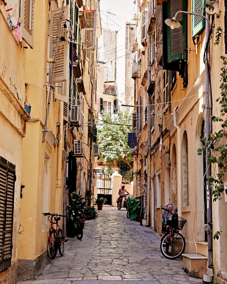
This street in Corfu, Greece is about nine feet wide, and yet it looks like a perfectly pleasant place to live.
So far, we’ve seen that a street can become quite barren and forbidding at widths of over 25 feet, even if there is essentially no vehicle traffic at all. But, true “no-car” places where vehicles are banned completely are rare, and probably should be. In most situations, we will want to allow some vehicle access for things like package delivery, trash pickup, demolition and construction, buses and taxis, and even some personal automobiles. This is the case in most TradCity places in the world today.
We have seen that vehicles and people can get along quite productively in Narrow Streets for People. Vehicles just don’t go there unless there is a specific need to, and even then, they tend to travel very slowly and are not threatening.
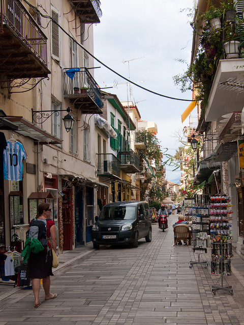
Napflio is an interesting looking city, but we just stopped there for about an hour on our way back to Athens to catch a plane to Santorini
Napflio, Greece.
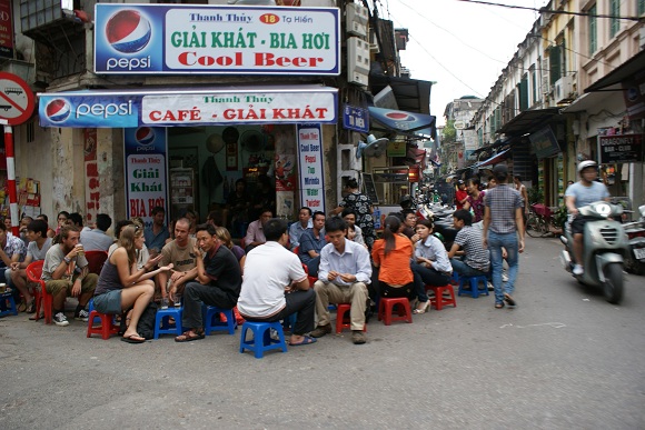
Hanoi, Vietnam.
However, when a street gets a little too wide and there is a lot of open, empty space, sometimes problems can pop up. Vehicles tend to drive too fast; this becomes threatening to walkers, and also buildings on ground level begin to develop “buffers” between the entrances and the possibility of fast-moving vehicles right outside the door. Pretty soon, you have begun to segregate the center roadway for cars, using things like bollards, planters or low curbs, and end up with a sort of proto-Arterial. Once the central section has been segregated for vehicle use, vehicles tend to drive faster and dominate the space.
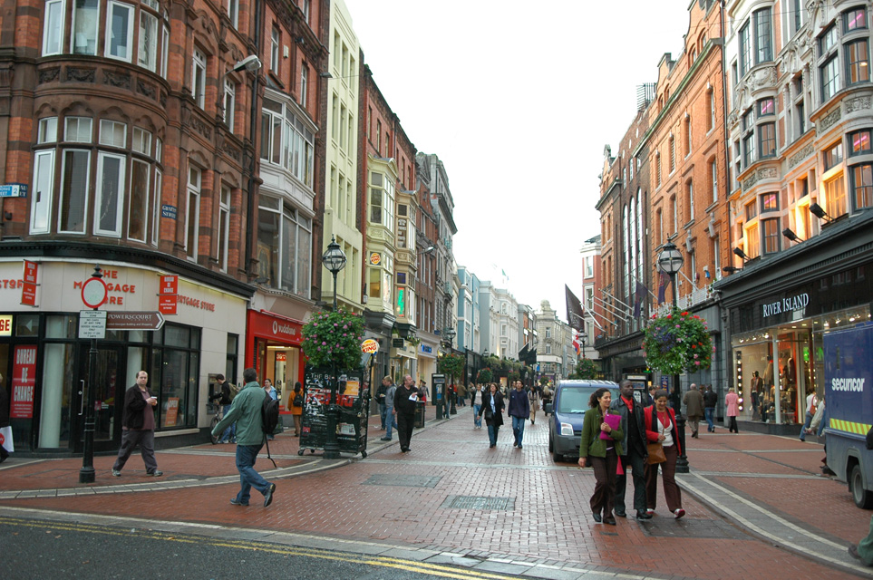
Dublin, Ireland.
We see here in Dublin that the street is, at first look, in the Narrow Street for People format of one flat surface from side to side. And, people seem to sense this and are walking down the middle of the street. However, there is some definite central-roadway segregation here. No curbs yet, but there is a sort of stripe delineating a “sidewalk” and also a line of bollards and trees. This is probably an Arterial conversion, which is why it is actually quite wide, about fifty feet from side to side. For this kind of Arterial conversion, I might suggest a big carproof barrier in the middle of the street, like this:
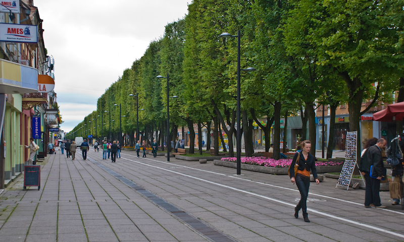
This is quite a large space, about eighty feet from side to side — probably an Arterial conversion. However, the use of the central planters is totally contrary to typical Arterial segregation (even though there is a bike lane marked), which I think would help keep vehicles (there is a van in the background) from being tempted to drive too fast. Bubliai, Lithuania.
Anyway, the point for today is that if you make your street too wide, it might tempt vehicles to travel too fast, which then introduces a whole new set of problems. So, just don’t do it. Stay within 8-25 feet.
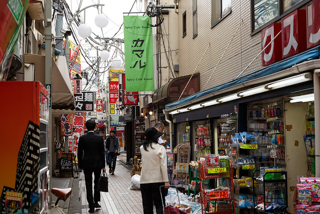
Nakano district, Tokyo, Japan
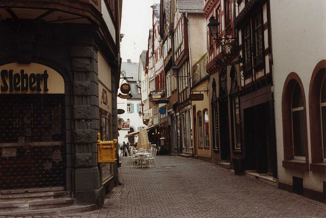
Frankfurt, Germany.
Click Here for the Traditional City/Heroic Materialism Archive

