Narrow Streets for People 3: A Shopping Center Example
March 22, 2015
We’re talking about some of the details of making successful Narrow Streets for People.
March 15, 2015: Narrow Streets for People 2: Subtleties of Street Width
March 8, 2015: Narrow Streets for People
In our first item of this series, we showed that the defining characteristics of a Narrow Street for People were:
1) That it is Narrow: much narrower than the Arterial-style streets common in 19th Century Hypertrophism. These Arterial streets are commonly 60-100 feet from one side to the other, and often effectively larger due to setbacks on private property on either side. This is true even of the quietest residential street. However, the Narrow Street for People is commonly about 10-25 feet wide. It can be larger, even sixty feet wide or more, but this is unusual and, for a street of this format, extremely wide. The term “narrow” is in contrast to typical Arterial widths. As a street For People, 15 feet is not particularly narrow, and is actually about average. 40 feet is very wide. There is really no good reason at all to go beyond 40 feet, but we do find it when Arterials have been converted to For People formats with the removal of the central vehicle roadway.
2) That it is For People. Another defining characteristic of an Arterial is that it has very definite roadway segregation, with a central area for exclusive use by wheeled vehicles, and sidewalks on either side for exclusive use by people walking. Thus, the Arterial is optimized for vehicles. The Narrow Street for People is optimized For People, and is typically one flat surface from one side to the other, as if the entire street surface was a “sidewalk.” Narrow Streets for People often allow vehicle access, but vehicles normally travel very slowly, as in a parking lot for example, because drivers are aware that they are in a place For People. This is not a problem for drivers, because there is typically an Arterial within a quarter-mile or so.
April 13, 2014: Arterial Streets and Grand Boulevards
In the second item in the series, we looked at various examples of street width, and showed how problems can begin to appear rapidly when Narrow Streets for People exceed about 25 feet in width.
I think I will continue that discussion with one more example. It is quite common to find architects (subconsciously) attempting to replicate Narrow Streets for People in outdoor shopping centers, or possibly other “resort”-like destinations like a ski area base village, beach resort or amusement park. These areas are explicitly no-car people-only places, so this should be quite easy, as there is no need to accommodate motor vehicles and all the issues involved. You should be able to make an optimized environment. Yet, we find that most examples are crude failures. The most common reason is that the streets are much too wide.
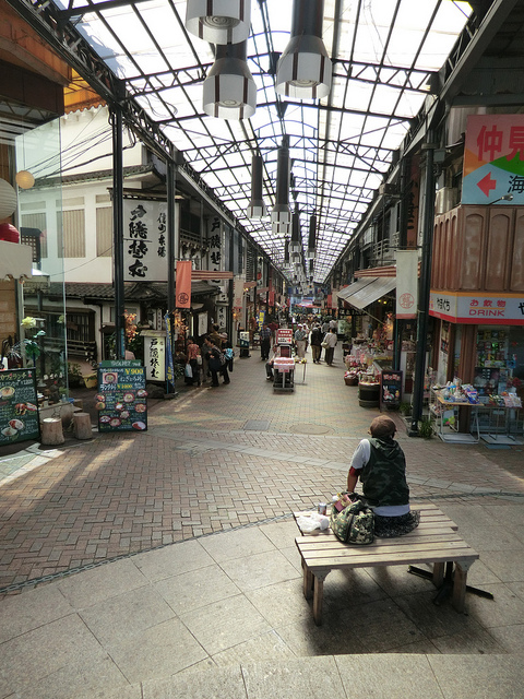
Let’s look at some typical commercial streets in the Narrow Streets for People format:
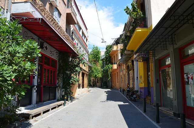
Street in Athens, Greece with shops along the sides.
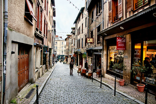
Commercial street in Limoges, France.
We see that, in Japan, Greece and France, despite all of the ethnic and aesthetic and historical differences, the basic format is nearly identical. The street width in all of these examples is almost the same, around 16-18 feet I’d guess. This is the typical Traditional City format that we find all over the world, and which was really the only urban form before the introduction of 19th Century Hypertrophism beginning around 1780.
So, we see that this width produces very beautiful and familiar kinds of places. Especially since there is no need to accommodate vehicles at all, the 16-18 foot width is, for people walking, quite pleasant and roomy. Even for a destination with literally thousands of visitors, or even hundreds of thousands in the case of some Tokyo neighborhoods like Shibuya on the weekend, it is easy to simply have more streets of this format, rather than a smaller number of wider streets.
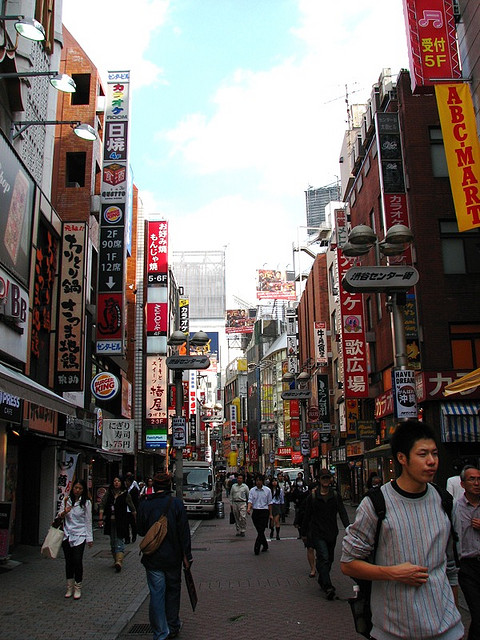
One of many such streets in the Shibuya district, Tokyo.
Now let’s look at a typical example of design failure, the Woodbury Commons outdoor mall, about an hour north of New York City.
http://www.premiumoutlets.com/outlets/outlet.asp?id=7
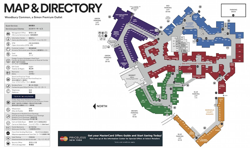
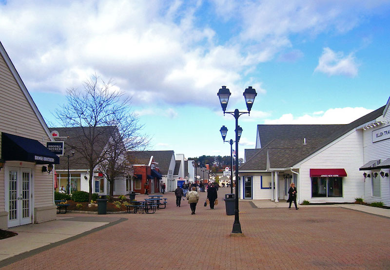
This is not the worst thing ever, and the shopping center seems to be fairly popular. But, doesn’t that seem empty, bleak and barren to you? It does to me — not only in this photo, but in person as well. This is an explicit no-car area, so you can’t complain about that. The problem is that the street is too wide For People. Note how we are getting some attempts to fill in that barren expanse of pavement with some planter boxes and picnic tables, because that amount of featureless pavement is quite unpleasant For People. The width here is 40-60 feet, I’d say. We saw the same problems in Whistler Village.
It could look like this:
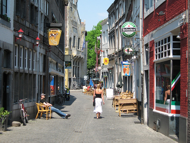
Netherlands.
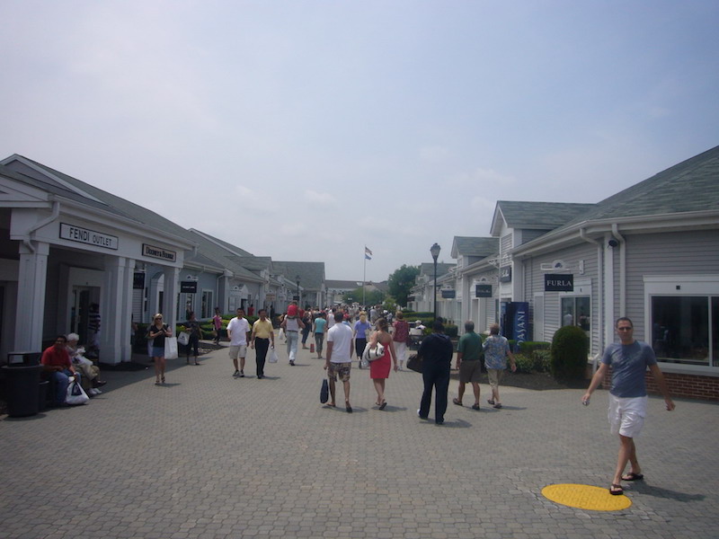
Woodbury. Note the shrubbery used as a buffer/filler along the sides. It is actually about six feet wide.
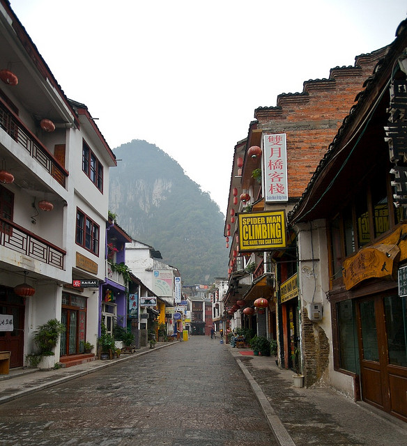
Yangshuo, Guanxi, China.
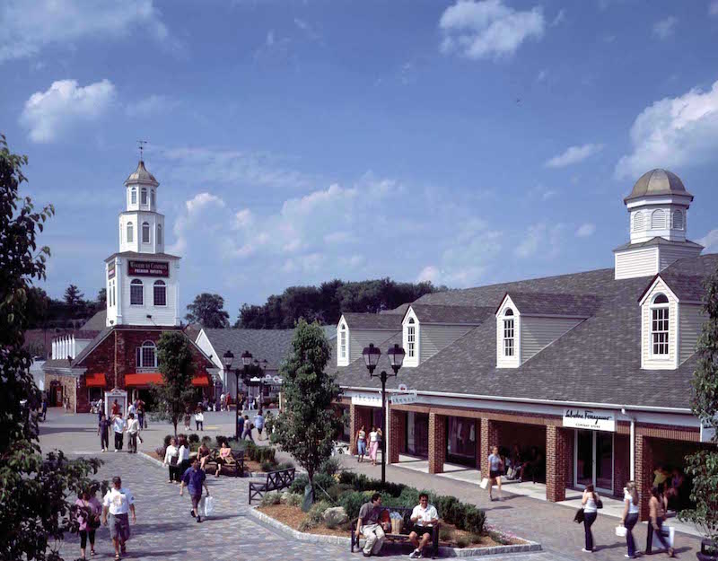
Woodbury. The usual vegetative fillers. Again, we have confusion as to whether this is a “street” or a “square.” That’s because it is neither, just some excess space to be filled in with low-value shrubbery.
Here we have a far more successful shopping center design: Village Square in Burlington, Canada.
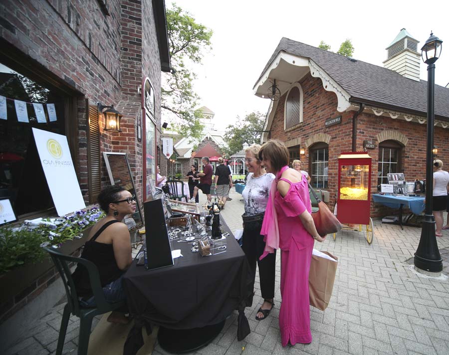
You don’t have to travel to the Netherlands for this stuff, you can just build it yourself in Burlington, Canada. Note how much narrower these streets are.
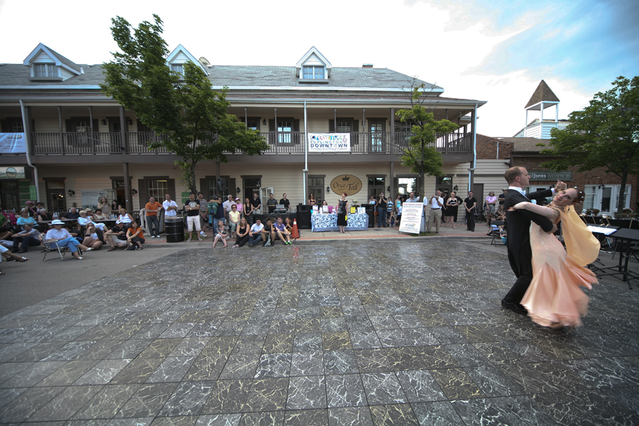
As befits a place called Village Square, there is an actual square, which is an enclosed public event area distinct from streets. This place is very clearly a Square, not a street that’s too wide.
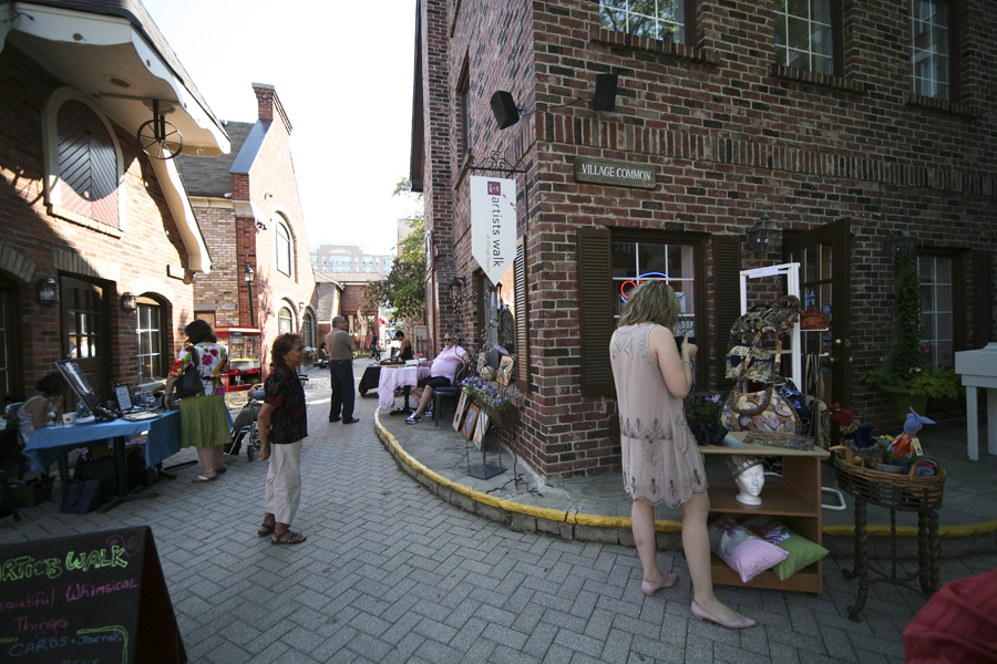
Of all the thousands of shopping centers in North America, this one is so popular for photo shoots that it has its own photo permit page:
http://www.village-square.ca/photo-permits.html
And, it has been used as a movie location:
http://www.village-square.ca/blog/location-location-location
I haven’t devoted a separate item to squares and plazas yet, but a square should be distinct from a street, like this:
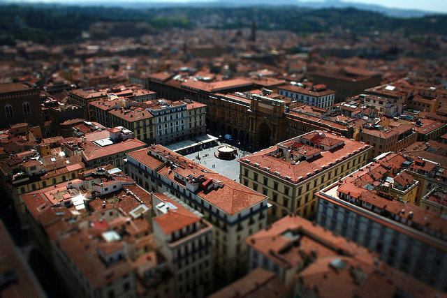
Square in Florence, Italy.
It doesn’t have to be actually square, of course, but it should have a name that includes the word “square,” “plaza” or somesuch. The actual dimensions should roughly approximate a square, overall width and length about the same, not something very long and narrow like a street. And, a square should have clearly defined boundaries, not just morph vaguely into streets and vice versa. You can also have gardens and parks, with lots of vegetation, but they should be identified as a “garden” or a “park,” not just a street that has a lot of filler vegetation because it is too wide.
So, to summarize, if you have the urge to add buffers and fillers like shrubbery and isolated picnic tables, your street is too wide. Just make it narrower. If you want a place that is not a Narrow Street for People, but more of a wide open public gathering spot, then make a Square, Garden, Park and so forth.
Shopping center developments like Woodbury Common are excellent places to incorporate Traditional City design principles. So, do it! Because, you’re going to build something anyway, so it might as well not suck.
November 11, 2012: HTMAPODWTTC 10: Let’s Bulldoze a Big Box Shopping Center 2: No, Seriously
Click Here for the Traditional City/Heroic Materialism Archive

