Parks and Squares 3: Squares
August 16, 2015
We’re talking about public space in the Traditional City that is not streets. Mostly, these are parks and squares. There are a few forms that are not quite streets, parks or squares — perhaps a “promenade” or “boardwalk” along a waterway, which doesn’t quite fit the model of a “street” — but most everything tends to fall into one of these categories easily. There shouldn’t be much that is not one of these forms. If it doesn’t have an identifiable form, name and purpose, what is it? Probably, it is some kind of wasted or confused space, such as “Green Space.” Places for People have names, because it is hard to do anything there if you don’t even have a name for it.
July 26, 2015: Parks and Squares
August 2, 2015: Parks and Squares 2: Smaller and Closer
October 10, 2009: Place and Non-Place
Squares are large public spaces that are not streets, and not parks. Often, they are paved, or mostly paved. There is also a pattern of “squares” that are somewhat parklike, with trees and so forth, but typically the buildings surrounding the “square” open onto the square with their front and main entrance, and typically there is some sort of street also. “Squares” are normally for human use, not for automobiles. Often, there is a pattern of large Arterial or Grand Boulevards converging on a “square,” such as Times Square in New York which at the confluence of Broadway and Seventh Avenue. But, it is common for these large open areas at the intersection of large roadways to be called “Circles,” which is not a “Square.” This is a 19th Century Hypertrophic pattern, basically an attempt to have a smoothly-flowing intersection for wheeled vehicles (horse-drawn wagons and carriages in those days). Large wagons with a team of four (or more) horses have a wide turning radius. Also, in the days before automatic electric lights, people wanted a self-regulating intersection.
There is not very much you can do with a “square” or “circle” that is at the confluence of major Arterials and Grand Boulevards. It is what it is: basically, a 19th century version of a freeway interchange. Sometimes, you can close it off to traffic briefly, as is the case for Times Square on New Year’s Eve. But, the fact that people want to drive on Broadway and Seventh in the process of getting here or there will naturally limit the extent to which you can use such a space for people only.
Thus, if you want people to use a square, obviously it should not have an Arterial, or two or three, running into it! Rather, like a park, it should be separated from Arterials and all the automobile traffic and noise they generate. The best squares for people are enclosed on all sides by buildings. The borders of the square should be clear. Typically, there is some sort of access street, and where the street opens into the square there is a clear transition between the “street” and the “square.” We often find today somewhat squarelike spaces that don’t have clear borders, but sort of mush into streets or parks rather amorphously. They are never quite “squares,” a destination with a name and a purpose and boundaries, but remain “squarelike spaces” that nobody is quite sure what to do with.
What is the purpose of such a large open area of pavement? Why do people desire such things? I think it serves as an alternative to the relentless Narrowness of Streets for People in the Traditional City form. Arterials and Grand Boulevards are also quite wide, but since they are dominated by vehicle traffic they are not For People, certainly not in the way a proper no-car Square is. Obviously, a square can also serve as a venue for all kinds of events of one sort or another, but in general the main purpose of a square is simply to be a plain open area. It is not a form of outdoor theater space, with daily booked events.
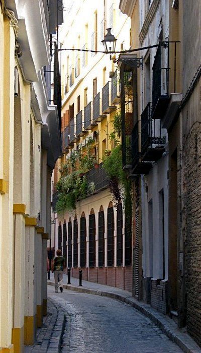
and also the vehicle-dominated Arterials and Grand Boulevards. Seville, Spain.
Here’s a list I found of the “most beautiful squares in the world.” Why not start with the best?
http://www.ucityguides.com/cities/top-10-most-beautiful-squares.html
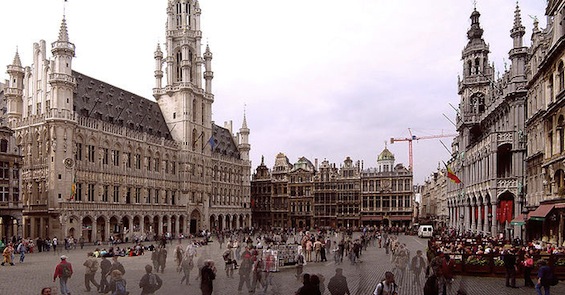
Grand Place, Brussels, Belguim. It is just a big chunk of pavement, in a roughly rectangular shape. Not that complicated. Here, we have a profusion of really stellar architecture, which elevates this place to the top of this list of the most fabulous squares in the world. Note that the square is enclosed by buildings — not surrounded by roadways on all sides — and that there is no automobile traffic here. This is a Place for People.
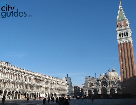
St. Mark’s Square, Venice, Italy. Again, a design so simple a ten-year old could make it, combined with some of the best architecture humans have ever created. No cars. Enclosed.
Forms like this would probably be easiest to integrate into today’s Suburban Hell or 19th Century Hypertrophism, that we have in the United States, by including them (probably smaller size) as part of privately-owned properties like shopping centers, resorts, ski areas, and so forth.
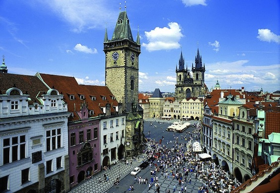
Old Town Square, Prague, Czech Republic. This list has a tendency to focus on very large squares, which you might often find in capital cities. A large state or empire seemed to inspire giantism in squares, as an analogue of the extent of state power.
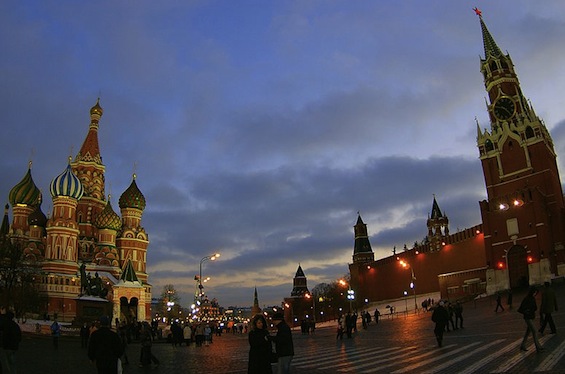
Red Square, Moscow, Russia.
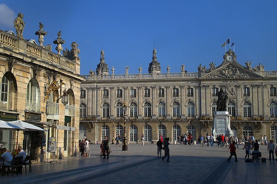
Stanislaus Square, Nancy, France. Just flat pavement surrounded by buildings. No cars, no roadways.
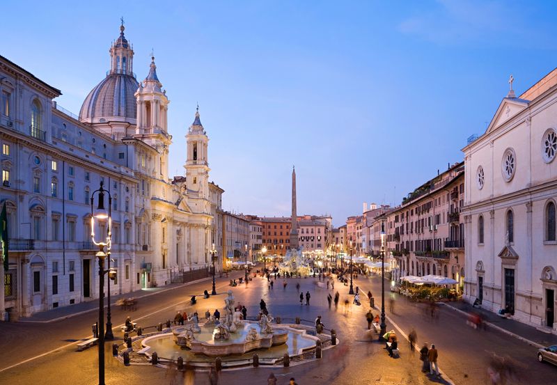
Piazza Navona, Rome, Italy. Known for its exceptional sculpture and fountains. It doesn’t have to be only flat pavement. But still no cars. People only. Surrounded by buildings.
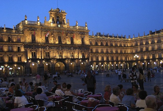
Plaza Mayor, Salamanca, Spain. Surrounded by exceptional 18th century architecture. Once used for bullfights.
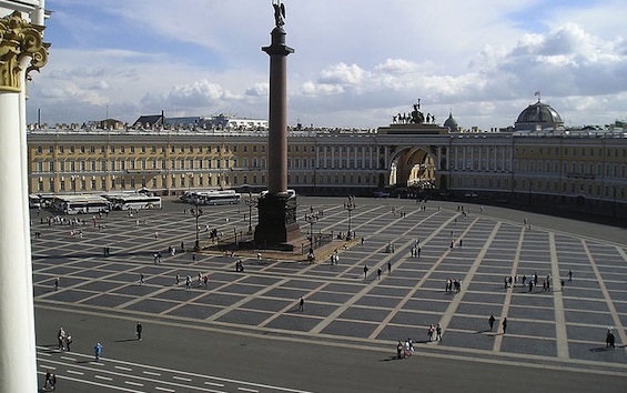
Palace Square, St. Petersburg, Russia. Europe’s largest royal square, reflecting the size of the Russian Empire. Bordered by the Winter Palace, now home to the Hermitage museum. The maximum limits of giantism. This is not so much a Place for People as it is a Place for the Display of Infantry.
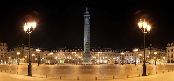
Place Vendome, Paris.
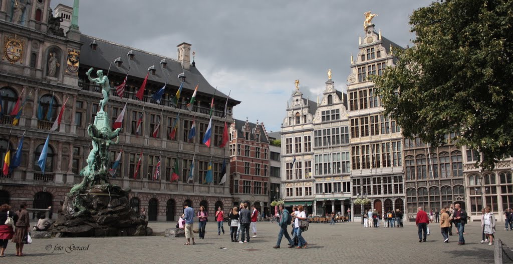
Grote Markt, Antwerp, Belgium. Not so gigantic here, thankfully. Again, no cars and surrounded by buildings, including an exceptional 16th century town hall.
Whew! With all that giantism representative of central state control, I am definitely in need here of some squares that are a bit more cozy and neighborly.
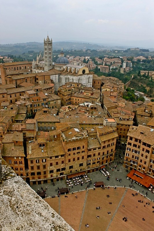
The Piazza Del Campo in Siena has long been considered one of Italy’s best squares. A square is, by its nature, a “negative space.” The “positives” around it — buildings, ideally — give it much of its character.
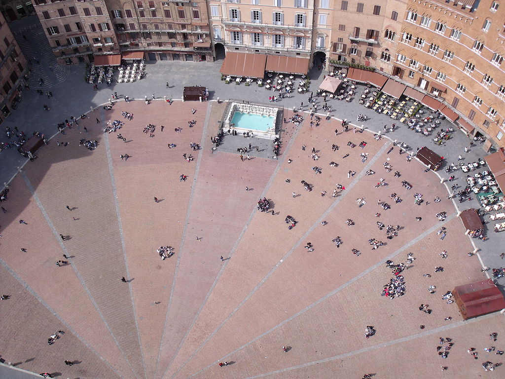
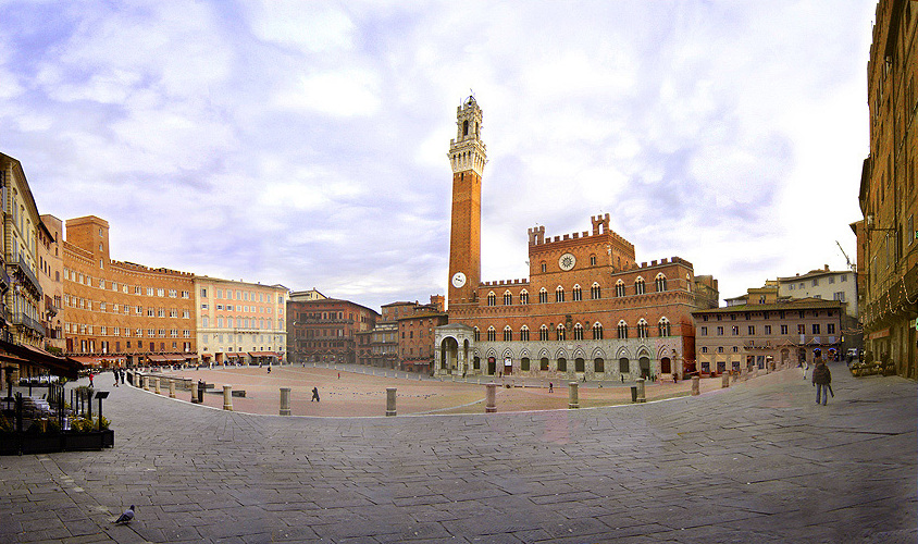
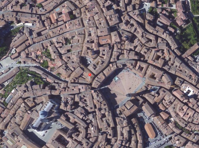
An aerial shot of the same square. It deserves a little study.
I think that will be all for today. We will continue to look at squares, including some smaller-scale squares.
Click Here for the Traditional City/Heroic Materialism Archive

