Corbusier Nouveau 3: Really Narrow Streets With High-Rises
September 23, 2012
We’ve been working on ways to combine our Traditional City design techniques with high-rise construction to make something is far better than today’s typical high-rise neighborhood.
August 26, 2012: Corbusier Nouveau 2: More Place and Less Non-Place
August 19, 2012: Corbusier Nouveau
In our last episode, we concluded that the main problem with high-rises is not necessarily the building itself, but what’s outside the building. This tends to consist of either:
A 19th Century Hypertrophic Pattern of very large automobile roadways in a grid pattern, typified by Manhattan or Chicago.
A 20th Century Hypertrophic Pattern of even larger automobile roadways, approaching (and often exceeding) superhighway size, diluted by large expanses of “green space” and parking lots, exemplified by Dubai.
Also, the buildings tend to be somewhat “monolithic” in character, with blank expanses of stone and concrete at street level, instead of a string of storefronts such as you would see in a Traditional City environment. But, you would expect this when you have to face several lanes of roaring traffic!
Both of these are not very satisfactory, as we now know from experience. One way to understand why they are not very pleasant is to see that both design patterns result in an environment that is a) dominated by large automobile roadways, and b) blank expanses of stone and concrete at street level, both of which are inappropriate and unpleasant for people. In short, they are “non-Place.”
October 10, 2009: Place and Non-Place
In our design, we will use very tall buildings often in excess of 20 stories high, but we will make almost all of our outdoor spaces into “Places” for humans, much like a Traditional City environment. This means:
a) Most streets will be “Really Narrow” pedestrian streets of 20-40 feet wide. There is no segregated automobile roadway in the middle and no sidewalks. Although automobiles and other wheeled vehicles are not necessarily banned, the area is designed primarily for pedestrian use.
b) We will provide a lot of parks, gardens, squares, and other forms of public outdoor space, but no “Green Space.” You know it’s a park if a) it has a name; and b) the name includes the word “park.” These parks should be designed for people to use to relax and recreate, with trees, ponds, bridges and so forth, much like New York’s Central Park.
c) Buildings will have a Traditional City design in their first six stories, including storefronts and other inviting small details at street level.
We adopted a basic land use pattern:
60% building footprint. You have to use the land for something, and if you don’t use it for enormous roadways, parking lots, and “green space,” then you should use it for buildings, parks, gardens and so forth. Mostly buildings.
25% Parks, gardens, courtyards, squares, plazas etc. These are Places for people to go and enjoy.
15% Roadways, broken down to: 80% Really Narrow pedestrian streets (by length), 17% Arterial streets with two to four lanes of automobile traffic and sidewalks, and 3% Grand Boulevards of four to eight lanes of automobile traffic. Because the Arterial streets and Grand Boulevards are wider than the Really Narrow streets, perhaps 33% of total street area (i.e. 5% of the total) consists of streets with a segregated automobile roadway.
Please read the preceding items in this series for more detail on all of these points.
Enough talk. Let’s start designing!
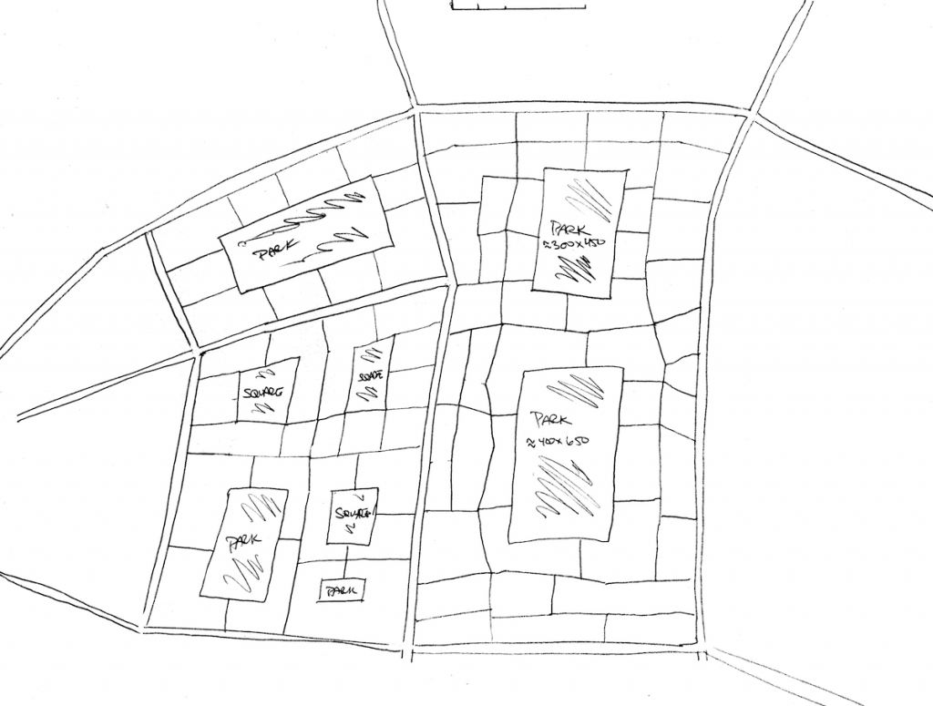
Here is a sample street layout, that I just sketched off the top of my head. The double-lined streets are Arterial streets, probably with four lanes of automobile traffic in a segregated roadway with sidewalks. The simple black lines are Really Narrow pedestrian streets, typically of 20-25 feet wide although some can be 40 feet or wider.
We see that we have some quite large parks here. These are not just flat expanses of mown grass, they should be lovingly crafted to provide a wonderful recreation area for all the people living and working here. Note that we do not surround the parks with automobile roadways. The parks are actually not surrounded by streets at all, the buildings are flush up against the park. (There are streets which access the parks however.) We see that everyone is within a short walk of a large and inviting park, and many people live “on the park” itself. Also, note that the walk to the park is along Really Narrow pedestrian streets, not an automobile roadway, and that you don’t have to cross any automobile roadways to get to the parks.
In the largest block in the center, we see that many buildings do not have immediate access to the automobile roadways. This can be fine in a city with a good subway system, where many people do not own cars. You can still have automobile access to these inner blocks, but perhaps on an intermittent basis such as for deliveries or taxi dropoffs. However, in the United States, in most situations, designers will have to include automobile parking and access for all residents and commuters. Thus, access to an automobile roadway for all buildings is preferred. This is easy to do: you just add a few more Arterial streets such that there are fewer isolated blocks. This is exemplified by the two blocks on the left side. Even with this requirement — each block must be adjacent to an automobile roadway for vehicle access — we find that our design doesn’t change much, and we can still have a land use pattern that is 90%+ Places for People.
Also, on the left side, we have a few examples of public squares instead of parks. These are a little smaller, but can be just as much fun as a location for outdoor markets, public performances, and the like. Paved public squares are an integral feature in beautiful Traditional Cities throughout the world.
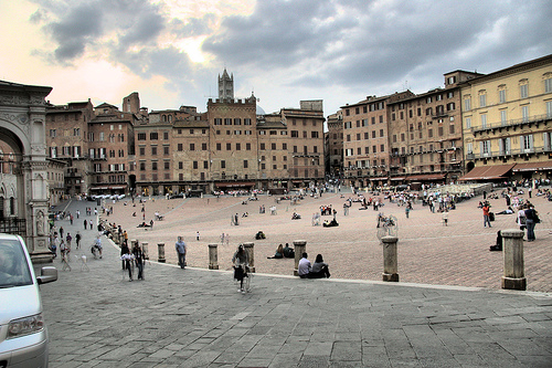
A typical public square in a Traditional City environment. Siena, Italy. Note that the buildings surround the square and open directly to the square. There is no road surrounding the square. Building height is 4-7 stories.
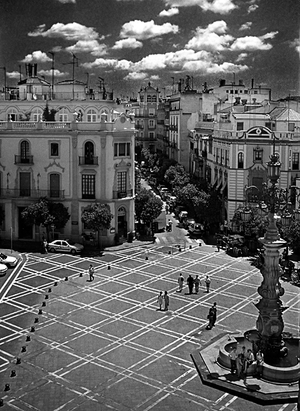
Another nice public square. No cars! Buildings right against the square. Building height is 4-5 stories.
The buildings in this design are quite tall, generally over 10 stories and often 30+ stories. The combination of a high ratio of building footprint and tall building height produces a very high level of density, comparable to Midtown Manhattan. This degree of density is not really necessary in most situations, except perhaps in a few land-constricted places like Hong Kong, but you can do it so why not.
The basic building design is a “pedestal” or “ziggurat” building. The first four to six floors are in the Traditional City style, with lots of detail like storefronts at street level. Then there is a setback, followed by several more stories or even a high-rise tower. For example:
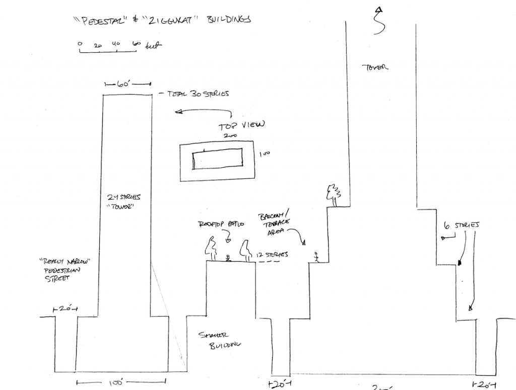
Here we see that we maintain the Traditional City street level consisting of a Really Narrow pedestrian street of 20-40 feet wide and a 4-6 story building height. Then there is a setback, and further height additions of some sort. These setbacks can also become very welcoming patios, balconies etc. for human use, including trees if so desired. Not every building has to be 50 stories high. I also included some “smaller” buildings of “only” 12 stories, which is still actually pretty tall.
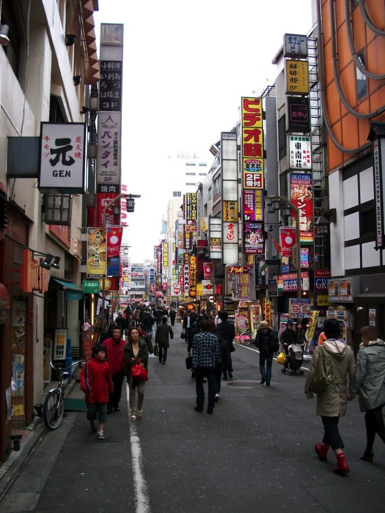
Here’s the sort of thing we’re aiming for. This is the Shinjuku district, Tokyo. The street width is about 25 feet, building height about 5-6 stories, with some taller than that. We’re aiming for generally taller building height, but in a “pedestal” or “ziggurat” format so that the street level actually looks much the same as this. The high-rise part of the building would seem like it is just “way back there somewhere.” We have LOTS of streetfronts and other fun stuff at street level here!
No cars!
If that kind of Asian hugger-mugger doesn’t appeal to you, then you can have something a little more elegant and sedate, like this street in Madrid, Spain:
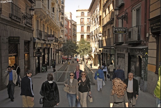
Again we have a street width of about twenty-five or perhaps thirty feet, and a building height of 5-6 stories.
You can have both the hugger-mugger style and the more elegant European style. There are lots of streets. They don’t all have to be the same.
The Arterial streets would be much like the typical Manhattan street, of perhaps four lanes of traffic with sidewalks and storefronts on either side.
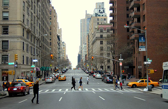
Madison Avenue, New York City. Five lanes here, which borders on “Grand Boulevard” size but you get the idea.
Even here, though, we want to maintain a nice Traditional City-style streetfront no matter how tall the building is. This would be in the character of the Empire State Building in New York City, which has small-scale storefronts at street level.
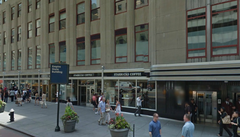
Looks like a very normal sort of Traditional City building at street level. Note the five-story (I said six story before but apparently it’s five) Traditional City-type pedestal at the base. It looks just like any other building from the street. It is NOT a blank stone or concrete wall! Still, you could hugger-mugger it up a lot more at street level. Why not? There are no rules that say you can’t. And, it would be a whole lot more fun.
There aren’t a lot of good examples of high-rise buildings and pedestrian outdoor places used together. However, there are a few which might be helpful. This is a series of photos I took of Wall Street (the real place not the metaphorical one) in Lower Manhattan, and also another port area nearby which has become a pedestrian place.
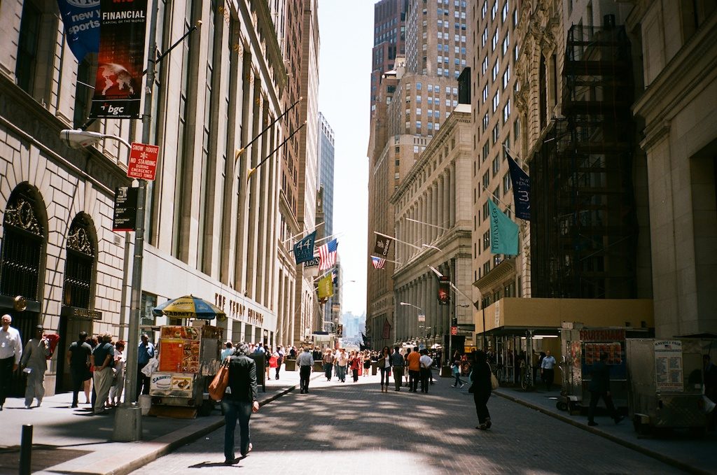
Wall Street, with the Trump building on the left obviously. This street is a lot wider than our 20-40 foot design goal, but it is still a pedestrian place. Also, the building facade is a lot higher than the 5-6 stories of the Traditional City example. These are not “pedestal” or “ziggurat” buildings. In other words, the street is a lot wider and the buildings seem a lot taller (because no “pedestal” design”) — in short, it is Hypertrophic in nature. But, it is still a pretty good result, and very popular with tourists and the like.
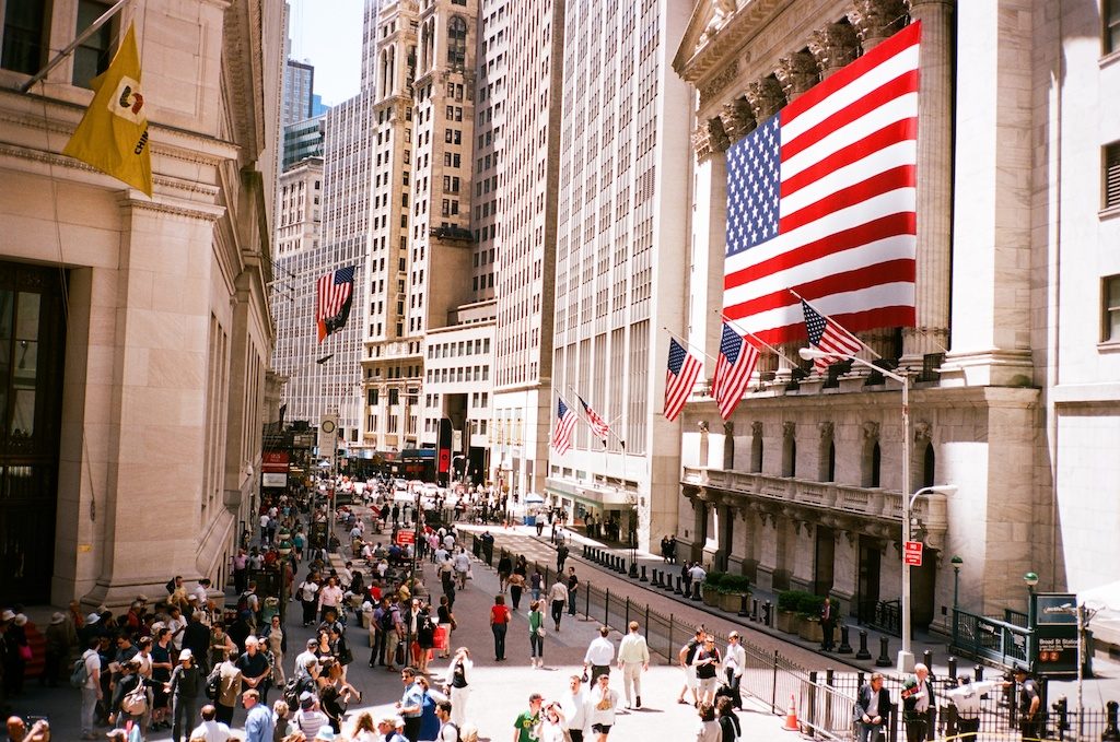
The New York Stock Exchange, on the corner of Wall and Broad of course. The street here is becoming very wide, almost a “square.” Also, we don’t have a lot of detail such as storefronts at street level. there are a few, but we are tending toward blank walls of stone and concrete here. Front facades are much taller than our 5-6 story Traditional City-style “pedestal” design. A very “Hypertrophic” style but still a lot of good things here too.
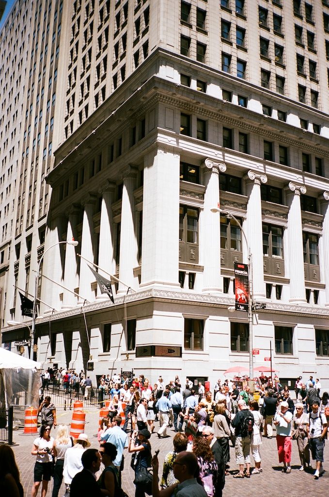
A good example of what not to do. A very Hypertrophic design with blank stone walls at street level. The people seem like insignificant specks. This is medieval castle architecture, designed to withstand infantry assault (or peasant uprising … these are banks after all). No no no! Still, I appreciate the interesting architectural detail. A lot more interesting than the flat-sided rectangles that came later. If they just paid some attention to the first floor/street level, the result would have been a lot better.
These following pictures are from the South Street Seaport, also in Lower Manhattan.
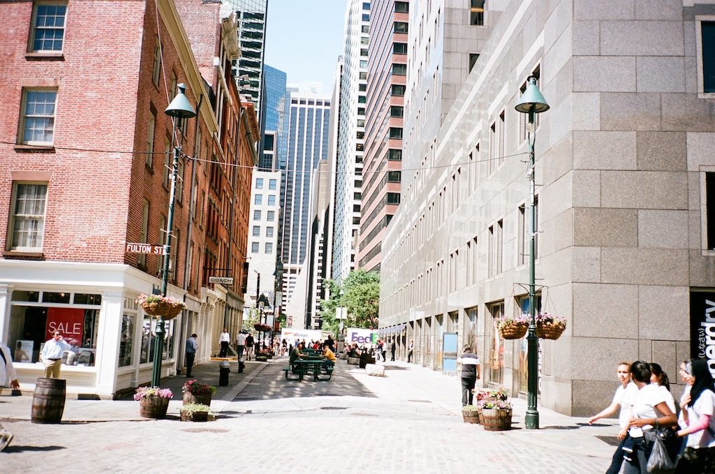
A decent pedestrian street, with a hint of small-scale storefronts at street level and a hint of pedestal-style building design. Could be a lot better. But, it is not too bad as it is. The building on the left is a Traditional City-type building from the 19th century, naturally of 5-6 stories in height and a much nicer set of storefronts at street level. Just do it like that! It’s not that hard. Sheesh. And then build the big tower on top, with a pedestal setback.
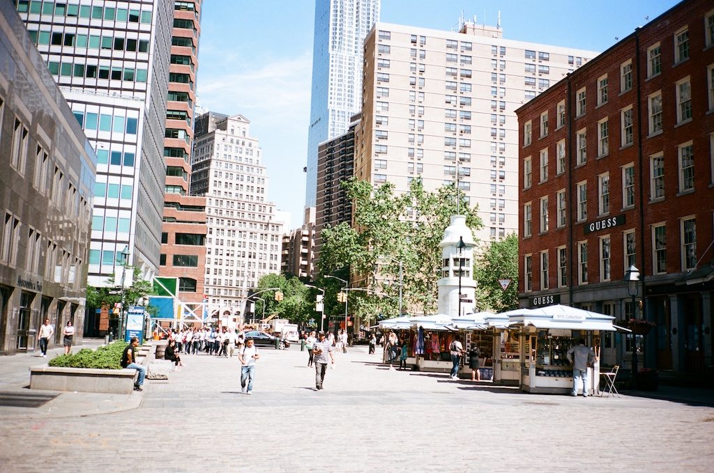
A very wide street here, almost a square.
Another good place to see the combination of tall buildings and pedestrian public places is Raffles Place, in Singapore:
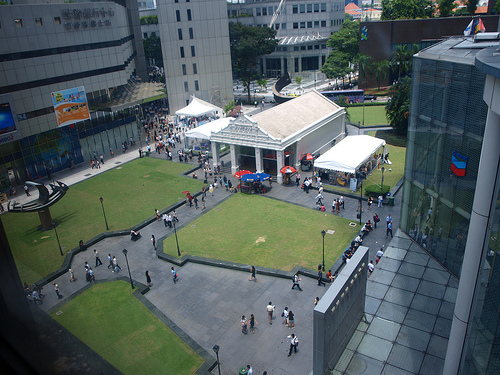
This park/square area is not real big. And, it unfortunately consists mostly of mown grass and pavement. You could do a lot better than this! However, we see some interesting things here. The park/square is surrounded by highrise buildings, but they have some nice storefronts at street level. The buildings are right up against the square, with no street in between — certainly no automobile roadway! It is a popular place, especially during lunchtime as you might imagine. The small building in the center is a subway exit.
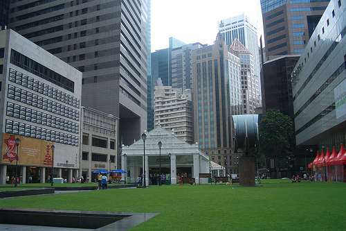
Another shot showing the buildings surrounding Raffles Place. These are some big highrises! But, note the small storefronts at ground level. It could be a lot more interesting, either with a lot more Shinjuku-style hugger-mugger, or with more Madrid-style architectural elegance, instead of these simple monolithic buildings that look like slabs of obsidian.
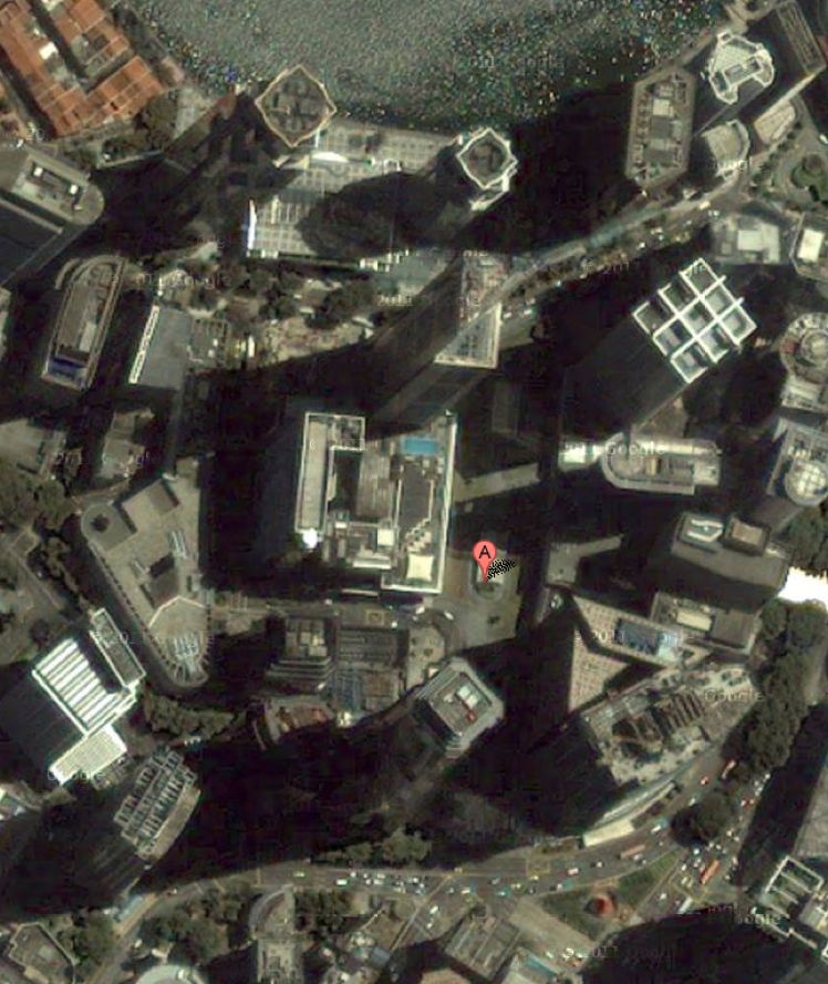
Aerial view of Raffles Place. Note that we have highrises surrounding the pedestrian square, and then some Arterial streets surrounding the block. This is our basic design pattern.
There are a lot of other things you could do, like incorporating both high-rise patterns and Traditional City patters of 5-6 stories high (or less) together. But, this should give you a start in thinking about how to make high-rise architecture that creates much better results than the abysmal junk we have today.
Click Here for the Traditional City/Heroic Materialism Archive

