For a long time, I’ve been asserting that the basic building blocks of the Traditional City are Narrow Streets for People, amounting to perhaps 80% of all streets by length; 17% Arterials and 3% Grand Boulevards. Most of the remainder is private space, in the form of building footprint and outdoor private space such as yards, courtyards, gardens, etc. Also, Traditional City design often includes some parks and squares, which are public spaces for people that are not streets.
Parks are mostly naturalistic (vegetation) and squares and plazas are mostly paved. How much of the total surface area should be given to parks and squares? Many cities are quite successful with very little public open space, notably the classic Italian cities. Venice, to take one particularly extreme example, has hardly any parks at all, although there are a number of squares. Most of what few green areas you can see appear to be private courtyards.
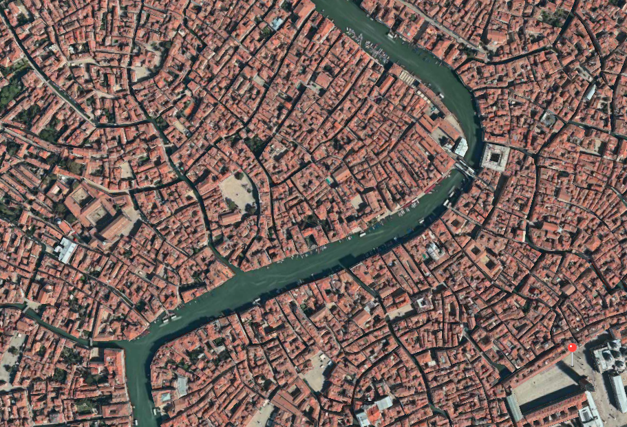
In the case of Venice, the waterways add a naturalistic element, while the fact that the entirety of Venice is both car-free and bike-free means that the whole city is For People, and thus serves something of the role of a park. What we find is that, when a city is beautiful (in practice, this means a lot of pleasant Narrow Streets for People), then people have less need to go somewhere to “escape the city,” whether a park or somewhere out of town.
On the other end of the scale, a large amount of surface area devoted to parks or squares sounds nice, but it means that there is less and less land that is used for building footprint and other urban uses — which is to say, all human activity that takes place outside of parks and squares, mostly living and working. A simple way to think of this is in terms of land value. How much is an acre of prime real estate, in Manhattan, Tokyo, Paris, Hong Kong, London etc. worth to a property developer? This value is what we are giving up by having a park or square, instead of buildings.
Unfortunately, almost all of our urban areas in the United States, from low-density Suburban Hell to the highest-density highrise districts, tend to be rather harsh, ugly and unfriendly to people. By “people” I don’t mean only a male adult in a business suit, but also a mom pushing a stroller, or a four-year-old walking, or a seventy-year-old woman. This tends to exaggerate our desire for parks — somewhere that is comfortable for people, including all ages and genders. This desire is well-founded, but I would caution that it should not get so out of hand that we decide to devote an overly-large amount of surface area to parks. That would result in a very beautiful place where nobody could live, since there is no space to live on. (In practice, it would be expensive.)
As a guideline, I would postulate a rough number of 20% of total surface area given to public parks and squares. We would also have about 10-20% of surface area as streets, and thus 60%-70% as private property, which will also include privately-owned (but possibly publicly-accessible) patios, plazas, gardens, yards, courtyards, and other such outdoor spaces.
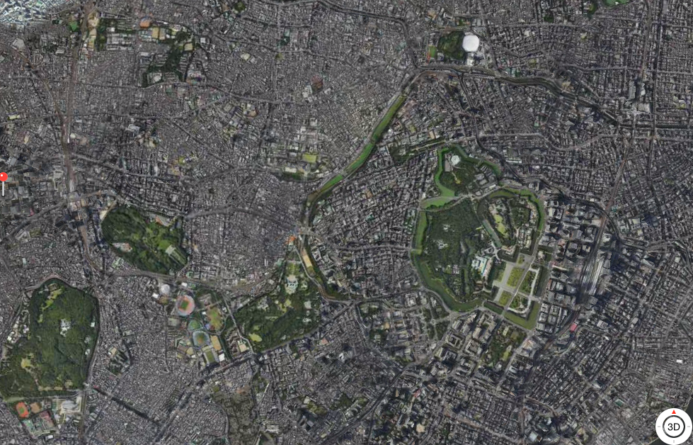
Central Tokyo from above. Note that the Emperor’s Palace (center right) is mostly not open to the public.
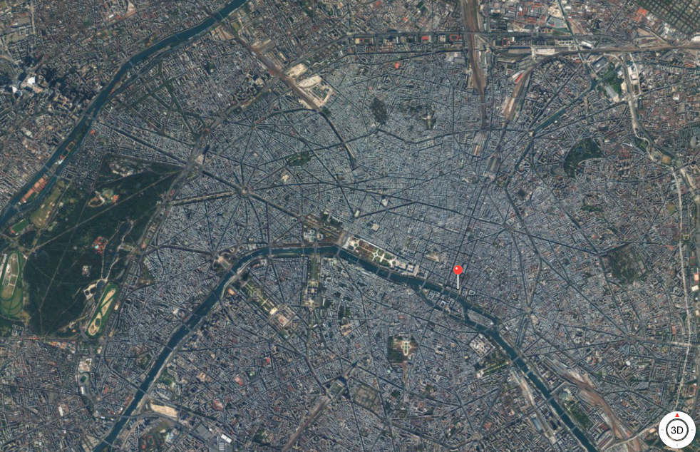
Paris from above. This distance tends to make smaller parks invisible.
As we think about parks, we have to address the really poisonous notion of “green space” which has polluted City Design thinking over the past several decades. The term “green space” is rather fuzzy in general use. In practice, it can certainly include formal parks, but what it really tends to mean is some kind of surface area covered with vegetation that is not a park. If it was a park, then we would call it a “park” and not have a separate term, “green space.”
“Green space” is a new invention. The basic purpose and format of “green space” is to serve as a buffer between some sort of automobile infrastructure (Arterial street or parking lot) and some place where human activity takes place — like an office, residence, or, for that matter, a park. I’ve talked about “green space” extensively in the past. A park is not “green space.” It is a park.
October 10, 2009: Place and Non-Place
I often say that a park should have a name, and the name should include the work “park.” This is only linguistics, but it tends to illustrate exactly what I mean. For example, the rather large expanse of grass in the center of the superhighway offramp is certainly “green space,” but it is not a park, and nobody could call it a park with a straight face. Also, that greenery surrounding the parking lot at WalMart is not a park. We understand that a park is a destination for people, and for use by people. Green space is not a destination (which is why it has no name), and if you actually tried to do something there, you might get arrested.
“Parks” can range from tiny urban “pocket parks” of only a few hundred square feet, up to extremely large wilderness areas, like “National Parks.” Also, parks should be designed, for their intended human use. This “design” might mean leaving most of it in a naturalistic state, like Yellowstone National Park, or, for a small urban park, it might mean a lot of artificial elements like manmade waterfalls and pavement, and precise organization of trees and shrubs. But, it does not mean just a flat square of mown grass. If you could hire Frederick Law Olmstead, the designer of New York’s Central Park, and say: “Fred, we love your recent work, and we want to pay you $300,000 to design our new park,” and he came back with a flat square of mown grass, what would you think? The reason you hired him in the first place was to get something like Central Park, which is quite lovingly and beautifully designed. (A flat square of mown grass is a typical format for “green space”.)
https://en.wikipedia.org/wiki/Frederick_Law_Olmsted
Today, we tend to call these people “landscape architects,” but I sense that that word is itself a problem. I like the word “park designer.” Because, a park designer designs parks. They don’t architect the landscape. I think a lot of “landscape architects” spend a fair amount of their professional time basically fluffing up some “green space,” and wouldn’t really know what to do if they were asked to design a real park.
Urban parks (as opposed to wilderness areas) should have clear boundaries. You don’t just have some sort of vague transition to some other place. Sometimes, you get some greenery which is a sort of filler element, and just sort of peters out. No. A park is a Place, and thus, it needs to have a clear transition to some other place.
I think that parks should be enclosed. In other words, they should not be bounded by streets. You only need one point of access for a park, or maybe a few for a large park, so you don’t need thousands of feet of street frontage, like buildings do. Also, I find it is quite unpleasant to have a park bounded by Arterial Streets full of automobile traffic. And, there is hardly any need to surround a park with Narrow Streets for People, as you can just walk in the park. Thus, it makes sense to surround the park with privately-owned buildings. These can be separated from the park with fences, possibly bolstered by a wall of dense trees and bushes. Or, buildings can possibly open onto the park, something in the manner of the “condos on a golf course” model that is popular today.
I think that it makes a lot of sense to surround a park with high-rise buildings. The buildings should open right onto the park, with no pavement in between. Highrise buildings tend to go well with wide open spaces, such as the very wide Arterial-type streets typical of 19th Century Hypertrophism (Manhattan), for the obvious reason that if you put highrise buildings close to one another, it gets very dim at street level and people’s window views are entirely obscured. I am NOT talking about the “tower in a park” pattern characteristic of 20th Century Hypertrophism (“Corbusier”). The typical problem with that pattern, in the first instance, is that the tower is not in a “park” at all — whatever greenery exists doesn’t have a name, and the name doesn’t include the word “park” — but rather Green Space. (Often, there is no greenery at all, but rather a parking lot.) For one thing, if you were designing a park, you wouldn’t put a tower in the middle of it, but you can certainly put them around the outside.
September 23, 2012: Corbusier Nouveau 3: Really Narrow Streets With High-Rises
August 26, 2012: Corbusier Nouveau 2: More Place and Less Non-Place
August 19, 2012: Corbusier Nouveau
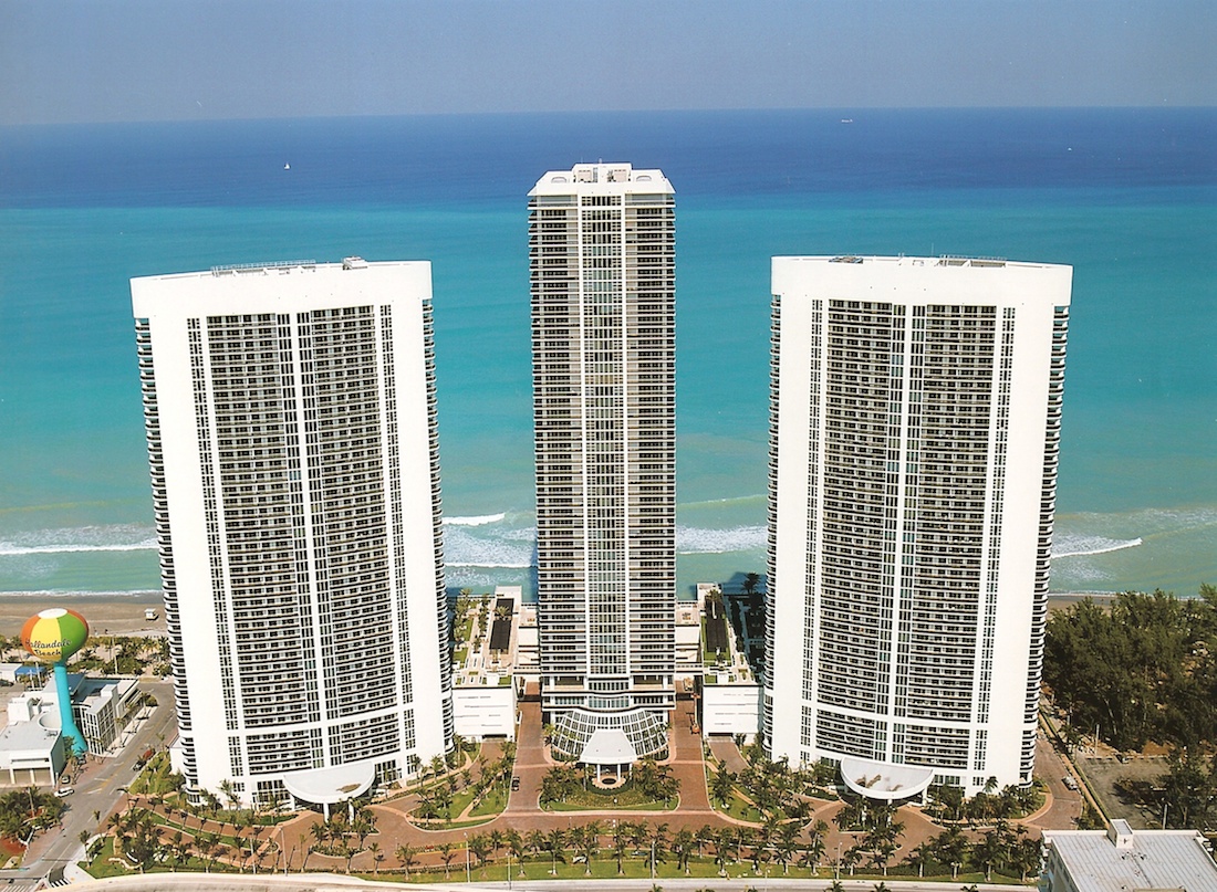
Here we have some highrises in Florida, and some kind of vegetative filler (“green space”) at the base. Would you call that a park? Does anyone who lives there call it a “park”? Does it have a name, which includes the word “park”? Even with thousands of residential units in these buildings, do you see one single person using this space, as they would use a park? Most of it actually consists of rather large automobile roadways — it is not even For People, but for automobiles! I wonder which “landscape architect” is responsible for this useless mess. This is classic 20th Century Hypertrophism. DO NOT DO THIS.
However, you can see that you could take the same land area, and the same buildings, and with the space here wasted on roadways and vegetative filler, make an actual, real-life Park For People, so that a mom with a toddler could just take the elevator down and spend a pleasant afternoon sitting in the park right in front of their building, instead of having to get in their SUV and driving to a real park somewhere.
We get close to what I mean with New York’s Central Park, which has tall buildings all around.
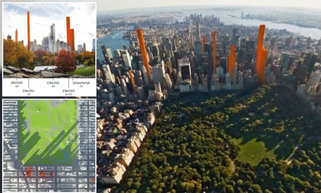
However, Central Park in New York is ringed with large Arterial roadways on all sides. You have to cross a wide avenue of traffic to get from the residence to the park. I find this quite off-putting. Also, the proximity of several lanes of traffic on all sides makes Central Park feel like less of a refuge For People from the noise of the 19th Century Hypertrophic City than it could, especially if you are within a hundred meters of the edge. By surrounding a park with buildings, you create a barrier from traffic noise, and a sense of refuge.
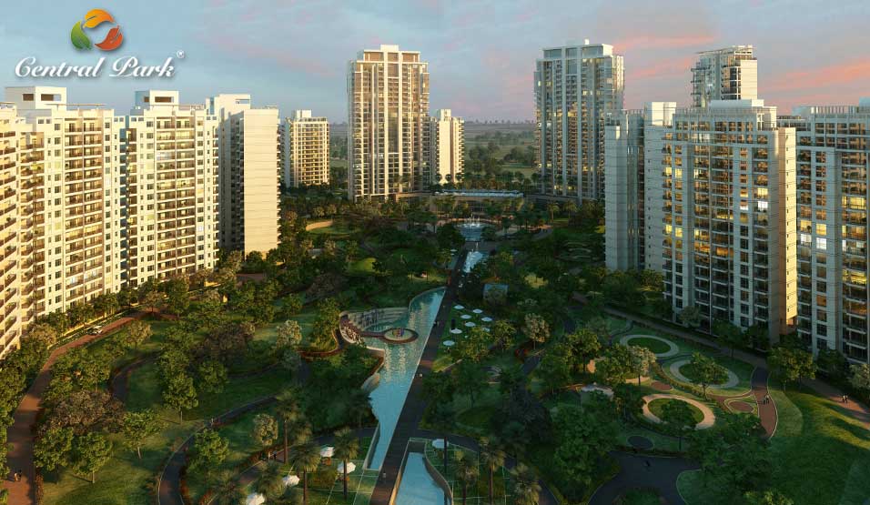
This is much closer to what I mean. This area qualifies as a real park, although I find that it still smells a little bit like “green space” in some of its design details. I wonder if it has a name — a name independent from the name of the development as a whole — and if the name includes the word “park.” Could you take the elevator down and spend a pleasant afternoon here with your toddler? I think the answer is yes. Note how the highrise buildings open right on the park, with no parking lots or roadways in between.
This development is called “Central Park.” It is in New Delhi, India.
You see what I mean? When people use the word “park,” in their names, they just naturally make parks.
In the “don’t do this” file, we also have this:
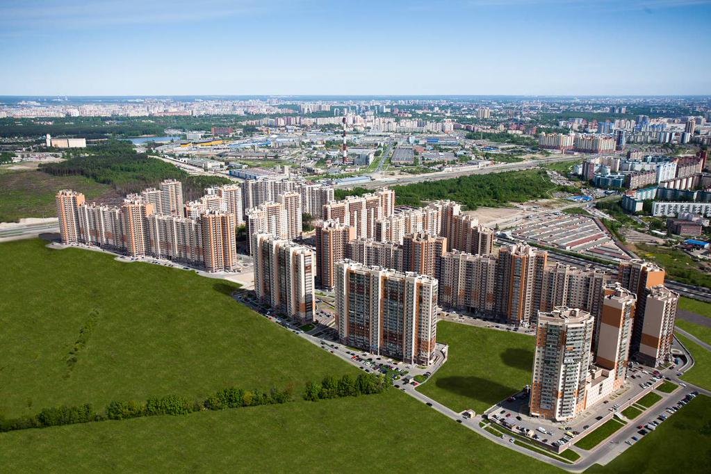
Here we have something that is potentially quite nice, including some big mown grass areas which kinda suggest a park … Alas, we again have the buildings surrounded by parking lots, and the green quadrangles surrounded by automobile roadways. Also, that blank grass can hardly be called a “park,” although it would be soooo easy to get a real park designer and make something of it. I’m pretty sure that blank of grass on the right does not have a name, and certainly not one that includes the word “park.” Also, note that despite being surrounded by thousands of apartment units, there is nobody and nothing in those grassy areas. With a little effort, you could make these areas into something like the “Central Park” development of New Delhi. But, you have to make the effort. This is in Moscow, Russia.
Fail.
Although I am perhaps overemphasizing the idea of highrise towers and parks here — you can also have parks with two-story single-family detached residential developments, and the same basic principles apply — nevertheless, let’s look at another example. This is the Gubei Gold Street project in Shanghai:
http://landscapevoice.com/gubei-gold-street-黄金城道步行街/
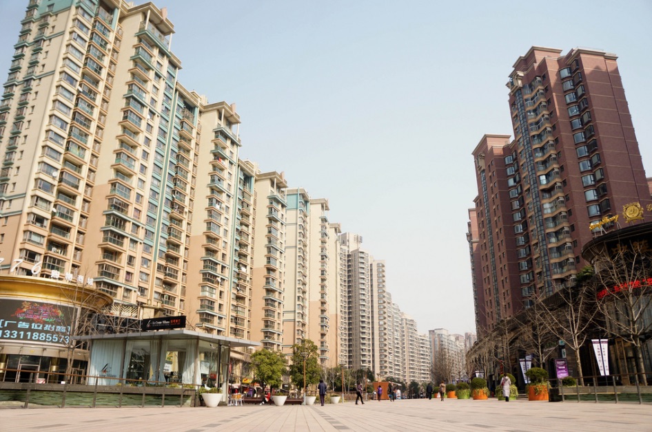
Here we have some highrise buildings surrounding a people-only space … which is sort of parklike …
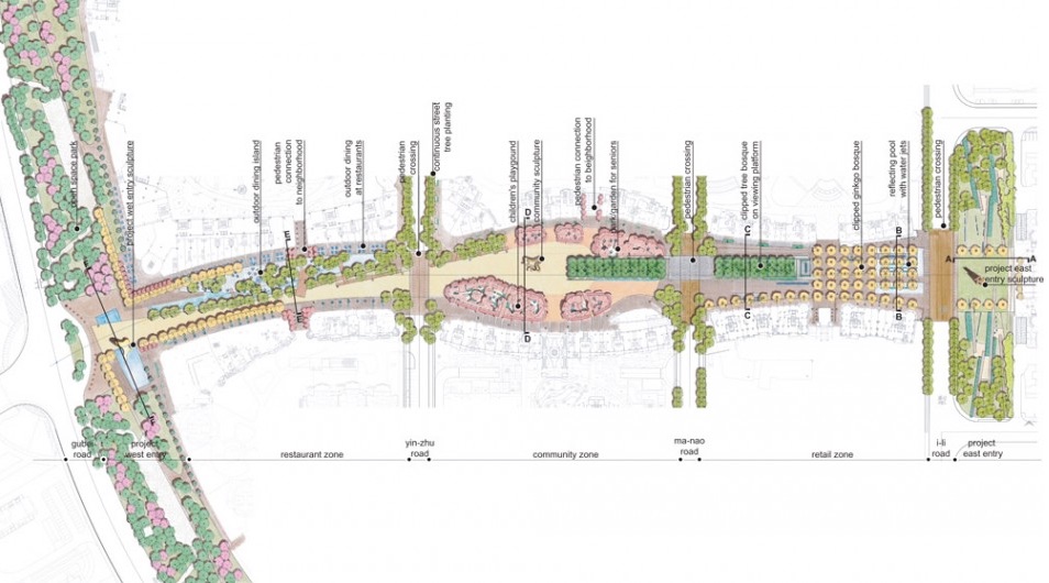
But, it is not actually a “park.” We know this because they don’t call it a “park,” they call it a “street,” namely, Gubei Gold Street. They also call it a “promenade.”
This area is not really a street … not really a square … and not really a park. Although the overall result is generally much better than a lot of other examples I could identify, there is a strong sense of “just filling up the space with pleasant stuff” that I get here. If you just made it a park, and called it a “park,” somewhat like the Central Park development in New Delhi, I think you would get a better result. I suggest “Gubei Park.” And you could even promenade (verb) from one end to the other, if you like.
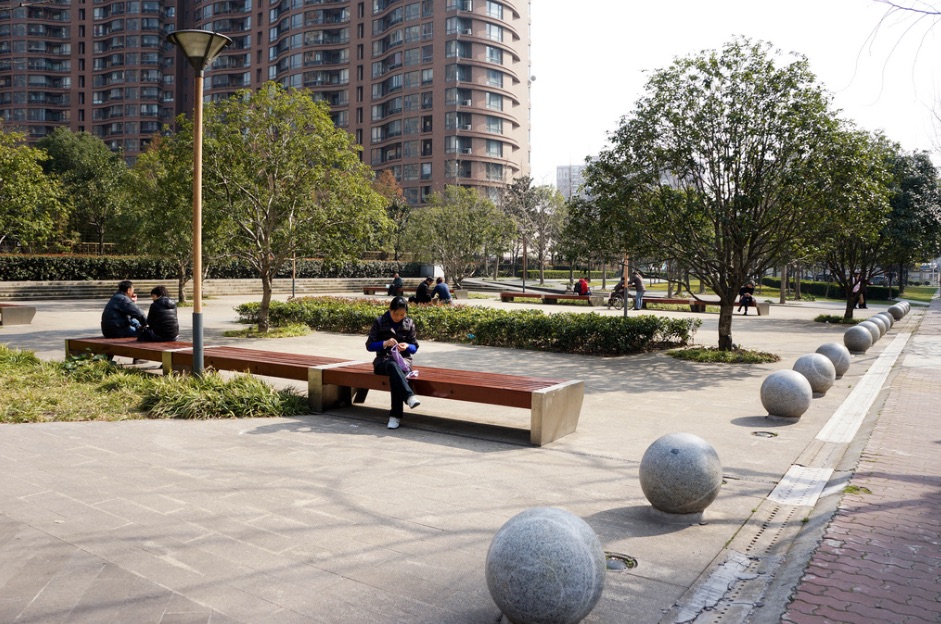
Really too much pavement here for a successful park, in my opinion. But, that’s because they weren’t designing a “park.” They were making a “promenade.” And what is that supposed to mean? The word itself is filler. And even if you were actually making a “promenade,” does it need to be two hundred feet wide? Or maybe twenty is enough?
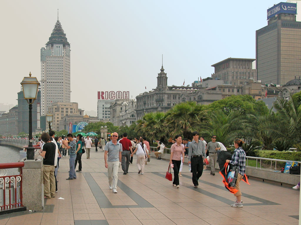
Le Bund est un boulevard qui longe le fleuve Huangpou, c’était le centre des affaires dans le Shanghai des années 30.
The “promenade” (yes that is what people call it) at the Bund, Shanghai. Twenty feet wide.
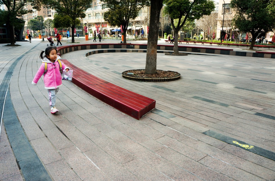
While there is quite a lot of attention to detail here, I think there is some big conceptual error.
Note that there is actually a space on the left of the map which is actually labeled a “park.” Note that this area does not get any pictures or description at the website link. It looks like it is called “open space park,” which is not really a name, but rather a functional label. It it no wider than the “promenade,” and fronts a major Arterial roadway. I think it functions more like Green Space, as a bufffer that nobody is actually supposed to go to.
Unfortunately, so many “landscape architects” have been designing this sort of vague filler crap that I think they are actually somewhat hesitant to design an actual park, with a name that includes the word “park.” We’ve seen these kinds of filler elements in various overly-wide pedestrian “street” situations, like this:
March 22, 2015: Narrow Streets for People 3: A Shopping Center Example
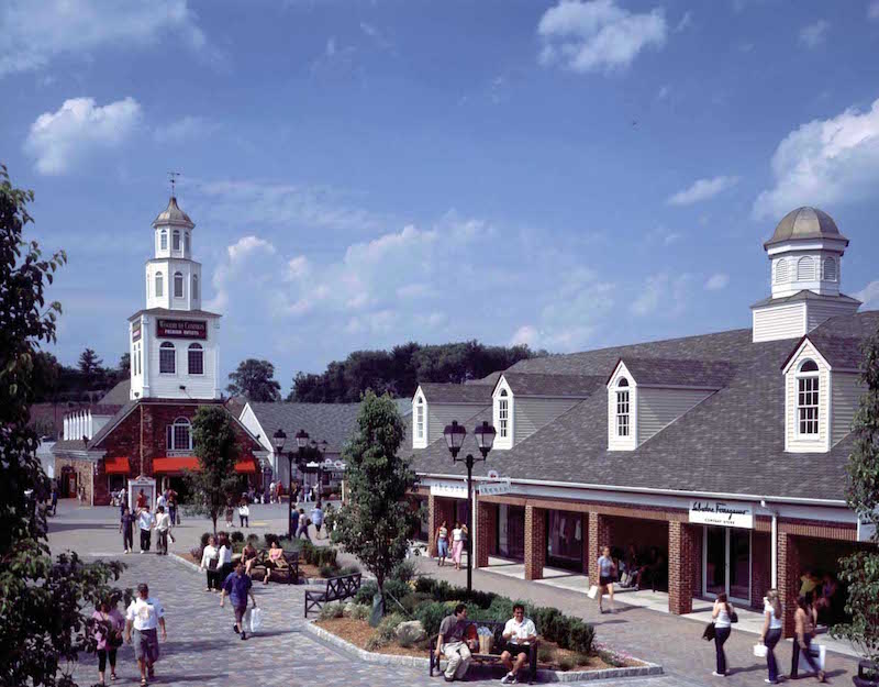
This is a shopping center, the Woodbury Common development north of New York. This is really supposed to be a “street,” but it was made much too wide for its purpose, so the “landscape architects” started to add all kinds of filler elements to break up the barren expanse of pavement. This is not a park. For one thing, there is no clear boundary. The park-ish part just mushes into the street-ish part.
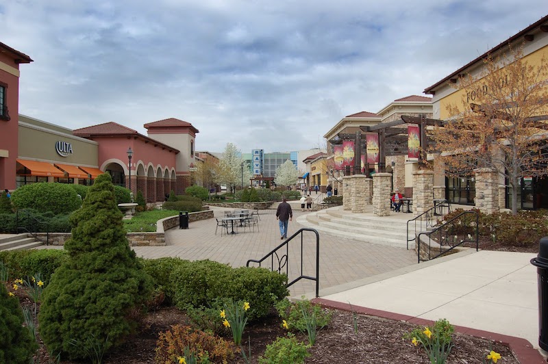
Here’s another example of failure, in a U.S. shopping center. We have a nice large area, which certainly could be made into a park. But, it is not a park at present. It is not quite a street, and not quite a square, either. It is a strange space with a bunch of weird filler elements, whose purpose is unclear. We can be quite sure that this space does not have a name that includes the word “park.” There is no clear boundary here, where there might be a “park” or a “square” or a “street.” It is just a mush of landscape filler.
March 15, 2015: Narrow Streets for People 2: Subtleties of Street Width
So, not like that. Just Make A Park, with a name that includes the word “park.” Hire a Park Designer to help you.
While we have these actually quite large and valuable areas wasted on a jumble of pointless filler elements, totally wasting our opportunity to make a nice Park For People, you can make a genuine park out of a quite compact space.
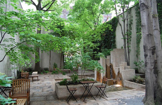
Here is Chestnut Park, Philadelphia. Note that it has a name. The name includes the word “park.”
It is very small. But, if I were to claim this is NOT a park, you would think I am nuts. Obviously, it is a park, even though it is perhaps two thousand square feet in size. It is maybe one-hundredth the size of the “promenade” at Gubei Gold Street, but this is a park, and that is not. It even got a writeup in Landscape Architecture Magazine:
http://www.asla.org/lamag/lam08/september/feature1.html
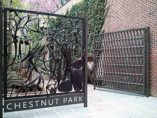
The entrance to Chestnut Park. It has a clear boundary. You know exactly when you are in the park, and when you are not. Also, note that it is enclosed. We do not have Arterial roadways on all sides. This adds a lot to the feeling of “refuge,” a protected space For People. This is especially important for a small park.
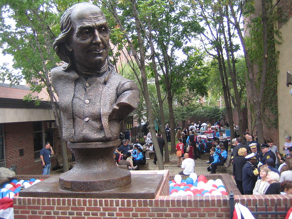
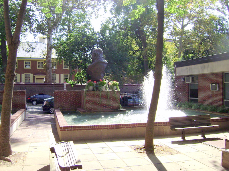
Also in Philadelphia, the Girard Fountain Park. The size is about 610 square meters, or 0.15 acre. It has its own page at Wikipedia. A fine place for an event.
https://en.wikipedia.org/wiki/Girard_Fountain_Park
I seem to have more to say about this topic than I thought. Let’s continue later.
Click Here for the Traditional City/Heroic Materialism Archive

