Parks and Squares 4: Smaller Squares
October 11, 2015
I’ve been describing the basic elements of Traditional City design. They are: Streets (mostly Narrow Streets for People), Parks, and Squares. Parks and Squares should have names, which include the words “park” or “square.” There isn’t very much that doesn’t fit into one of these categories. If you are designing something, shouldn’t it really be one of these things? And if it isn’t, why not? A lot of new design these days has a very large amount of somewhat aimless, disorganized space.
August 16, 2015: Parks and Squares 3: Squares
August 2, 2015: Parks and Squares 2: Smaller and Closer
July 26, 2015: Parks and Squares
April 12, 2015: Narrow Streets for People 4: Organizing the Street
March 22, 2015: Narrow Streets for People 3: A Shopping Center Example
March 15, 2015: Narrow Streets for People 2: Subtleties of Street Width
March 8, 2015: Narrow Streets for People
Click Here for the Traditional City/Heroic Materialism Archive
Today, we’re continuing our discussion of Squares. Previously, we looked at some very large squares, typical of the largest squares of capitol cities. Obviously, these are the most well-known, as many high-profile events happen there. However, a city can have dozens and dozens of smaller, neighborhood-size squares also.
There don’t seem to be many squares in the Asian examples, so today’s topic will have a Europe-centric flavor.
Existing squares have a funny history. Often they were used as a sort of old-fashioned Arterial intersection. It was hard to turn around a horse-drawn wagon, especially on the Narrow Streets for People that characterized Traditional Cities before 1800 or so. Also, squares often served as marketplaces, and marketplaces need a way to carry goods in and out. Thus, we find squares that are at the confluence of Arterial-size streets. In 19th Century Hypertrophism, after 1800 or so, certain “squares” seem to be designed primarily with traffic flow in mind, and serve primarily as roundabout intersections of Grand Boulevard-size streets. Once you put a square at the confluence of Arterial or, worse, Grand Boulevard streets, in other words streets designed for vehicular traffic, it becomes rather difficult to make a Place for People.
Thus, we have a certain tradition of wheeled vehicle traffic flow in squares. This was not so much of a problem because, particularly before 1800, there just weren’t that many wagons, and they moved fairly slowly. They weren’t nearly so threatening as automobile traffic today. For example, here’s a square in Copenhagen, Denmark in 1905.
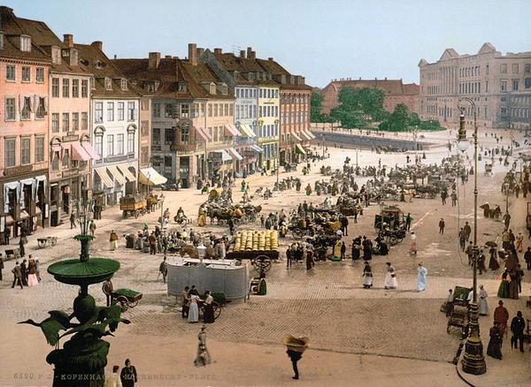
Here we see some wagon traffic, but it does not seem to be particularly unpleasant or threatening to people walking. This is even at the relatively late date of 1905.
As a consequence, today a lot of historic squares have some form of vehicular roadway, typically around the edge in some form. However, we really don’t need to use squares as truck-turnarounds today, so I suggest that, going forward, squares should be entirely For People.
Let’s take a look at some squares.
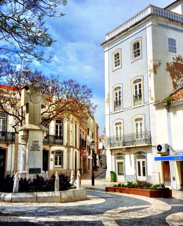
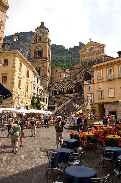
If you are serious about the study of squares in Traditional City design, there are at least a hundred great examples in Italy for you to study.
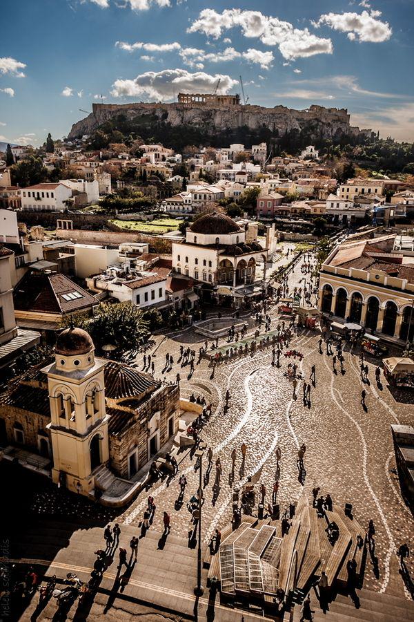
Athens, Greece. Greece also has umpteen great examples of squares. Note that this, like all of our examples, is a Place for People alone, with no roadway.
Although this square is somewhat amorphous in shape, it nevertheless has clear boundaries.
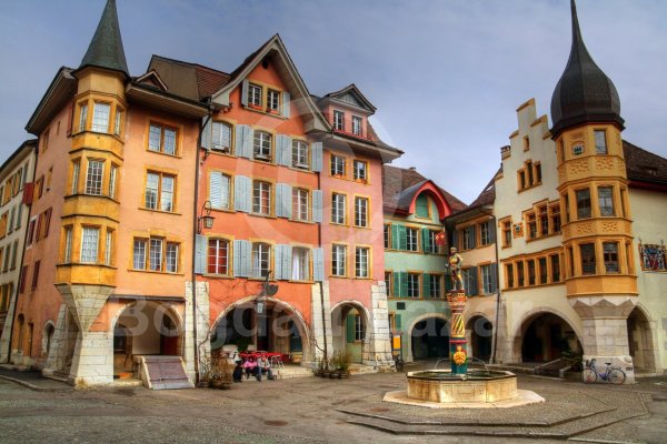
Biel, Switzerland. Another example of a nice “neighborhood” square.
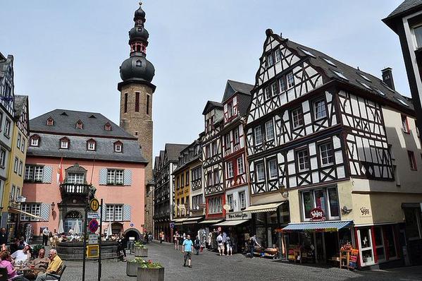
Cochem, Germany. Neighborhood size.
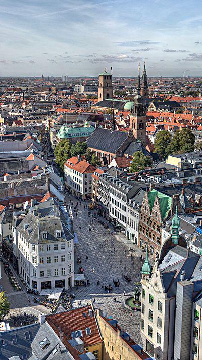
Another square in Copenhagen, Denmark.
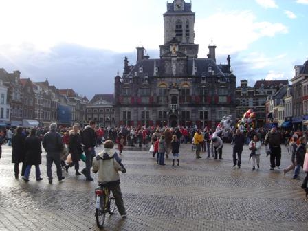
Delft, Netherlands. The basic design of a square is very, very simple.
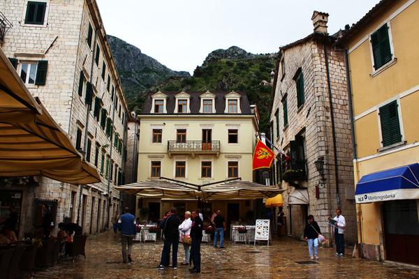
Kotor, Montenegro.
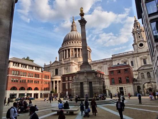
London, England.
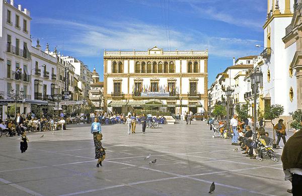
Marbella, Spain.
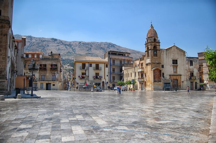
Palermo, Italy.
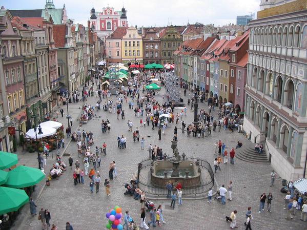
Poznan, Poland.
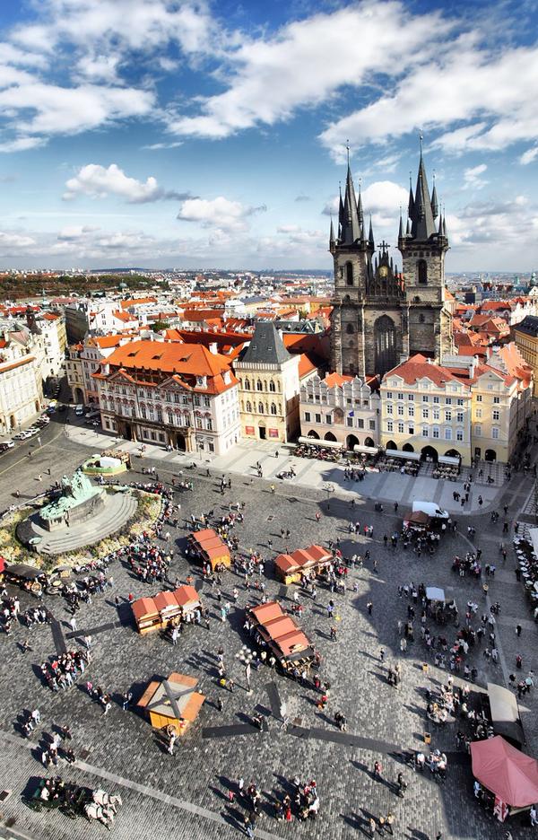
Prague, Czech Republic.
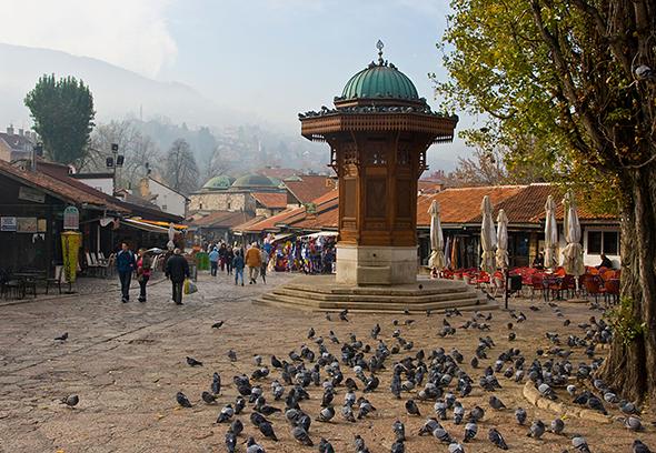
Sarajevo, Bosnia.
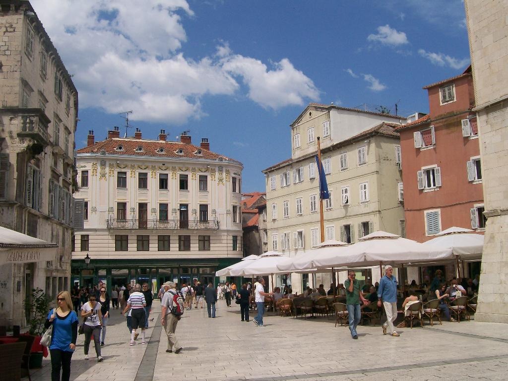
Split, Croatia.
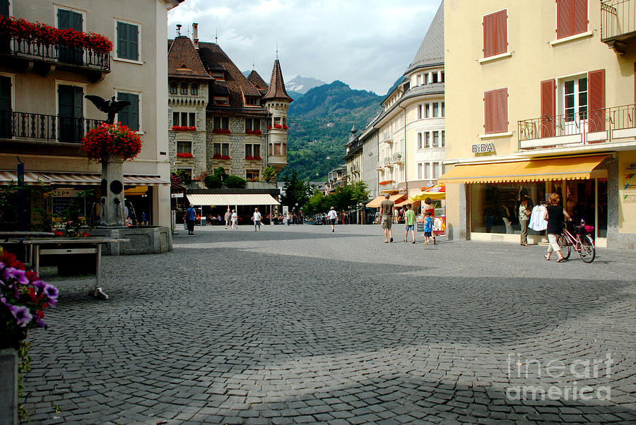
Somewhere in Switzerland. This “square” is nice enough, but it is a case of the square becoming somewhat indistinguishable from the “street.” This area just barely has clearly-defined borders.
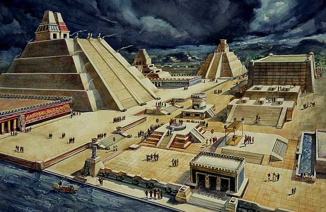
Tenochtitlan (Mexico City), Mexico.
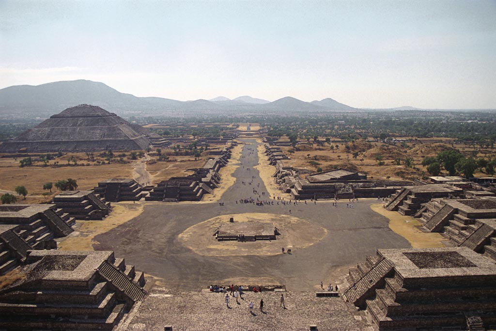
Teotihuacan, Mexico.
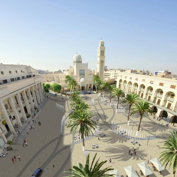
Tripoli, Libya.
This discussion about squares is mostly about making new squares. Obviously, if there is already a square there, you don’t have to build it, and you have to make do with what you have. I would suggest eliminating roadways as much as possible, ideally making a Place that is wholly for People with no cars whatsoever. But, sometimes this is not feasible. In that case, the best thing seems to push all the traffic to one side of the square. Avoid surrounding the square with vehicle traffic.
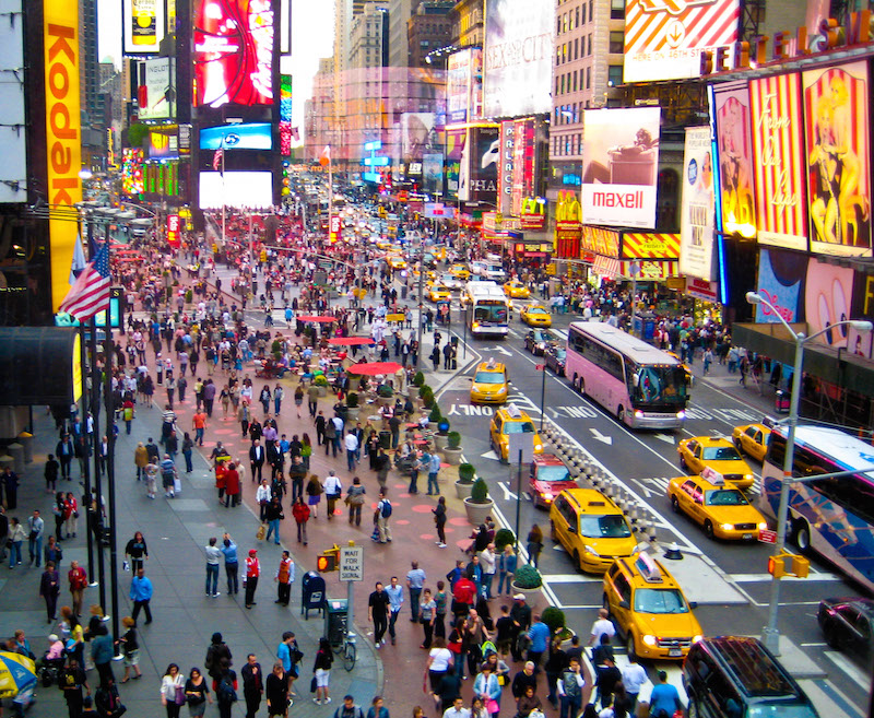
New York City
Times Square in New York City, US is one of those 19th Century Hypertrophic-style squares that is at the confluence of two Grand Boulevard-size streets. A recent “pedestrianization” pushed all the roadway to one side, and created a larger area for people. It was a big improvement, but you would still be better off with no roadway at all (in new development).
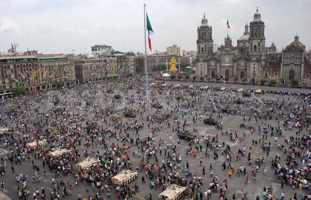
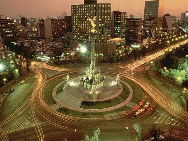
This square in Mexico City, Mexico, is typical of historic squares that now have a vehicular roadway along one edge. Do it if you have to, but it is not ideal.
Among the examples of What Not To Do, we have this from Whistler Village, at the base of the Whistler ski resort in British Columbia, Canada. This is an intentional people-only place.
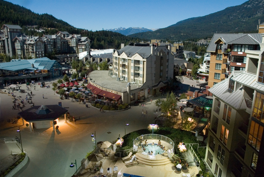
This looks sort of like a square … but it is a somewhat amorphous, fuzzy area that is not quite a square. What are the boundaries? The “streets” which themselves are somewhat squarelike (wide) just mush into this kinda-wider-area. Note how the buildings interact with the square: not as a public place, but more like a suburban parking lot, with buffers and separation. You could have a place with half the surface area that is a real square, rather than this amorphous mushy mess.
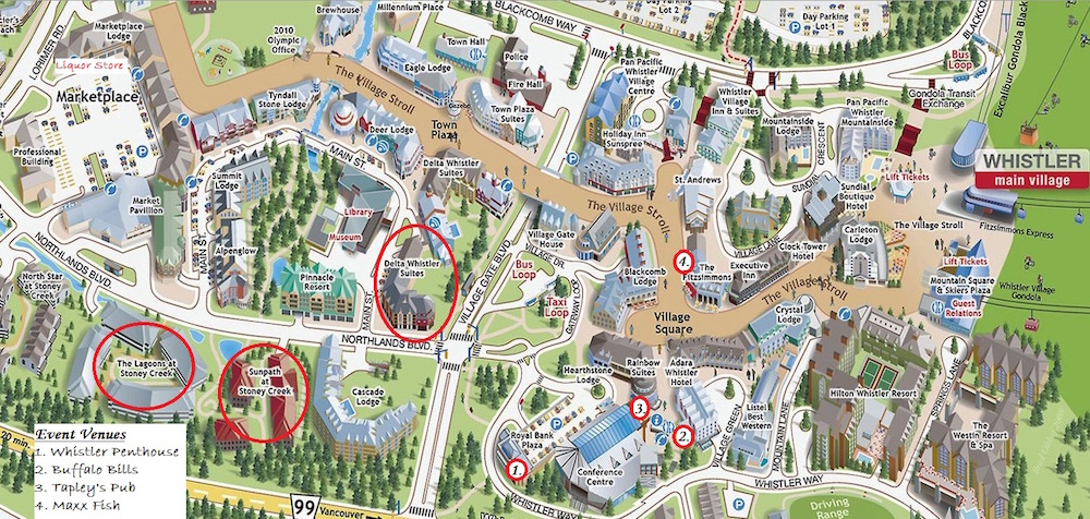
Although there is a place called “Village Square” here, the place pictured above seems to be the part on the far left of the “Village Stroll”, at the base of the lifts. So we see that it does not have a name. Note also that the “Village Stroll” is not a “street” and not a “square,” it actually has a fuzzy name to go with its fuzzy form. This is somewhat like the Gubei “promenade” we looked at earlier. Architects these days are a little dumb.
July 26, 2015: Parks and Squares
Lastly, because it is such a perfect example of design failure, we have this favorite image of ours:
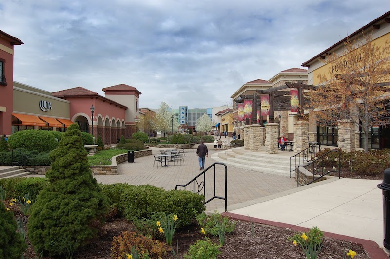
Here is a real people-only place that is practically begging to be made into a real Square — a beloved destination for local people suffering in the midst of Suburban Hell, so that they don’t have to get on a plane and go to Italy just to spend the afternoon in a properly designed bit of urbanity. But, instead we have a confused jumble of filler elements. Nobody could call this a “square,” which is why I am sure it does not have a name that includes the word “square.”
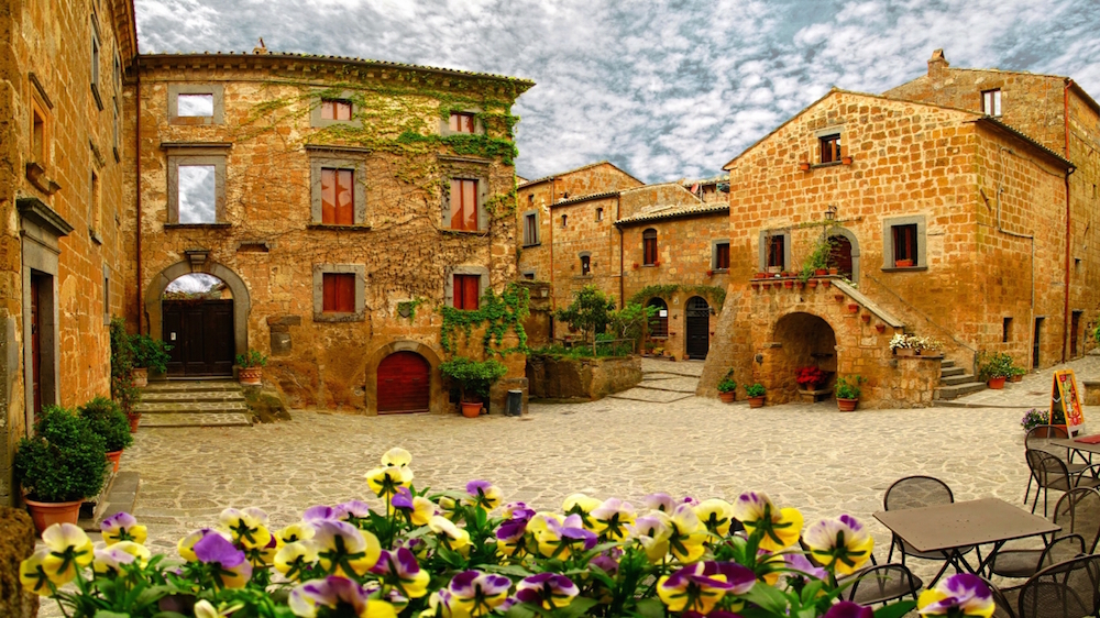
This square in Italy is about as simple a thing as you can imagine. The architecture, though charming, is not very complicated. And yet, the overall result, with the addition of a few potted plants, is very successful.
Just make squares. Even when they are part of a private development (as would mostly be the case for new squares going forward), give them a name that includes the word “square.

