
Income and Per Capita GDP in Gold Oz.
July 8, 2012
This is something I’ve been mentioning a lot recently, so I thought it deserved its own page here.
June 24, 2012: Who Destroyed the Middle Class?
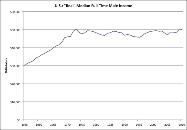
This is the U.S. government’s own statistics on the median male full-time income in the U.S. I use this because it compensates for a lot of things that have been going on, such as increasing female participation in the workforce, changing demographics or family size, or greater/lesser part-time work. These are “real” statistics, which means that it has been adjusted by the government’s version of price statistics — which have been buffed and polished to look as good as possible. If the price statistics showed an additional 1% of price rises per year, over forty years, this chart would look a lot worse.
The interesting thing here is how there is such a definite inflection point, right where we go from a gold standard system to a floating currency system. A lot of other things have happened over that time, but we don’t see any other major inflection points. You might think that the 1990s were really good for people, and the 2000-present era has been not so good, but oddly enough, there’s no particular difference you can see on this graph (although maybe the government is monkeying the statistics more aggressively in 2000-present to make it look that way). This is one reason why I think that the transition to funny money in 1971 is probably the most important long-term event for middle-class prosperity in the United States.
You can also see how the U.S. middle class steadily prospered in the 1950s and 1960s, despite the various ups and downs of the economy, not to mention social turmoil, of that time period.
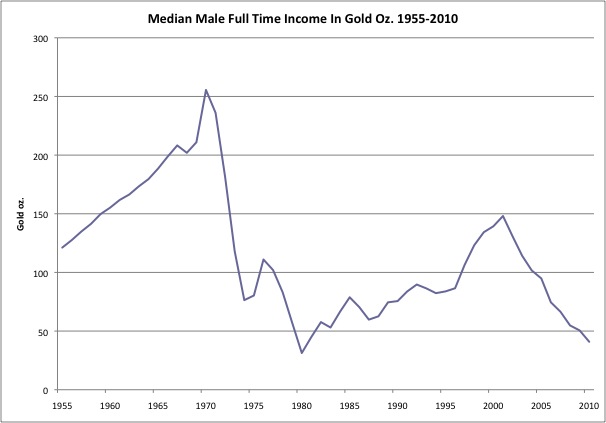
Here is the same information, but here protrayed in the value of the median income in terms of ounces of gold. This is not so weird, because the U.S. used gold as the universal standard of value for 182 years, until 1971. So, I’m just being a traditionalist here. This chart is plain ugly, which is why, I think, that even though we have transferred from a one-income household to a two-income household, the average American family still can’t afford today what one median income could buy in the late 1960s.
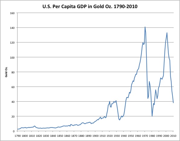
Here is some long-term data, the per-capita GDP as measured in ounces of gold. Any GDP statistics from before 1950 are highly suspect, and that is especially true of figures from before 1914. So, consider this suggestive rather than definitive. It tells much the same story.
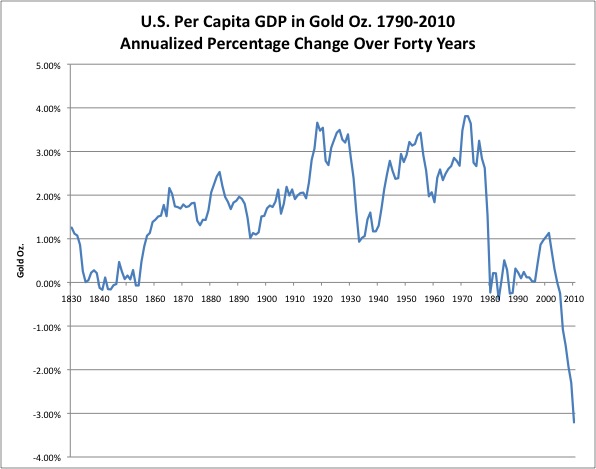
I smoothed things out a bit here by looking at average growth rates over forty-year time periods. Was the average American better off (as measured in per-capita GDP in gold ounces) than they were forty years earlier. You can see that, even despite hardships such as the Civil War and the Great Depression/World War II, the average American was consistently better off than they were forty years previous. The Great American Wealth Generation Machine kept on ticking, even after huge setbacks. We haven’t had any Civil-War-scale disasters since 1971, but the funny-money environment has nevertheless disabled the Great American Wealth Generation Machine. The average American is now, for the first time in U.S. history, consistently worse off (by this measure) than they were forty years ago.
